
22 Oct The Winner Is? Wallpaper by Kimberly Lewis & Patrick’s 5 Tips for the Right Selection!
Winning a wallpaper contest on Instagram was fairly easy, but wait until we get to the selection process, now that’s a totally different story!
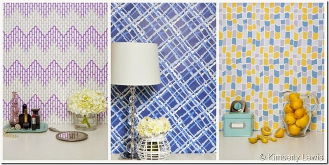
Sponsored by Brooklyn-based wallpaper designer, Kimberly Lewis, and fine French furniture manufacturer, Grange, I simply followed their #InstaContest instructions, and before I knew it, I had won 3 rolls of Kimberly’s colorful wallpaper. Now how sweet is that? It was a FANTASTIC surprise and I’m so grateful to Kimberly and Grange for having the contest. Fun pops of color and pattern to choose from…one lucky gal I am! (Please follow Kimberly’s Instagram feed @KimberlyLewisNYC and @GrangeFurniture. Well, and mine too while you’re at it 🙂 @DeborahMainDesigns).
But actually making a decision and selecting the “right” wallpaper is a whole ‘nother story!! It is HARD and far more challenging than I thought!! (You may not know this about me, but I’m fairly indecisive…Ha!)
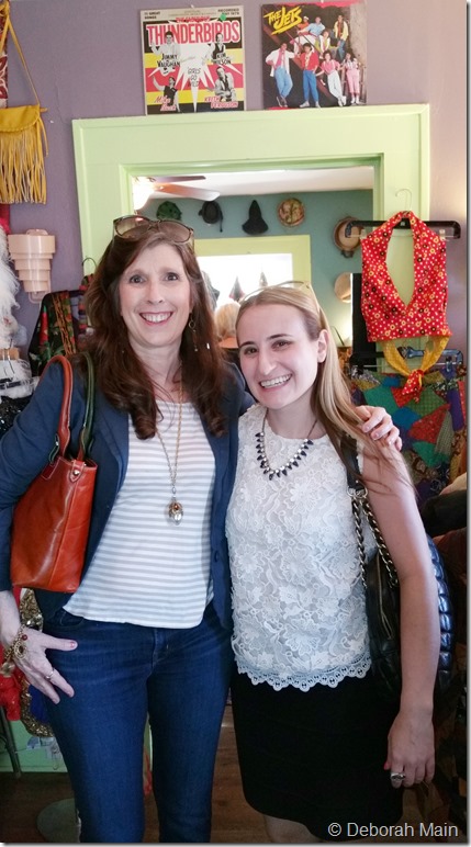
But before I get into this whole “selecting wallpaper” process, let me introduce you to Kimberly of Kimberly Lewis Home. Because it just so happened, that because I’ve taken soooo long to make a decision (remember how challenging it was to select a roof shingle?!?!) Kimberly was headed to Austin for a wedding, so we were able to meet up in real life (#IRL) last weekend. We had lunch at Bouldin Creek Cafe (ya know, a little iconic Austin) and had great fun bopping around some of my fave South Austin vintage shops. Below we’re at Flashback, a fun filled-to-the-brim vintage shop specializing in 1950’s -1980’s.
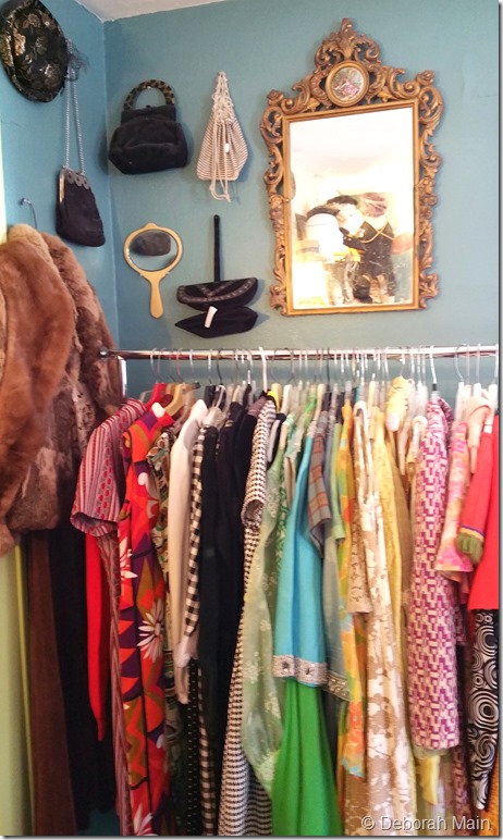
Here’s a rack (below) that Kimberly loved for all it’s color and pattern. And me too, but I was also eyeing that gilded mirror, cause you know I recently had a run in with a gorgeous gilded mirror I couldn’t resist (check out last week’s post HERE ).
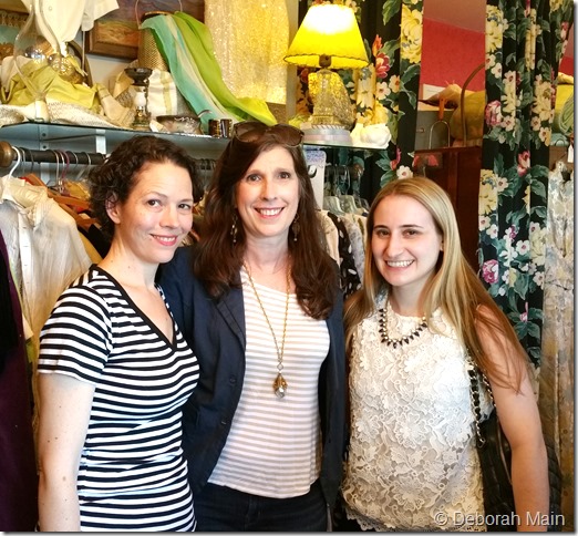
We also had time for a quick pop in to another of my absolute FAVE vintage shops in Austin, Amelia’s Retro-Vogue & Relics . Here we are below with friend Laura Del Villaggio of Milli Starr, Austin’s best kept secret milliner. Jane Clarke, owner of Amelia’s keeps a highly curated collection of a little bit of everything from 1890’s to 1950’s. Many of my prized textiles are from Jane’s personal vintage collection!
A little bit about Kimberly. She’s super nice, from Massachusetts (which some of you may not know, but I was born in Beverly, MA), has an impressive design background working with brands like Wolf Gordon, a design degree from Pratt, and got to study textile design at the Danish Design School. And, not to mention that she makes fun colorful wallpaper, with a touch of “preppie” in it, she also is one of “8 Brooklyn Wallpaper Designers To Watch”. And a couple of her patterns, inspired by vintage dresses (key to my heart!), were selected in 2013 by the Brooklyn Museum. Now how’s that for recognition!
Here’s what Kimberly had to say about her very first visit to Austin:
Travel is a great source of inspiration for my wallpaper designs. I was excited to find myself most recently jumping on a plane to Austin, TX. Deborah most kindly gave me a mini tour of her favorite stores and I was excited to soak up some of the local flavor. A big thanks again for showing me around Austin, I had a fabulous time both on Friday (at the vintage shops) and at the wedding! I honestly would love to book another trip back soon! – Kimberly Lewis
And what inspires Kimberly:
My most recent wallpaper designs are inspired by a trip to France, while other designs hark back to my childhood growing up in New England. I am always on the lookout for inspiring decor, color palettes, and experiences to add to my design process and love to soak up inspiration everywhere. – Kimberly Lewis
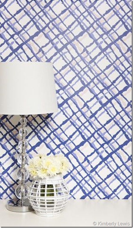
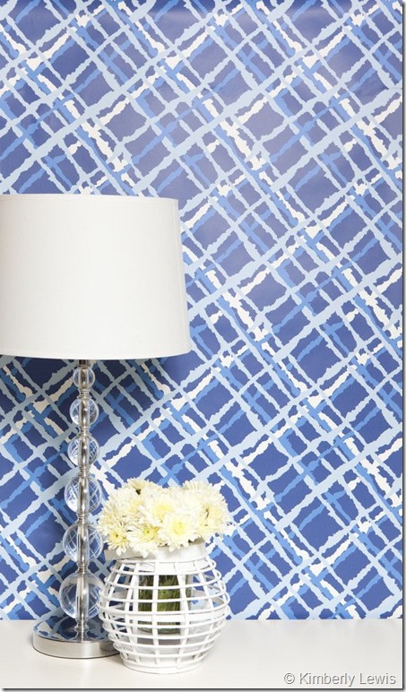
This design above, the Beverley in Perry (available in four colorways), is one of the many colors and patterns I’m lucky enough, as a winner of the contest, to choose from. And I have to say this one above is the one I’m leaning toward, but certainly after reading this post, you can help me decide, right? (Please follow along on my Pinterest board “Wallpapers Galore” ).
Selecting wallpaper is not as easy as it looks when you’re a pillow designer like myself who loves ALL color and has NO wallpaper on her walls and does not wear ANY pattern! Now how’s that for a challenge?
That’s where my interior designer Patrick Landrum of PL&D/Patrick Landrum Design, whom I’m lucky enough to work with on my “Vintage Cottage Bungalow” home remodel project, comes in. He’s a pro at “Authentic Luxury Design”!
All I have to say is thank God for Interior Designers! They really know EVERYTHING there is to know in making design decisions, using different materials, and putting together the look you want.
So if you’ve never worked with an interior designer before, just DO IT! They’re worth their weight in gold!!
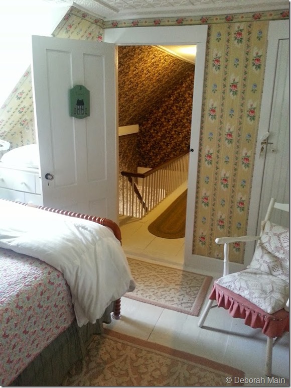
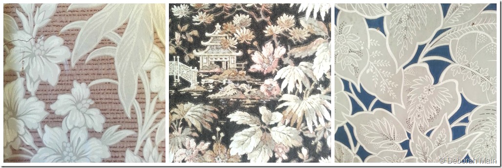
But first, a little background on my love for wallpaper. Growing up as a young child in Massachusetts, like Kimberly, I was surrounded by beautiful wallpaper on my bedroom walls and the walls of my grandparent’s homes too. Wallpaper very much like these below that totally inspired me when visiting my cousin Cheryl on Deer Isle on summer.
All homes on Deer Isle are gorgeous, historic, big white homes that are filled with stories! My cousin took me to this adorable muffin shop that happens to also be a cozy Bed & Breakfast. Well, the couple that owned it gave me a tour (more on that in a future post) and I fell in love with the wallpaper and stories that came with it.
Below are two, of several rooms, filled with inspiring vintage wallpaper like in my childhood.
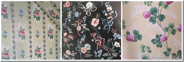
These patterns below are classic from the 1930’s and ’40’s!
Now, onto my task at hand: selecting a colorful patterned wall paper.
I decided to get moving on my remodeling (since Austin permitting is taking forever!) with my studio for Deborah Main Designs. My studio is in my home, my son’s old bedroom to be precise. I’ve spent weeks overhauling my entire studio, going through every piece of fabric and trim I’ve collected for the past 10 years. A daunting task, to say the least, if not for the help of Jana with Task Rabbit!
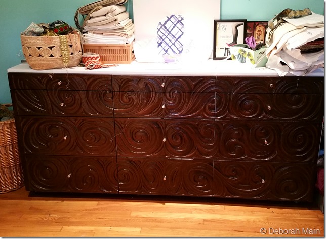
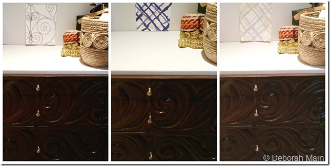
One drastic move I’ve made (inspired by the offices of two talented interior designers, Linda Holt of Linda Holt Interiors and Leslie Hendrix Wood, of Hadley Court, and members of this wonderful group Interior Design Chat) is that I’ve cleared out the wall-to-wall bookcases of fabric and now have this AMAZING 1960’s dark wooden credenza below. With a white top, the perfect height to design on, it gives me not only extra storage space in the drawers, but another counter top surface for designing.
So, my plan is to wallpaper the wall behind this fabulous credenza. (Btw, I purchased the credenza and my vintage blue velvet sofa from The Brass Peacock, another fabulous Austin vintage shop specializing in furnishings.)
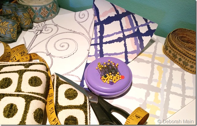
Now here are the choices I’ve narrowed it down to:
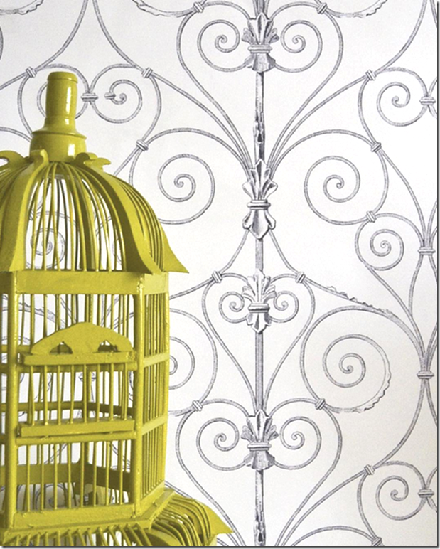
The Beverley pattern (not sure which color yet) or one of Kimberly’s newest designs, The Gate (not yet on her website).
The Beverley is inspired by vintage clothing, and I can totally see my great Aunt Adelaide Main in a dress like this. But The Gate pattern is inspired by Kimberly’s travels to Europe, and of course makes me think of all those fabulous gates in Varenna, Italy from our trip this summer (Here’s the post on that divine texture HERE).
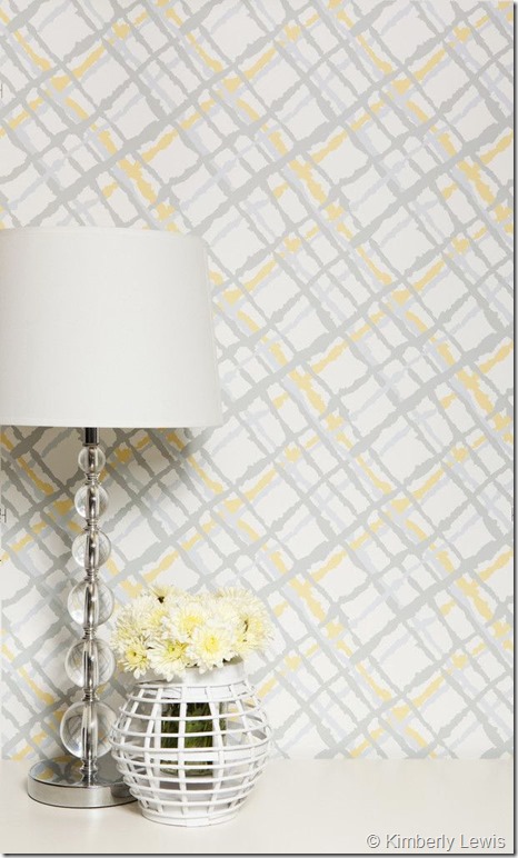
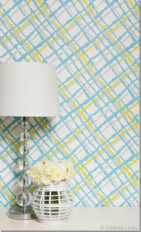
Here are my wallpaper choices below by Kimberly Lewis:
Sunpetal Wallpaper
Lime Fizz Wallpaper
Midnight Wallpaper
Perry Wallpaper
The Gate Wallpaper (not yet available online)
As you can see from the existing wall color (below), which is like an aqua green/blue, it sure would be simple to pick that same green//blue color of the vintage-inspired Beverley pattern, the Lime Fizz, and be done with it.
I DO love the vintage pattern, but there’s also good reason to pick the soft gray and yellow, because with all the natural light in my studio, it would help keep my space bright and calming (with perhaps soft butter yellow paint on the walls).
Or, one of the Beverley patterns with navy blue in it, because I LOVE blue! And to complicate matters, there’s also good reason to pick Kimberley’s new collection, The Gate….oh, how it reminds me of Italy.
So you see my dilemma? What is a woman to do?? That’s why I specialize in designing one-of-a-kind luxury pillows….I LOVE color and want to use it all!!
That’s where my knight in shining armor, interior designer Patrick Landrum of PL&D/Patrick Landrum Design, comes in on cue! I said, Patrick, how am I ever going to decide?? Well, here’s what he has to say.
5 TIPS FOR SELECTING THE RIGHT PATTERNED WALLPAPER – by Patrick Landrum of PL&D/Patrick Landrum Design.
- #1: Think About Cause and Effect
“Using a patterned wallpaper in a space has the single most dramatic effect of all the design elements available. You can change the level of intimacy, add drama, whimsy or movement, and create limitless scenes evoking exotic locales before you even place a piece of furniture.
Generally, the larger the pattern the more active or busy it will be. But colors will also effect this aspect. The more contrast in value or hue of the pattern to the background the more active the pattern will appear visually whether the pattern is large or small.
Larger patterns are usually more appealing in larger spaces, but they also work wonderfully in powder rooms adding high drama in a space that’s occupied for short periods where too long a stay could become dizzying or claustrophobic.” – Patrick Landrum
- #2: Focus On What You’re Doing in the Space
“When selecting a patterned wallpaper you can either decide on the mood you want to create, or conversely choose a paper you love.
Consider what activities take place in the room and be sure that the mood is appropriate and/or the pattern and color doesn’t distract from what goes on in the space.” – Patrick Landrum.
- #3: Remember the Lighting
“Lighting is a key issue with wallpaper as with paint. Darker colors will need more lighting, metallics will have a different requirement. Some papers will need ambient light to be effective, and some highly patterned ones will completely change in different levels of light.” – Patrick Landrum
- #4: Don’t Be Afraid to Dip Your Toes in Slowly
“If you are wary of using too much pattern, consider papering one or two accent walls. If you do one wall it must be a strong focal point wall, typically with a larger piece of furniture on it. You can also do a wall with the entry door on it. Usually you do not want to do a window wall only as this can create a disembodied wall feeling. If you do two walls they must be adjoining walls.” – Patrick Landrum
- #5: How This Applies to Your Studio
“Specifically with the Deborah Main Designs‘ studio, the pattern must be “mellow” enough as to not distract from her work in selecting fabrics, colors, etc. A close pattern to background color ratio is perfect. If you squint your eyes and you see little variance in light/dark then it’s a good choice.
Since highly patterned walls are new to Deborah, do one wall only, the one with the large buffet. To avoid having to add a lot of new lighting, go with the drama of a darker paper with little contrast and go very light on the other three walls and ceiling. This will give you the best of what wallpaper can offer without compromising your work space, or your psyche.” – Patrick Landrum
Thank you Patrick for those helpful tips!
Now that you have the down and dirty of the challenges in selecting wallpaper, five helpful tips, and how excited I am to have the opportunity to select some of Kimberly Lewis’ colorful patterns, please enjoy some more inspiring wallpaper below, some only recently launched at High Point Market.
Now, once I get this wallpaper selection down, I’m onto discovering French-inspired wallpaper for the master suite to go with that gilded gold vintage mirror I scored at FiND! (Please check out my post on #HPMKT & FiND HERE).
Till then, enjoy, and let us know your wallpaper selection experiences in the comments below. XO, PG
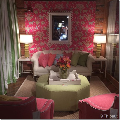
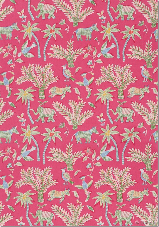
This Thibaut pattern above reminded me of the 1930/40’s wallpaper I loved in that Bed & Breakfast up in Deer Isle, Maine. Below is Thibaut’s new “Trade Routes Collection” recently introduced at High Point market. It was a huge hit and comes in many colorways.
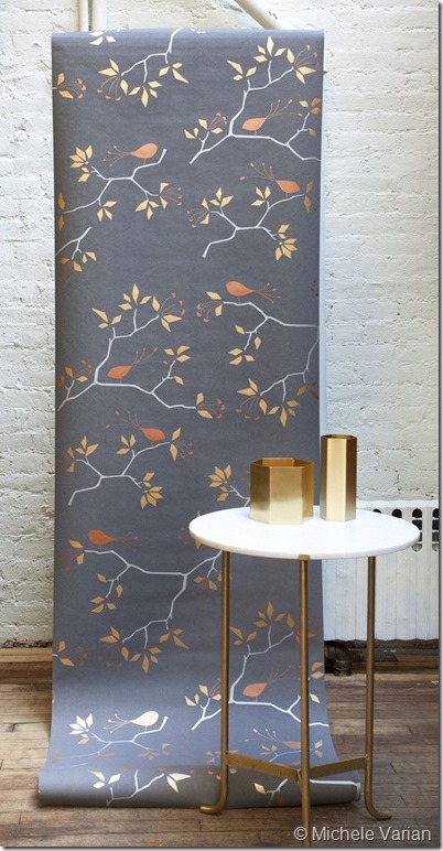
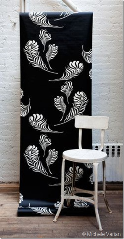
I met Michele Varian on Modenus’ #BlogTourNYC in 2014 and have been smitten over her wallpaper ever since!
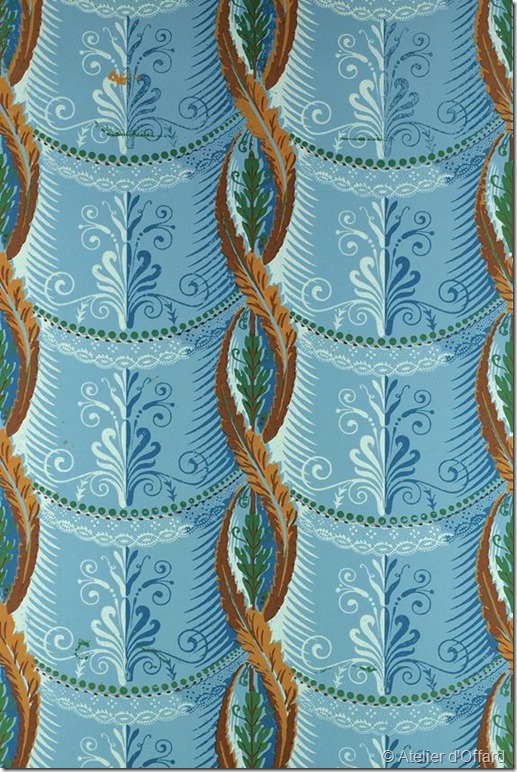
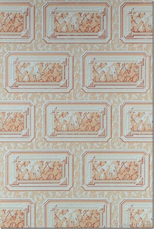
Last but not least, just out in the latest issue of No. 26, the fabulous luxury & design lifestyle publication by D Coop Media, are these luxurious hand blocked wallpapers from France by Atelier d’Offard. Divine decadence!
NOTE: I was not compensated by any person or business for this post. All views and images are my own, except where noted by, and with permission, of the brand. I will be receiving 3 free rolls of Kimberly Lewis wallpaper from winning the Instagram contest, as mentioned in this post. Thank you for reading my blog!


![2015-09-21_1442850088[1] (2)](http://deborahmaindesigns.com/blog/wp-content/uploads/2015/10/2015-09-21_14428500881-2.jpg)


KImberly Lewis
Posted at 03:34h, 23 OctoberSo excited to see what you choose and how you style it in your studio! Thanks so much for showing my around Austin! 🙂
Deborah Main
Posted at 18:32h, 23 OctoberYou’re welcome Kimberly!! I’m excited too! Still trying to figure out which colorway to go. It was great taking you around in Austin. Hope you come back to visit soon! Have a great wknd 🙂