25 Jul Amazing Before and After White Kitchen Inspiration!
Hello Friends. Took a week off (or perhaps it was two?) to recuperate from the intensity of the spring 2020 One Room Challenge (ORC). In reality, I think I need a month off, so don’t be surprised if I go quiet for a few weeks in August for a “Staycation”. The ORC ended July 5th, but I still can’t thank you enough for the support you gave me during my kitchen makeover and all your kind compliments. For a luxury pillow designer to design a kitchen was definitely stepping outside my comfort zone. However, to do ORC in the middle of a Global Pandemic and Social Justice Movement, well, let’s just say it was very challenging. Because of you and the AMAZING partners who sponsored the wonderful kitchen products, making all the difference, our home now has a fresh white kitchen that we absolutely love. Today, I share with you many amazing Before and After photos of The Collier St. Kitchen Makeover for inspiration so you can truly see what a difference a white kitchen makes.
The Grand Plan – Backstory
First, I’d like to share a little perspective in case you missed it in prior posts. You can catch up on the ORC Kitchen Makeover here:
Week 1 | Week 2 | Week 3 | Week 4 | Week 5 | Week 6 | Week 7 | Week 8

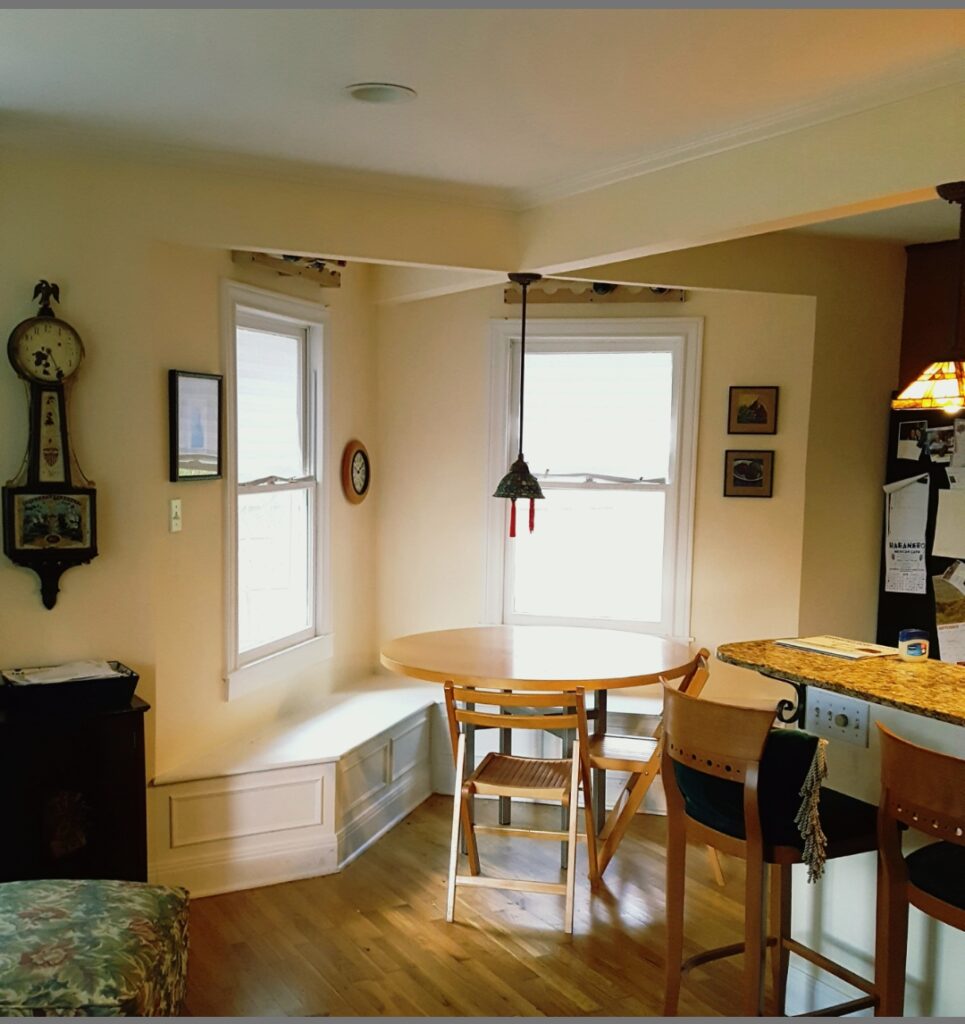
Our kitchen is in the center of our home, a quaint vintage bungalow in the heart of Austin, Texas. Last fall in 2019, I wanted to start the process of transforming the triad of rooms – the breakfast nook, kitchen, and living room. All three create one large open space in the front of our home. When we entertain, it’s where all our guests congregate and we’ve had the best of times. That’s one thing I miss most during this Pandemic is having friends and family over. Below is a visual of the three rooms before I began the One Room Challenge last fall – living room on the left, breakfast nook in the middle, and kitchen/bar on the right. Our front door opens right up into this space. You can see in this photo the awful pendants I had above the round table and bar. For the table pendant, I’m not sure what I was thinking in 1999 as it’s so tiny…perhaps a poker table feel? HA!
BEFORE
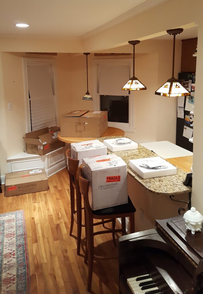
Beginning of the One Room Challenge Makeover
This image below shows the Before start of the entire grand plan, installing lighting by sponsor CWI Lighting for both the breakfast nook and kitchen bar.
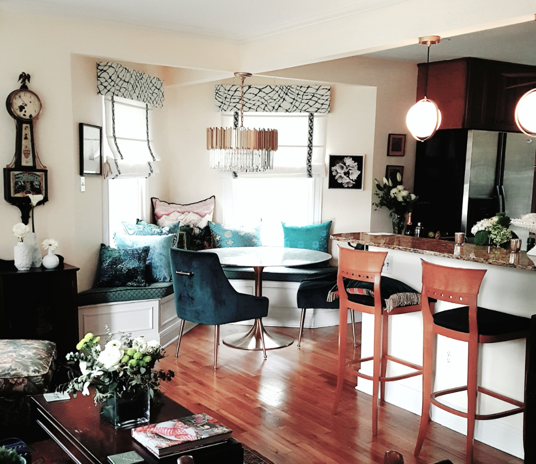
AFTER
This photo below is the After of the breakfast nook, shown in the context of the living room and kitchen. Also note, when we installed the beautiful chandelier we decided to go ahead and change out the bar pendants before we started the kitchen makeover. Deco crystal chandelier and Da Vinci pendants were sponsored by partner CWI Lighting.
Below are the two looks I created for our new breakfast nook for the fall 2019 One Room Challenge. If you’d like to see more and read about our sponsors of the nook, here’s the link to that Big Reveal.
AFTER | Breakfast Nook fall/winter look
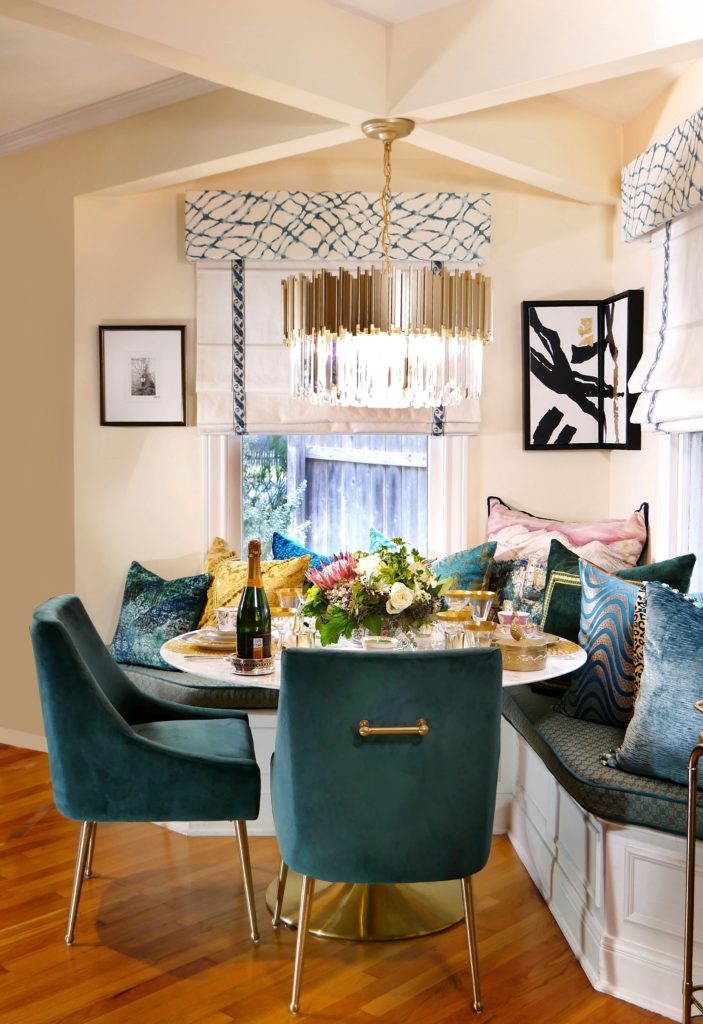
Photography by Gregg Cestaro.
AFTER | Breakfast Nook spring/summer look
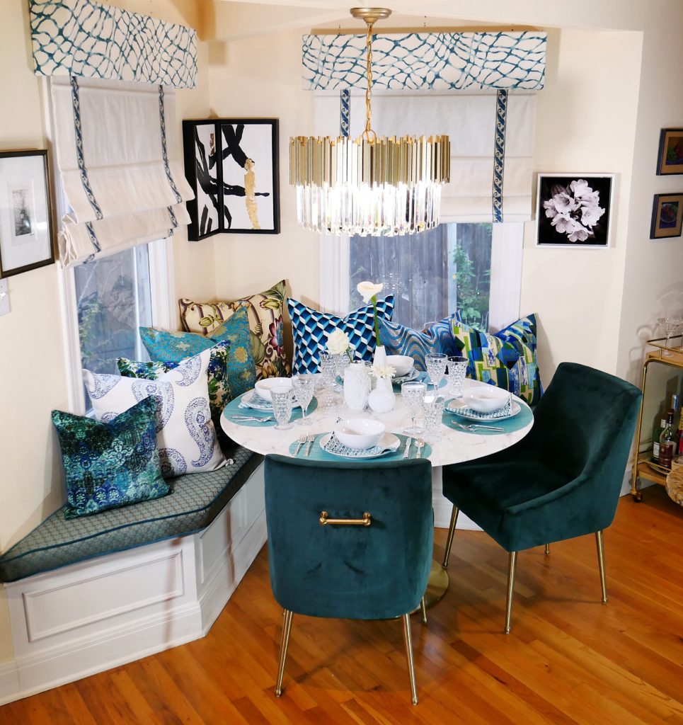
Photography by Gregg Cestaro.
AFTER – Kitchen and Breakfast Nook
This photo below, minus the green velvet chairs, shows the After of the two spaces once I finished the Kitchen Makeover this spring. I wanted you to see how the two spaces are integrally connected and where I got the blue/green color inspiration for our kitchen.
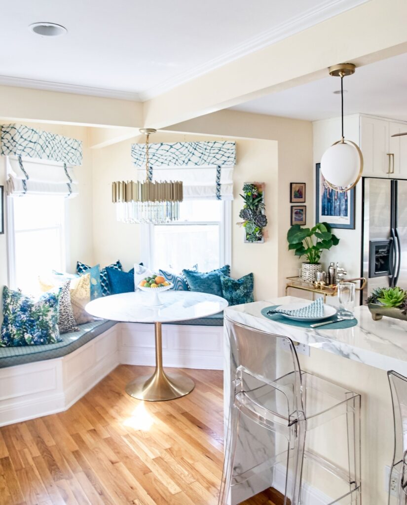
Photography by Deborah Main, The Pillow Goddess.
Primary Kitchen Goal – Light, bright, and white
Now that you have the full picture of the Grand Plan (I’ll spruce up the living room in the fall 2020 One Room Challenge) please enjoy several Before/After images and details of our Kitchen Makeover we finished July 5th. Here’s our Big Reveal post if you missed it.
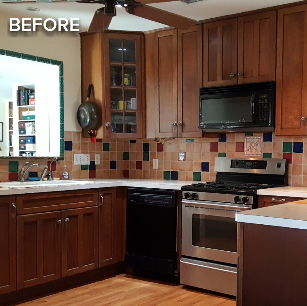
Brightening up a Dark Space with White Kitchen Cabinets

The main goal for the kitchen, which has no natural light in the room, was to paint the 90’s wood cabinets white to brighten up the space to work with the light-filled breakfast nook. We partnered with a top-notch local business, Paper Moon Painting, who did a fantastic job! Like many designers say, “A fresh coat of paint works wonders.”
However, selecting a white paint can be extremely difficult as there are so many options and each white has undertones in it. Paper Moon Painting matched Benjamin Moore’s “Snowfall White” to our white baseboards which worked beautifully. It’s always a good thing to have a sample of your baseboard when painting cabinets or walls in white. It doesn’t really look white here, but you can see how white it is against our cream walls, and our kitchen cabinets look as white as can be.
The white paint truly transformed our entire kitchen and we couldn’t be happier with the selection of Benjamin Moore’s “Snowfall White”. Read a review of Snowfall White I Googled (I have no affiliation with this reviewer). Although it’s repetitive, the reviewer tells you why “Snowfall White” can be the perfect white for you and your home. Often, working with an interior designer, like mine, Patrick Landrum of PL&D Patrick Landrum Design, or color consultant, can really help you wade through the umpteen choices of white. Thankfully, all we had to do was give Paper Moon Painting our baseboard and voila, we had our perfect white. (Details about Paper Moon Painting process in ORC Week 7.)
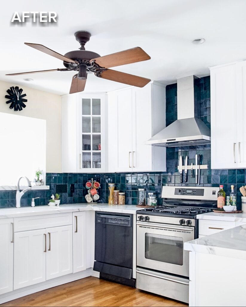
Photography by Deborah Main, The Pillow Goddess.
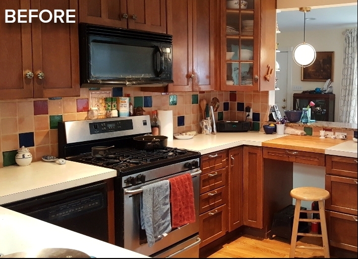
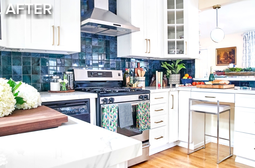
Photography by Deborah Main, The Pillow Goddess.
Toss Out that Taped Microwave
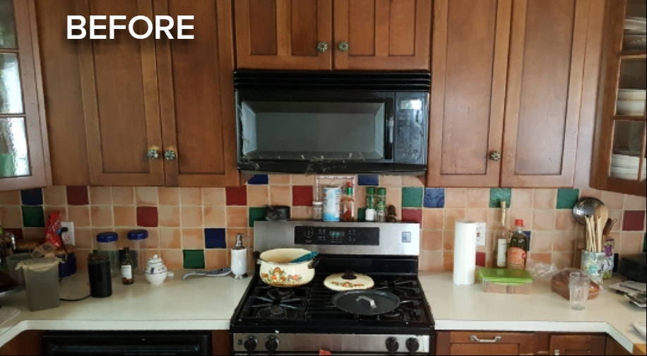
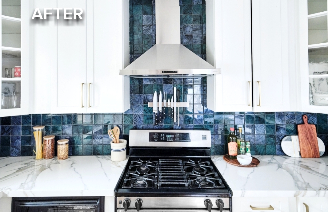
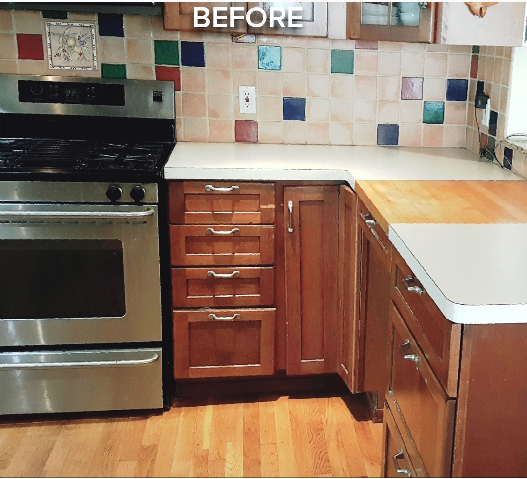
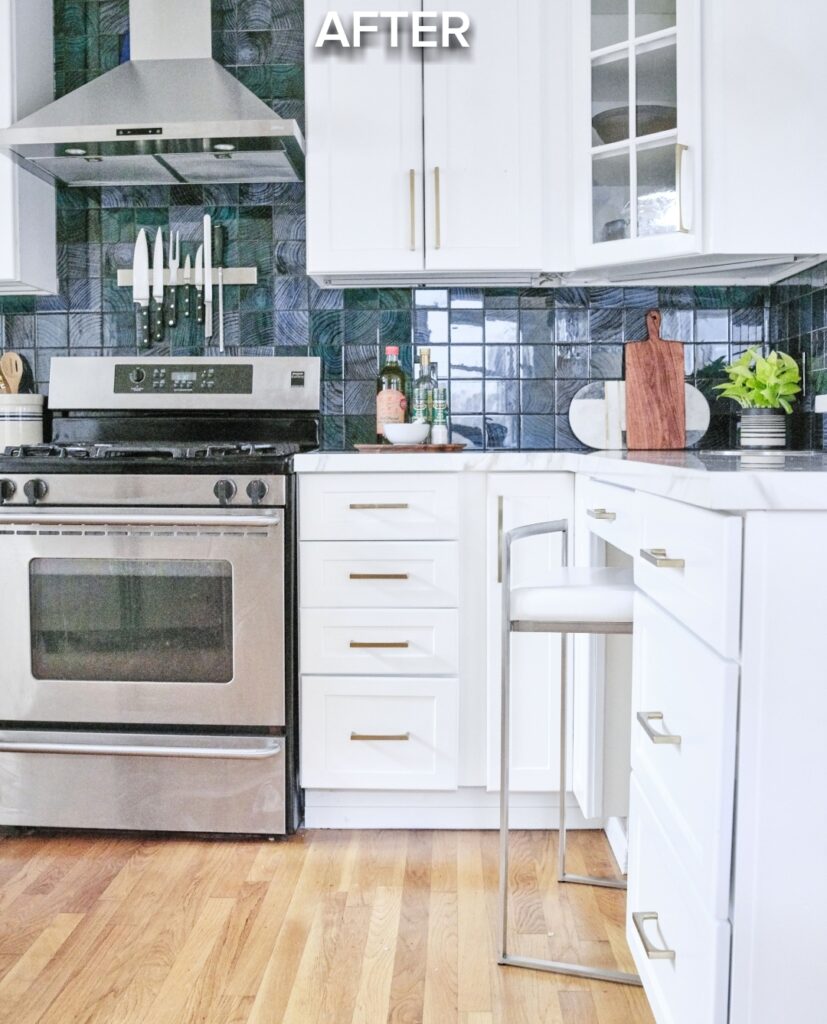
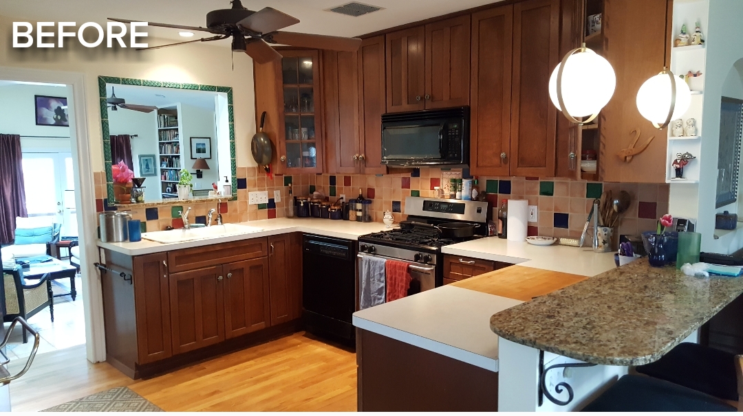
A couple of you have told me you have the same configuration of a microwave and upper cabinet over your range, as we had below. Some even said theirs was taped together like ours, which I think is a hoot…lol! If there’s one thing you want to change in your kitchen besides painting the cabinets, I would highly recommend getting rid of that upper cabinet/microwave and install a beautiful new hood.
The Ombra stainless steel hood below (also available in black stainless steel) was sponsored by partner Zephyr, a leading manufacture of range hoods in all different styles, finishes, and sizes. I can’t begin to tell you how this one single decision, and selecting a high-quality Zephyr hood, made all the difference in transforming our kitchen to a more contemporary feel. The Ombra hood also gives us excellent ventilation and wonderful lighting while cooking. See for yourself the difference this one decision made in a side by side image below. (Details about Zephyr hoods in ORC Week 7).
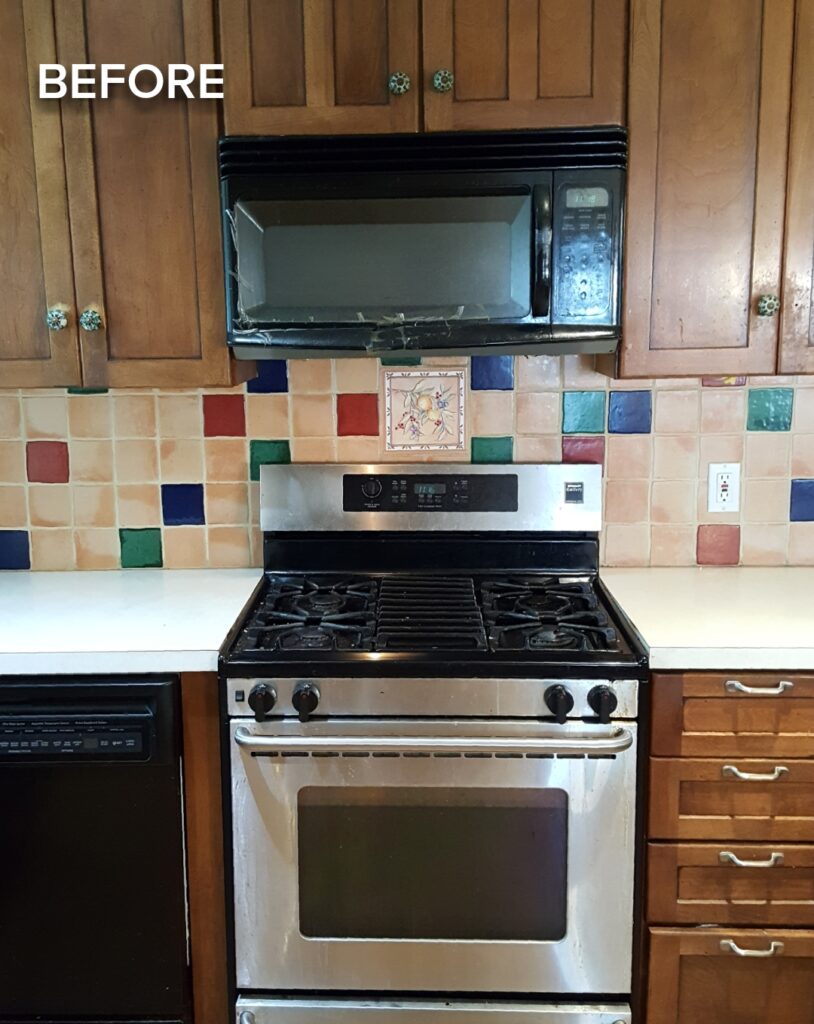
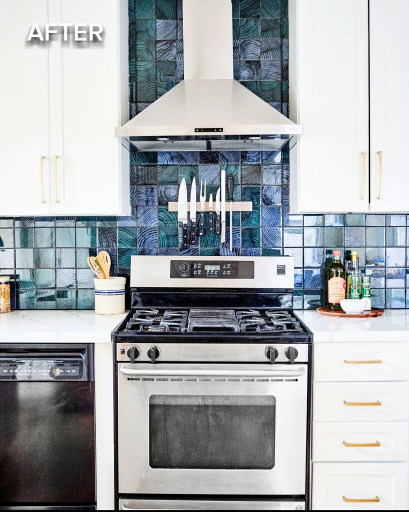
Photography by Cody Kinsfather.
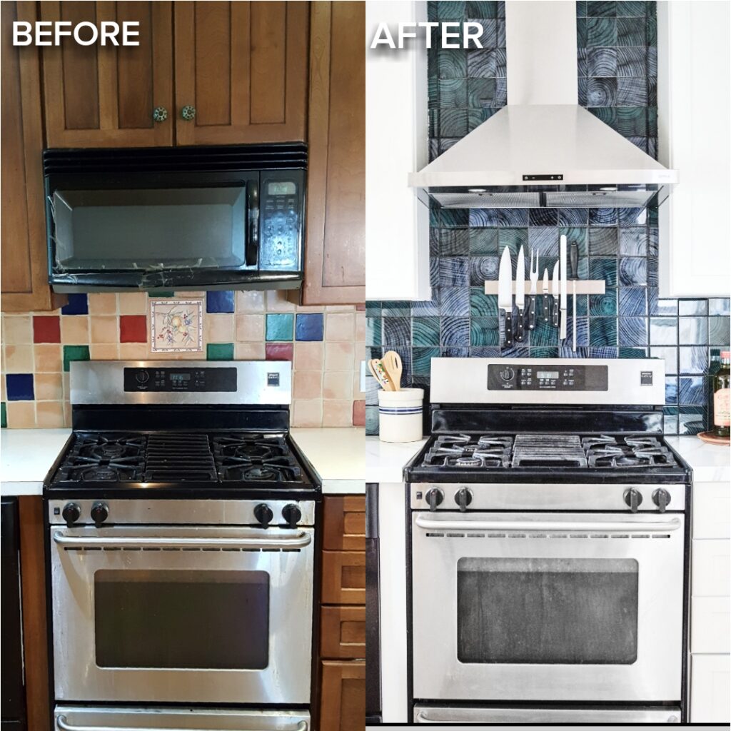
Countertop Heaven
I already wrote a blog post on “5 Reasons Porcelain is a Great Choice for Kitchen Countertops.” Now, I can speak from personal experience – porcelain is like WOW!!! Porcelain is not only gorgeous (I love the veining in our selection) but it is super easy to clean. One wipe with a damp dishcloth and voila, you’ve got a clean countertop. It is amazing how quickly it is cleaning up the kitchen now at night. I actually look forward to it. Read more about porcelain as the perfect kitchen countertop solution in ORC Week 3.
The old Formica countertop just never seemed to come clean and it had years of stains. The selection of porcelain was the perfect material for an easy to clean kitchen countertop. Thank you so much to our local partner, Empire Countertops, for sponsoring our amazing new countertop and bar. We love it!
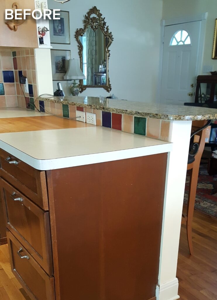
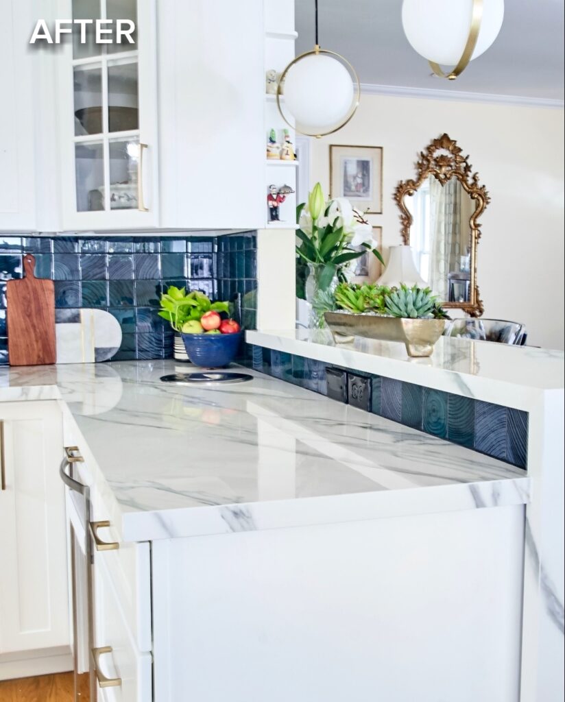
Photography by Deborah Main, The Pillow Goddess.
Please PIN for easy reference
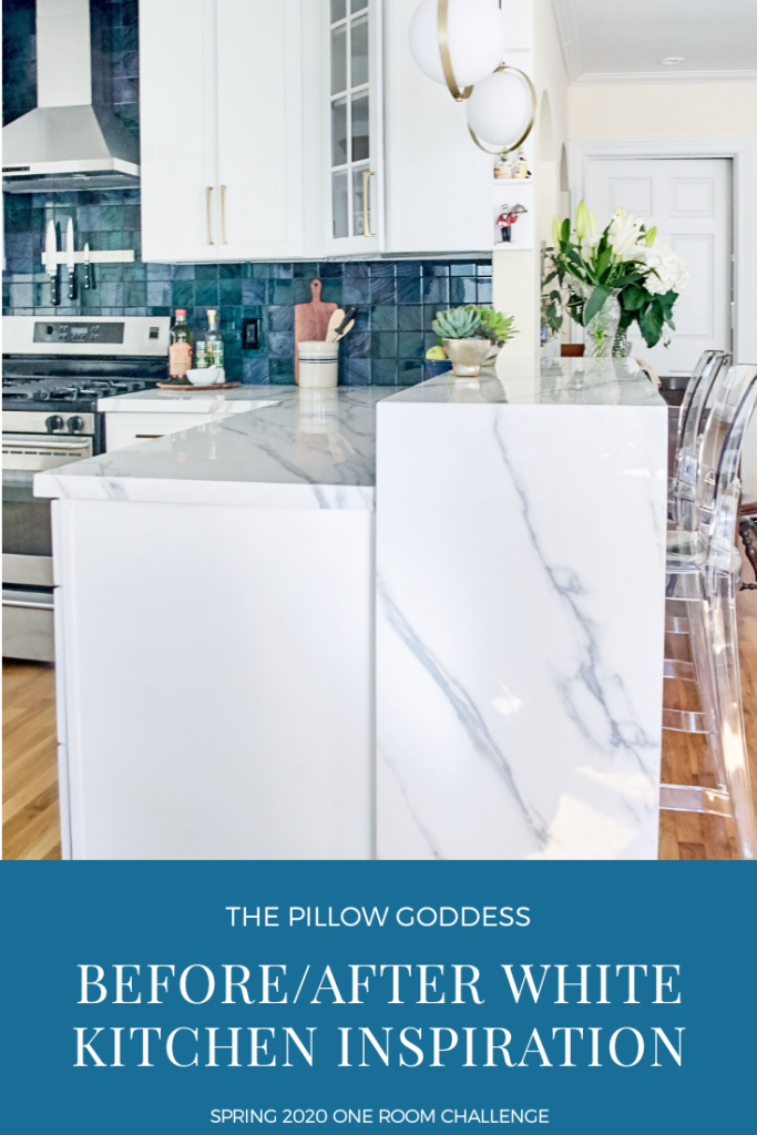
Adding a Modern Touch
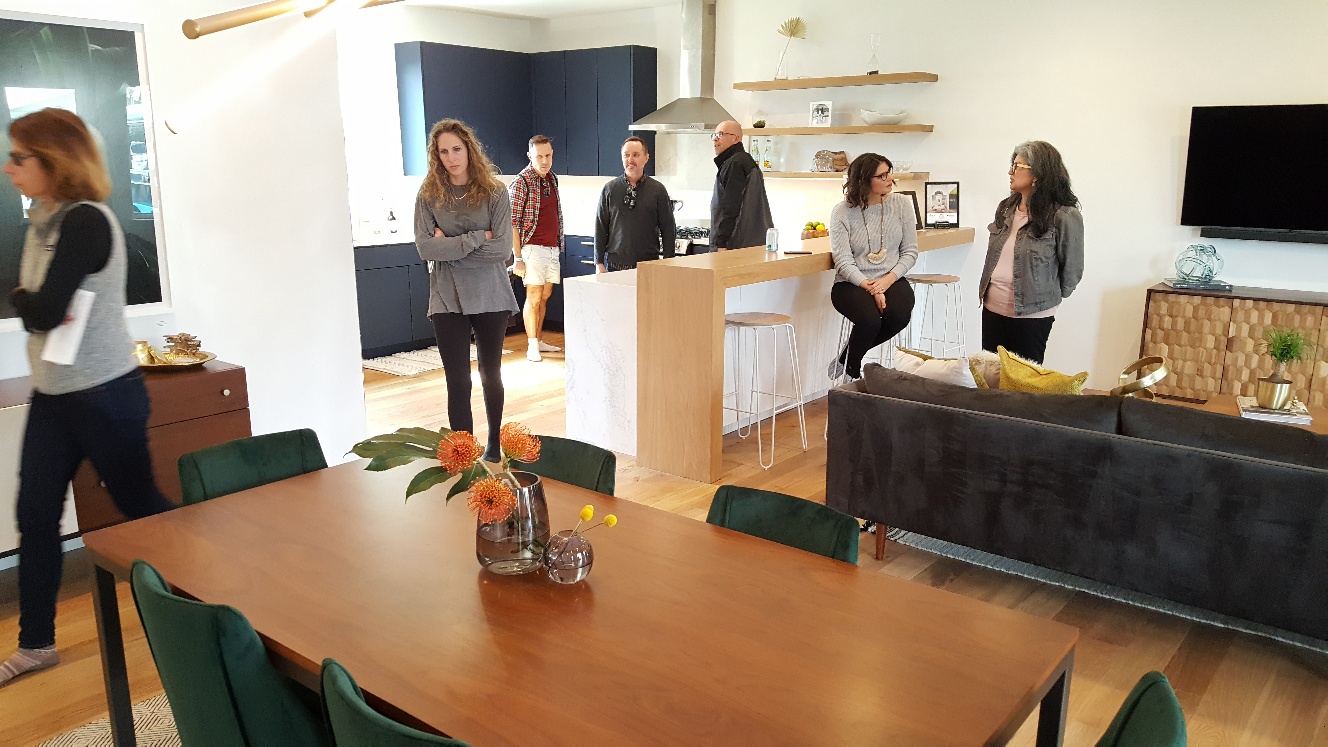
You may remember that right in the middle of our Kitchen Makeover I decided that I couldn’t simply put up another bar the way our old bar was. Inspiration struck and I remembered a more modern bar, in a vintage home similar to ours, on the Austin Modern Home Tour.
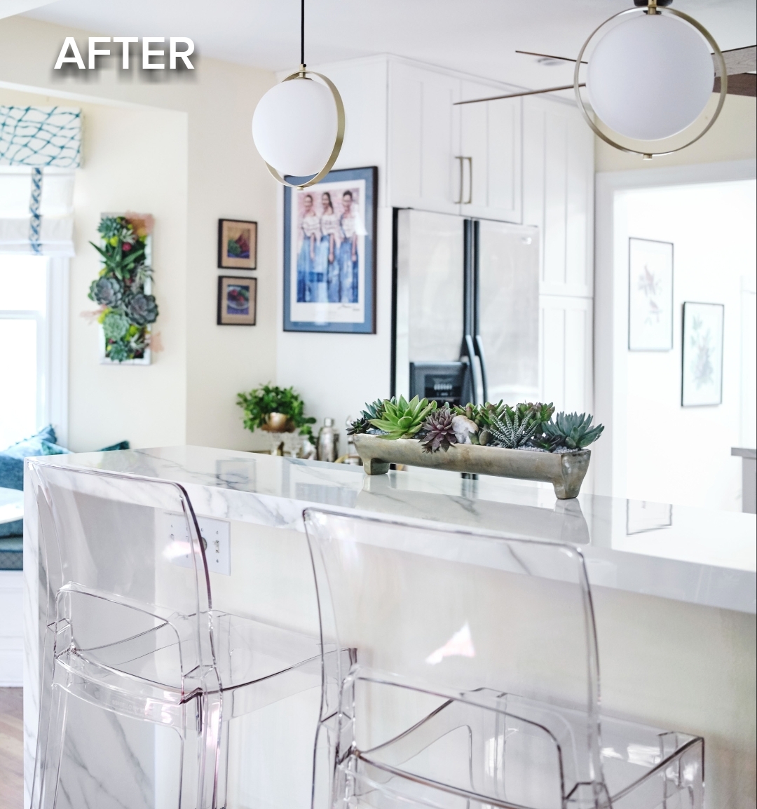
ESS Design Build took a bungalow like ours in our neighborhood and modernized it. I could not be happier with this decision because it allowed us to do a waterfall. I was determined to have a waterfall in our new kitchen and thanks to partner, Empire Countertops, who sponsored the gorgeous porcelain countertop and bar we have a beautiful waterfall.
Below is the bar that gave me the idea. I was so happy I had a photo of it in my Top 10 Design Trends post! Paired with Eurway’s modern acrylic chairs from partner Collectic Home, we love having meals at the new bar.
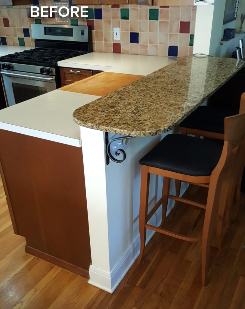
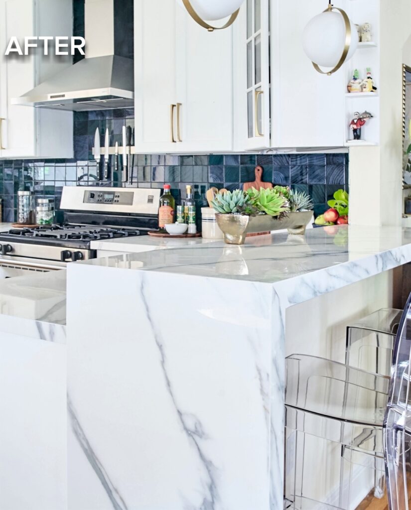
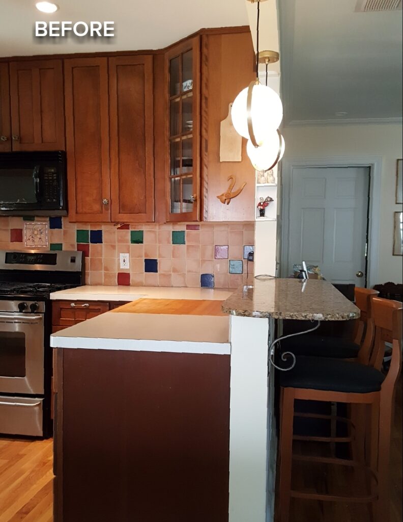
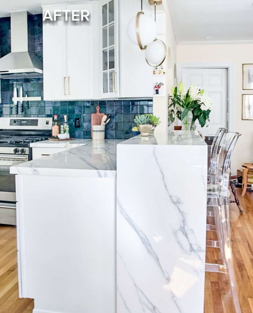
Photography by Deborah Main, The Pillow Goddess.
Get That Sink Outta Here!
I have to tell you, the impetus to remodel our kitchen and the number one reason my husband David made no objections on my 3rd ORC, was our old sink had to go! It was awful We loved the white cast iron, but that caulk….ick. No matter how often we cleaned it, it was time for a new one. Not to mention that the faucet and garbage disposal leaked. Our Kitchen Makeover couldn’t have come at a more needed time.
BLANCO to the Rescue
Our wonderful partner BLANCO came to the rescue with their beautiful low-divide PERFORMA SILGRANIT® sink and the ARTONA SILGRANIT® faucet. I know there’s a huge debate between the single and double sink contingents (which I will get into another time), but we’d always had a double and are so pleased with the 1 3/4, which features a small section on the right with the garbage disposal and a larger section on the left. The functionality of a sink is so important to make life easier and more enjoyable in the kitchen.
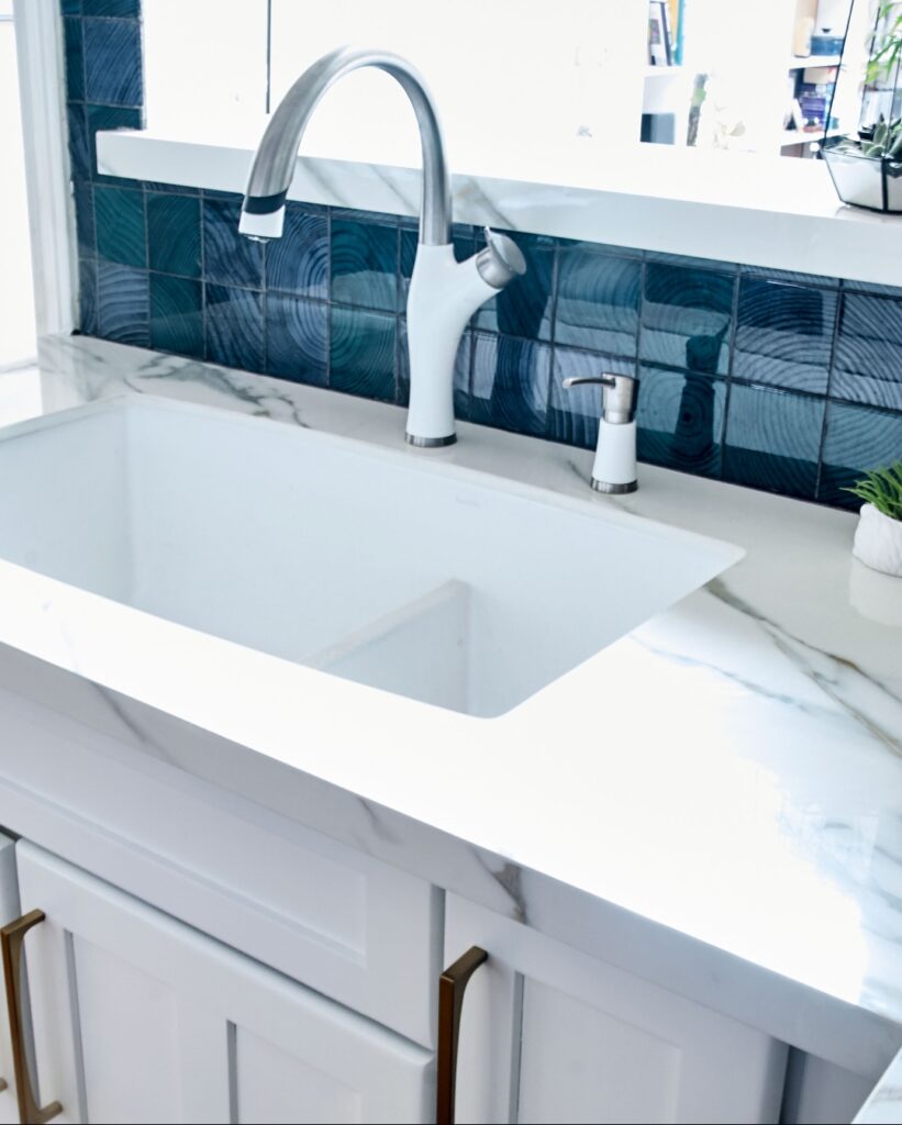
Photography by Deborah Main, The Pillow Goddess.
We couldn’t be happier with this amazing BLANCO sink! It’s easy to keep clean and forced us to establish a new sink routine and rhythm in dishwashing, which makes life so much easier. In addition, the grids in the bottom and the nozzle spray hose help tremendously.
Hands down, BLANCO makes THE best, most beautiful and easy to cleanSILGRANIT® sinks! So if you’re shopping for kitchen sinks, be sure to check out their new website as they have tons of fantastic options and a handy Buying Guide. I wrote about my BLANCO selections in Week 2 of the ORC.
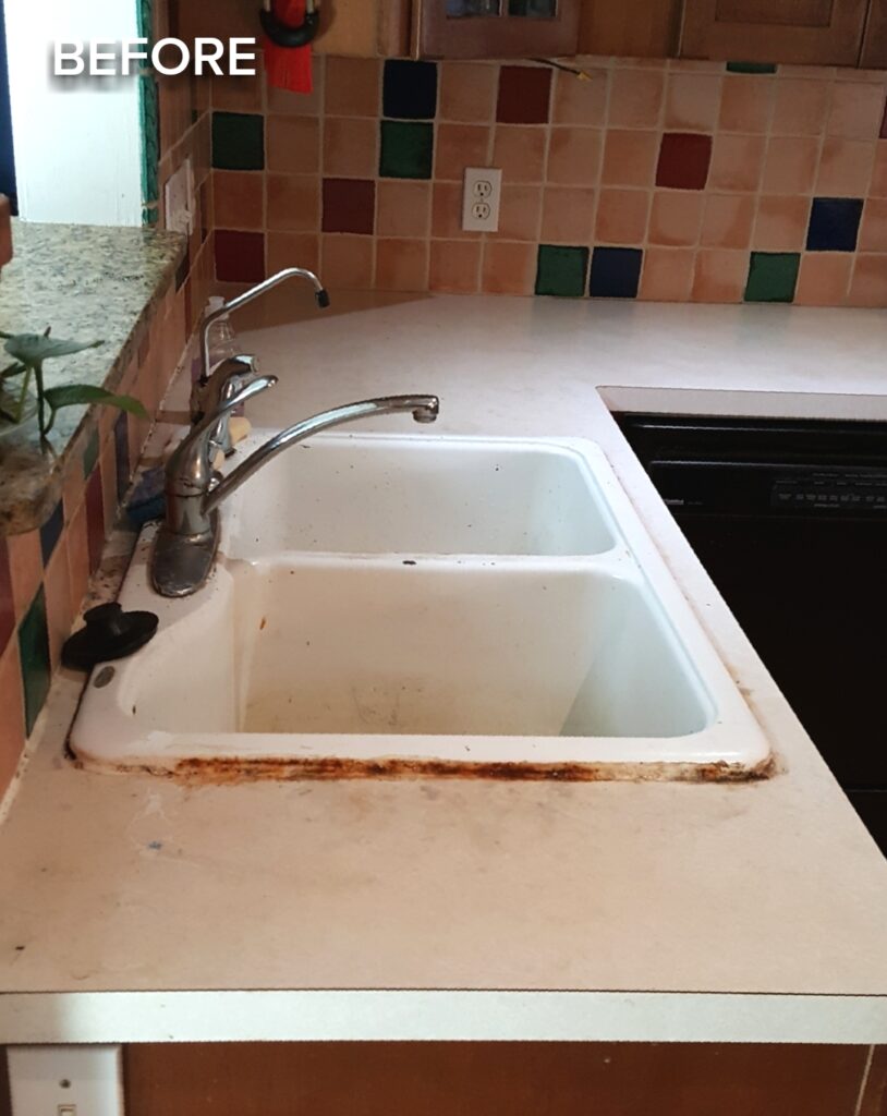
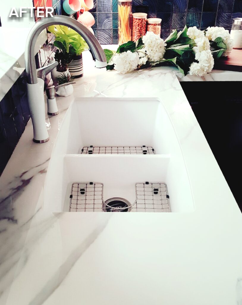
Phone photography by Deborah Main, The Pillow Goddess.
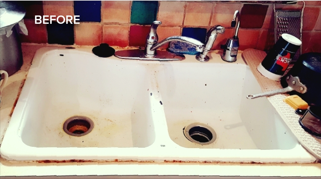
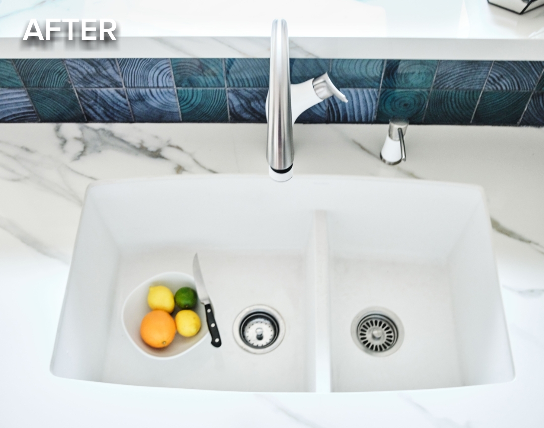
Photography by Cody Kinsfather.
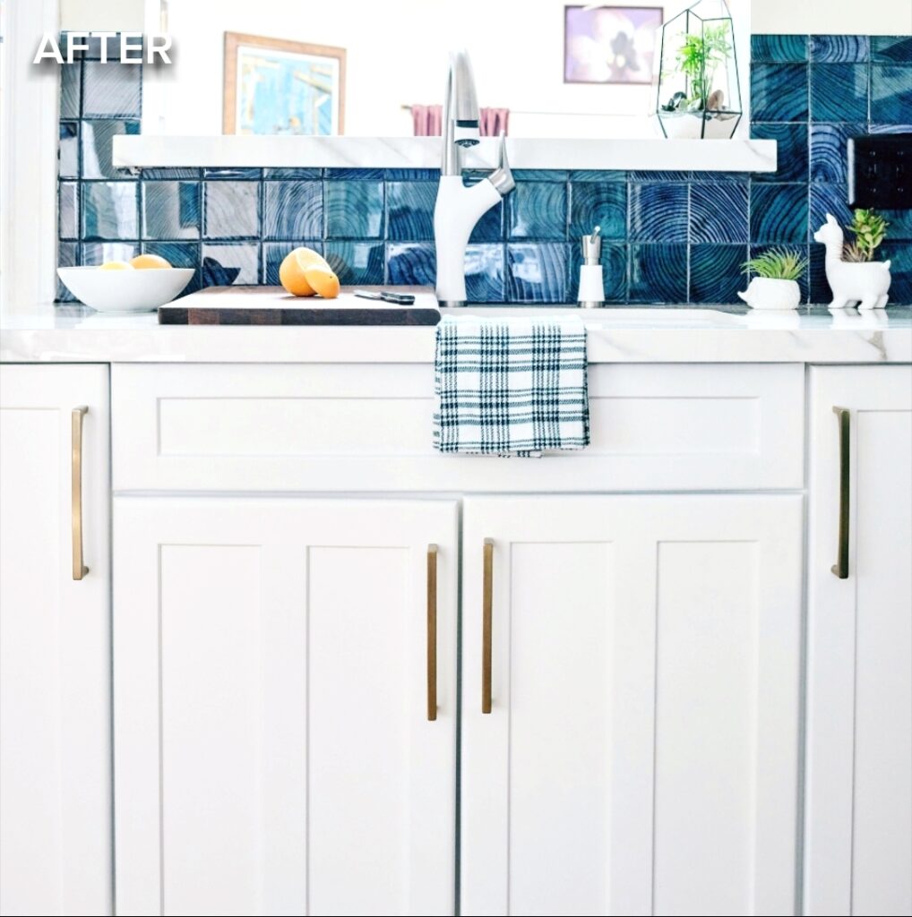
Our kitchen sink has a passthrough window leading into the light-filled, high-ceiling family/dining room with skylights. That’s where the light comes from on the sink side of the kitchen. We took out the window frame, extended the depth of the passthrough a tad, and that too improved how the sink area looked.
In addition, as you’ll see below, we stacked all our bottles and cans to be recycled on the passthrough. Was not pretty at all. Rev-A-Shelf came to our rescue on cabinet organization. Phew!
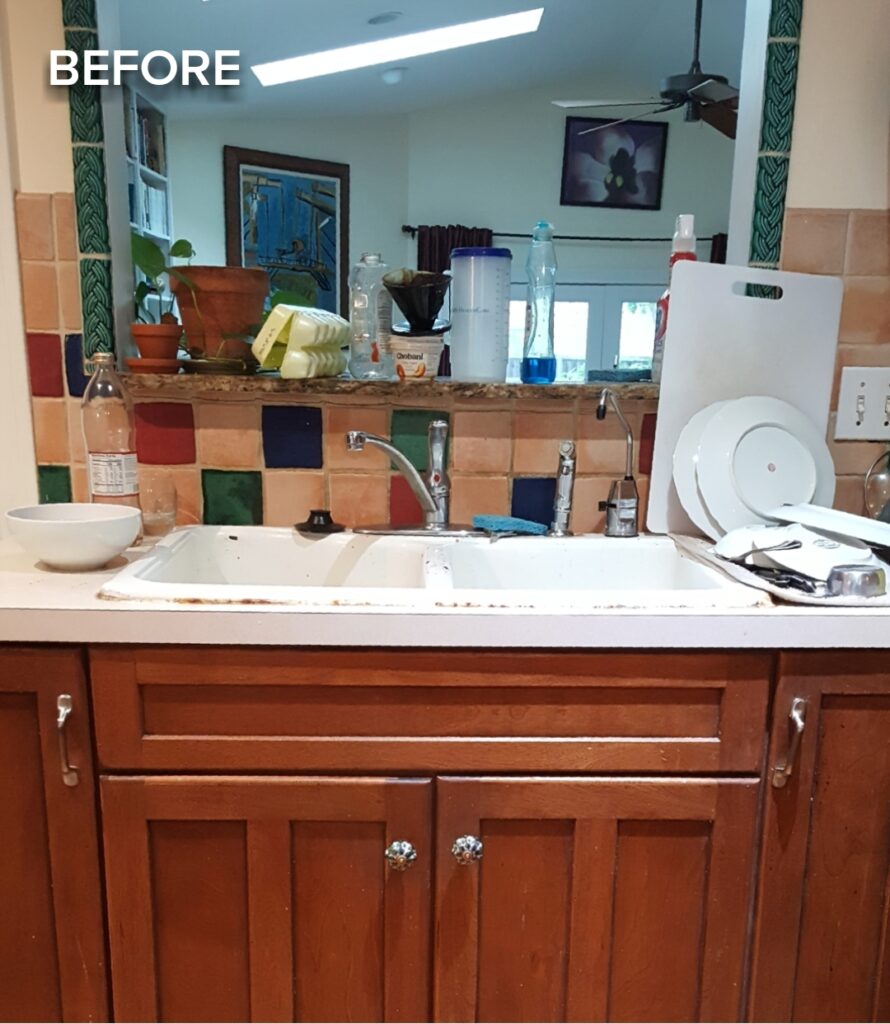
Photography by Cody Kinsfather.
The Inside of Kitchen Cabinets Matter Too
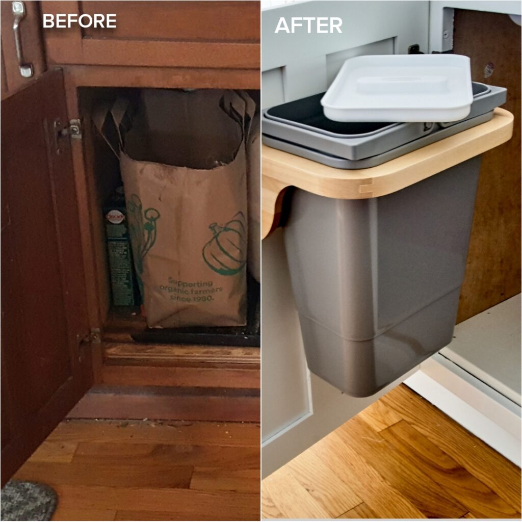
Our kitchen cabinets have not only been a mess on the outside but inside as well. We partnered up with Rev-A-Shelf to re-organize as many of our kitchen cabinets as possible. First up, we installed a recycling bin on the inside of the sink cabinet. Bye Bye junkyard on the passthrough!
We still don’t have everything put back in the kitchen cabinets because we have more fantastic Rev-A-Shelf products to install and decisions to make about what goes where. Also, I’m rebuilding the inside of our small pantry.
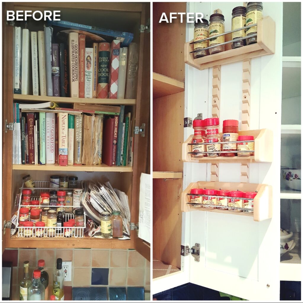
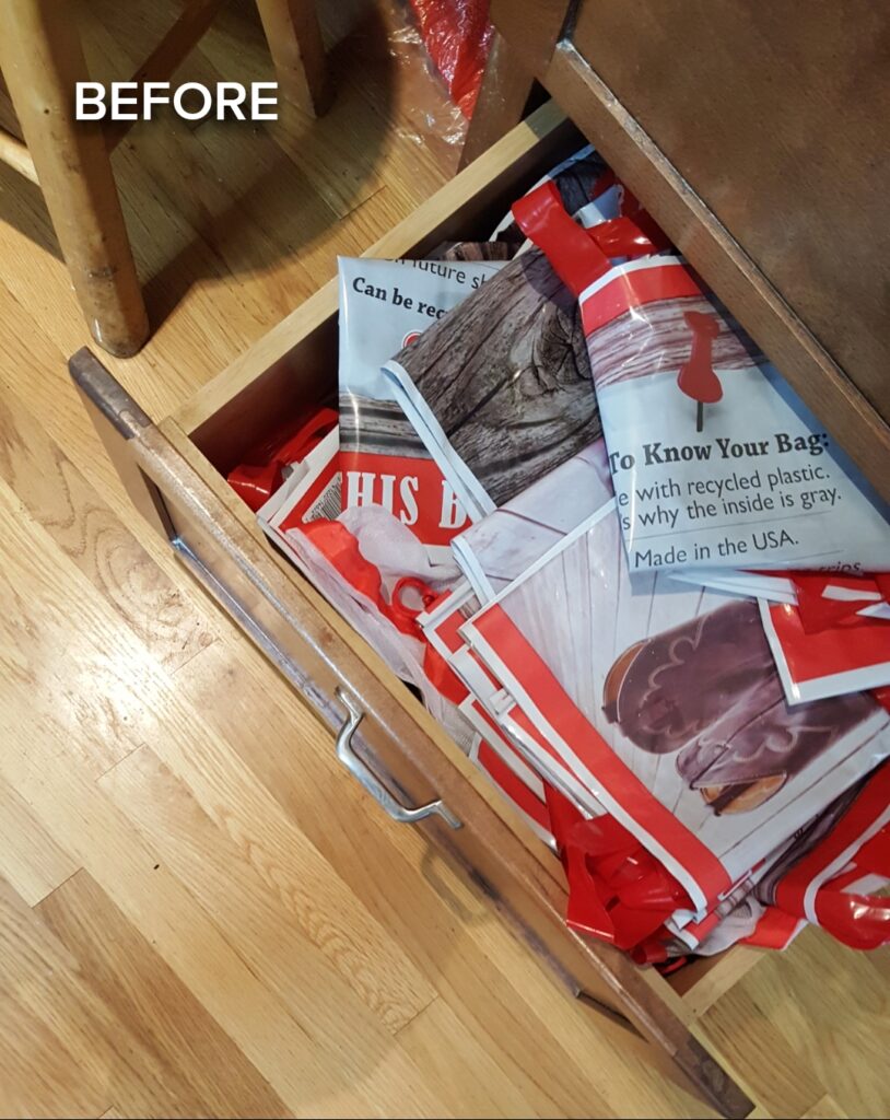
For now, thanks to Rev-A-Shelf, these are a few of the wonderful products below that helped us get our kitchen organized. We’re still working on the Adjustable Door Mount Spice Rack, but boy is it better than our old system. I think I mentioned it before, but their brilliant Drawer Peg System for the drawers is a miracle, as well as the Chrome Tray Divider.
Read how essential cabinet organization is to a kitchen and how our partner Rev-A-Shelf sponsored wonderful products to help us succeed in ORC Week 6.
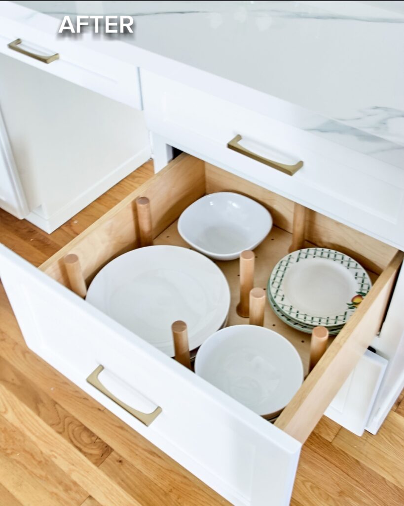
Photography by Deborah Main, The Pillow Goddess.
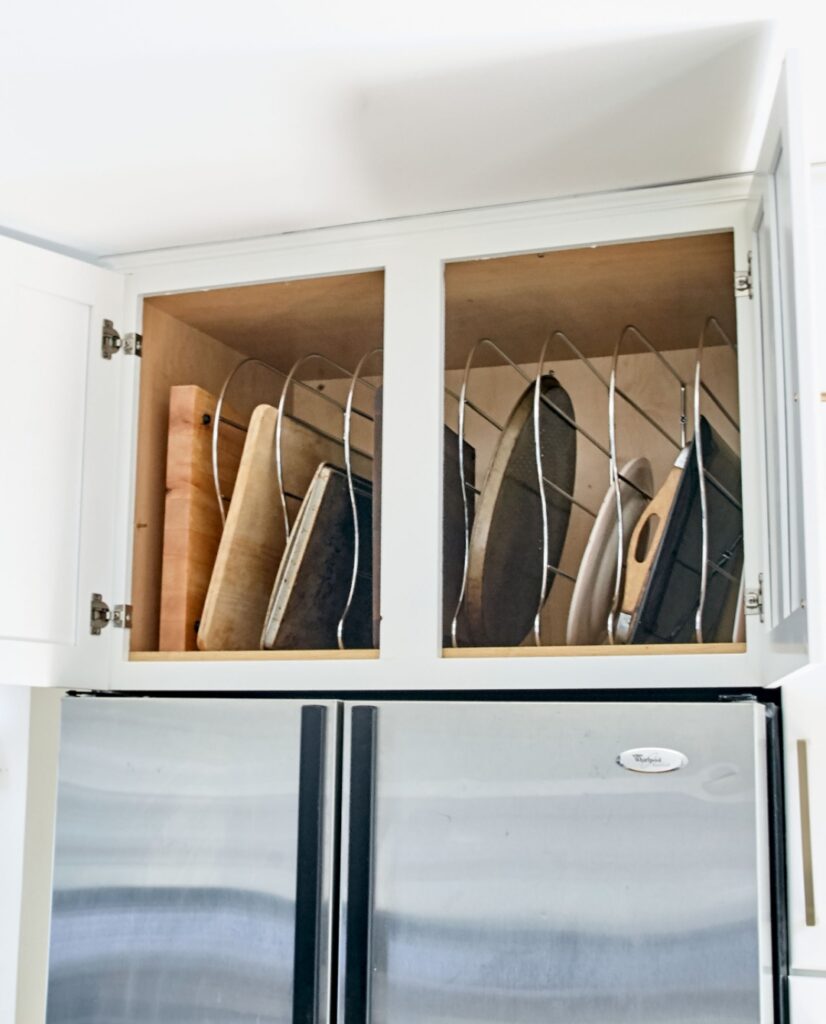
Photography by Deborah Main, The Pillow Goddess.
Bringing Color Into Your White Kitchen
You know, I really wasn’t totally sure I was going to love a white kitchen. But it feels so fresh, crisp, and alive that we couldn’t be happier. What I did know, was that I could not live without color tile. If you’re wondering why I chose a dark blue/green tile, it’s because of the breakfast nook and the dark blue velvet sofa in our living room (which hopefully you’ll see in the fall 2020 One Room Challenge).
Crossville Studios was our amazing partner for the Convergence glass tile by Crossville, Inc. we selected for our kitchen backsplash. If you go to this link HERE, you can see all the wonderful color options. How lucky I was they had a blue and teal green?
Real Question: Can We Keep the Old Tile with the New Kitchen?
Yes, this is a legitimate question my husband, David, asked me. There was no real way to explain it to him, because he could not visualize the Kitchen Makeover. I kept telling him no and finally said, “you’ll see why when we have our new kitchen”. And of course, he did (Thank God!)
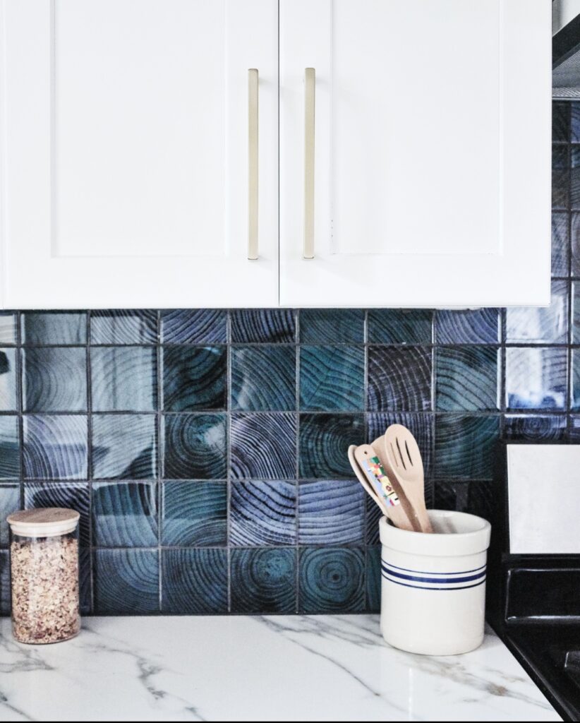
The photo below shows the inspiration behind randomly mixing the Convergence Peacock and Indigo tiles together for our kitchen. Because it’s a glass tile, the beautiful green and blue color changes throughout the day. Also below are the tiles on top of the circular pattern of the Kravet fabric for our breakfast nook cushion. The wood pattern in the tile mimics that beautifully. All in all, with Crossville Studios and Patrick Landrum’s help in visiting their showroom, I don’t think I could have selected a more perfect Crossville, Inc. tile! Learn more about selecting the right tile in ORC Week 6.
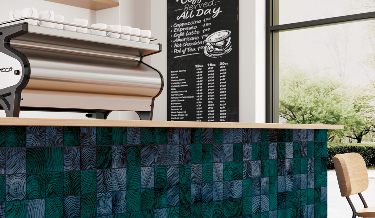
Photography by Crossville, Inc.
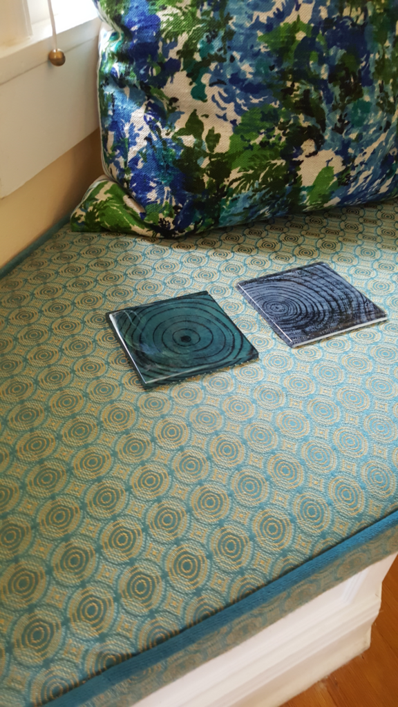
Photography by Cody Kinsfather.
Photography by Cody Kinsfather.
The Problem Child – Botanical Solutions
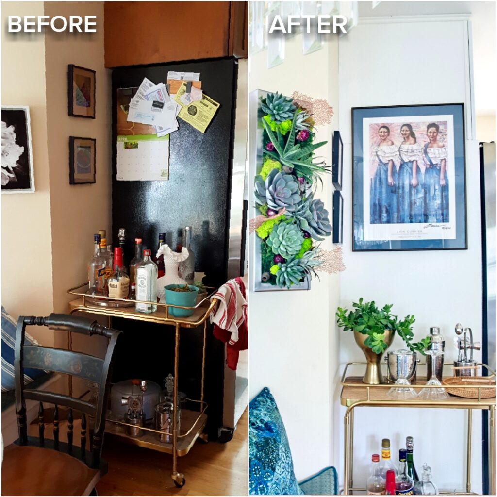
There has always been one area of our kitchen/breakfast nook that was an eyesore. And guess what? It was the first thing your eyes went to when you entered our front door. We never finished the cabinets by the refrigerator in 1999, so during the Breakfast Nook Transformation, I put a fun bar cart there. Why not? We serve all our cocktails in our kitchen and that’s where all our guests congregate when we entertain.
Then, during the Kitchen Makeover I decided we had to somehow finish the left side of the refrigerator. We added a thin white wall there and some indoor green plants to liven up the corner with color and texture.
Our botanical partner was a fantastic local small business, Articulture, who created an incredible living wall installation for our kitchen and all the other beautiful greenery. We wanted to incorporate a biophilic element to our new kitchen and I am so grateful to Articulture who did an outstanding job in helping us do that.
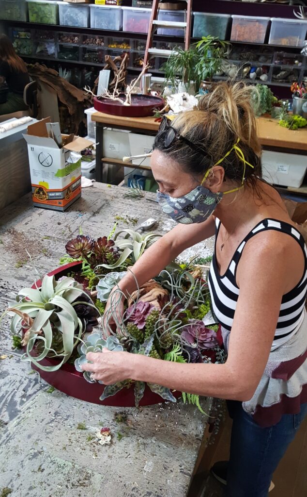
Here’s a “Behind-the-scenes” photo of owner Monique Capanelli designing a Living Wall in Articulture’s studio and boutique. Be sure to check out Articulture website and boutique.
In addition, installing a wall enabled us to also hang one of our favorite pieces of art, a print of “Bandits and Beauty Queens” signed by the artist Erin Currier whose work is made from recycled materials from across the world.
What consistently compels my artistic practice is the deep desire and sense of obligation to convey that which I have found to be true in all of the countries I have traveled to: that our commonalities as human beings far outweigh our differences. – Erin Currier
The Jewelry of the Kitchen
I’ll wrap up this post with two brand partners that helped me find the perfect gold jewelry for our kitchen – Top Knobs and CWI Lighting.
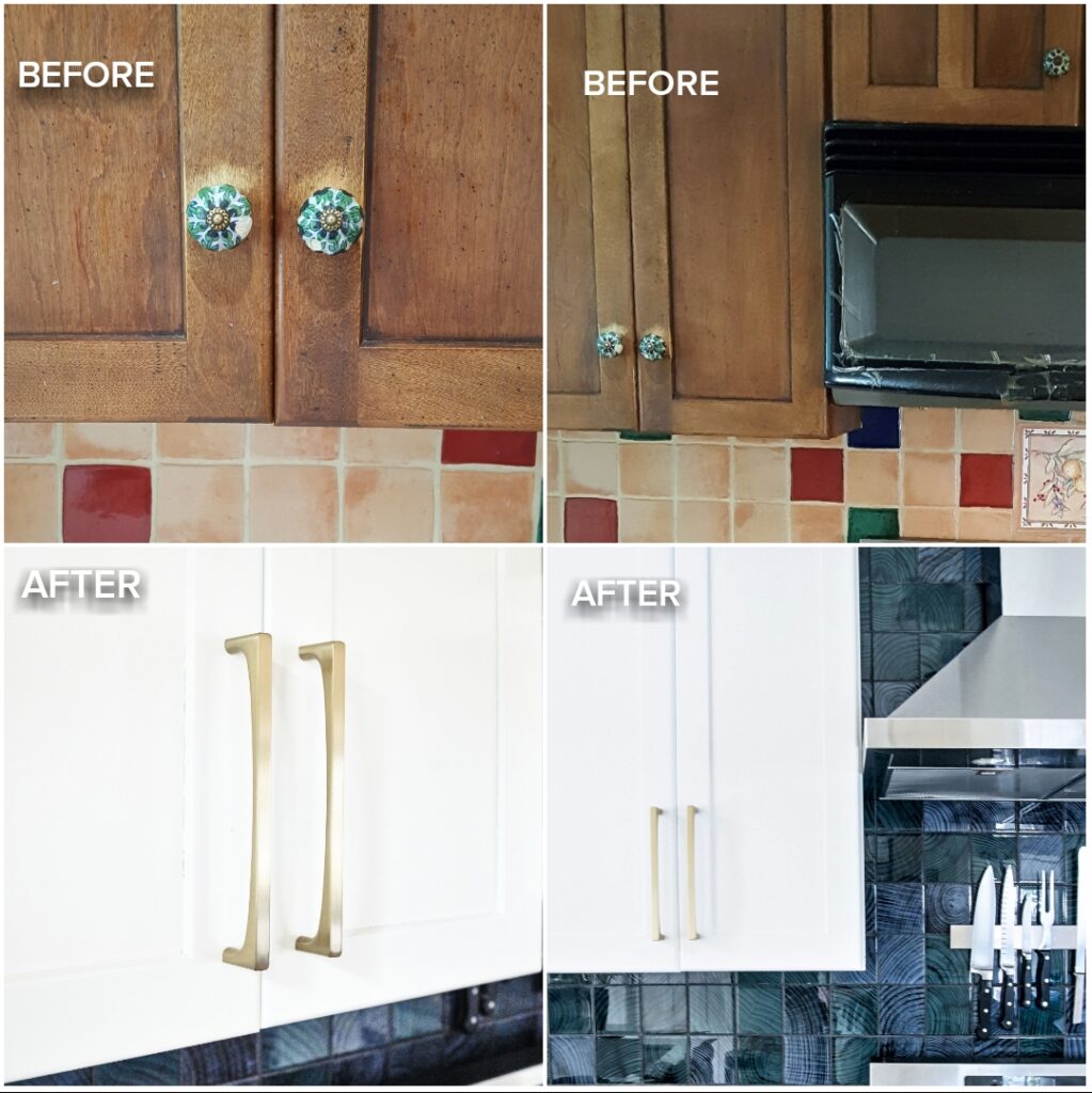
Since we have a fantastic Deco Crystal Chandelier in our breakfast nook by CWI Lighting, it was important to me to not only have gold pendants, but also gold-toned kitchen hardware. I wrote about the decision-making process and your vote helped me make the final selection of the Riverside Pulls in Honey Bronze finish in Week 4 ORC.
Above in the detail image of the tile, you also see the wonderful flat modern front of the Top Knobs Riverside pulls I fell in love with. The below image shows the two different sizes I selected, larger for the upper cabinets, smaller for the drawers, and you can see a little bit of the curved inside. I absolutely love how these Top Knobs look and feel and the Honey Bronze finish works beautifully with our lighting.
You already know that we installed the wonderful modern Da Vincie Pendants by sponsor CWI Lighting when we did the breakfast nook. But here’s a great Before/After of those and how perfect they are for over the bar. By the way, we decided to keep our bar and not cut it down to counter height. We’re very happy with that decision.
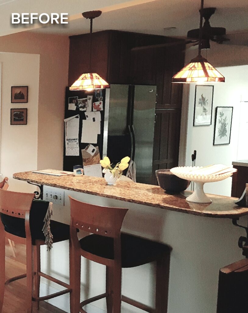
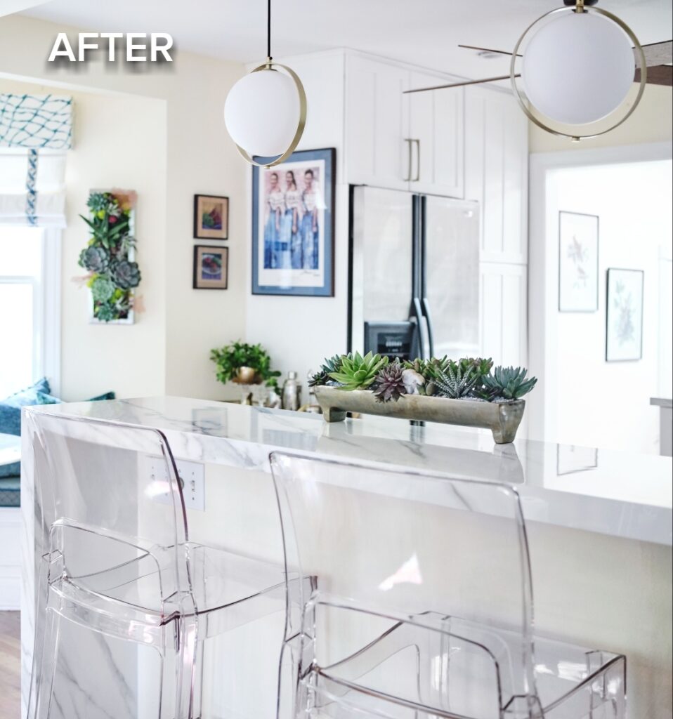
Photography by Cody Kinsfather.
I love all the colors captured in this photo below and especially the living art on the wall. Learn more about the incredible biophilic living art by Articulture Designs in Week 7.
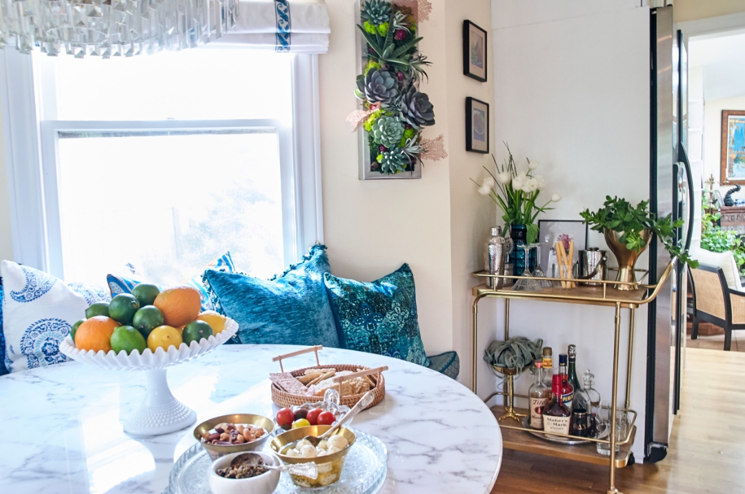
Photography by Deborah Main, The Pillow Goddess.
Please PIN me for easy reference
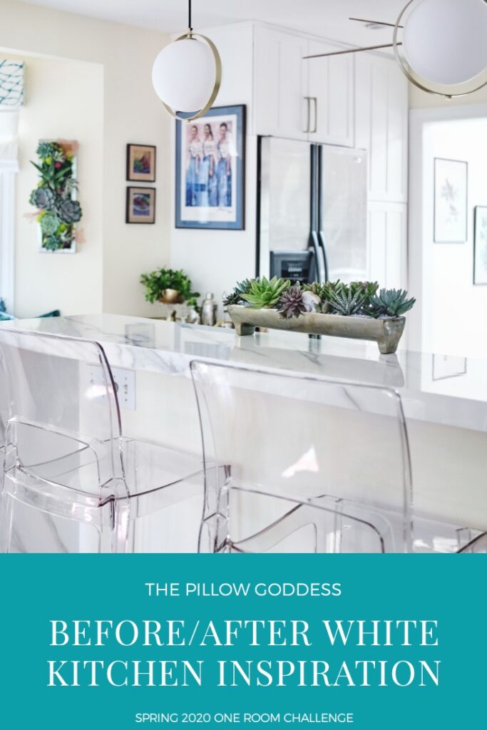
I’d like to end this Before/After post with the wonderful view of the kitchen that the talented photographer Cody Kinsfather took. He’s standing in the small, front living room that adjoins the breakfast nook and kitchen to capture this view. You can also see how our kitchen (which is the original part of our 1957 home) opens up into our addition with high ceilings and three skylights for a lot of natural light. And that the veining in our new porcelain countertop coordinates with our faux marble gold pedestal table.
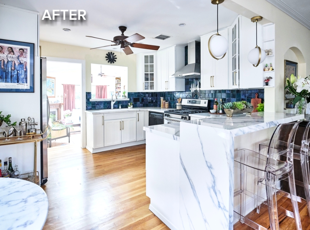
Photography by Cody Kinsfather.
I hope all of you are doing well despite the Pandemic and social unrest. If any of you are sick or have loved ones sick, or are unemployed, please know that my heart goes out to you. If there’s anything I can do to help, I hope you will not hesitate to reach out. These are very difficult times, with so much uncertainty, and we are all in this together.
Let color, joy, love, hope and kindness be your new compass. Making our homes beautiful, anyway that we can, whether it’s a full remodel, re-organizing a closet, changing out your decorative pillows, or a coat of fresh paint, will make you feel better. Trust me. I know this from personal experience. Every time I walk into our new kitchen I have two thoughts and immense gratitude:
- I can’t believe we really did it, right in the middle of a Global Pandemic, and
- I’m so lucky and happy to be in this light, bright and cheerful new kitchen.
I’m incredibly grateful to all our partners who sponsored the amazing products for The Collier St. Kitchen Makeover. I hope this post inspired you to think about your own kitchen.
BLANCO described our new kitchen as a “Beachy” theme, and the funny thing is I never looked at the tile and thought of waves or sand until today. Now, I’ll pretend I live in a cottage on Cape Cod and am on vacation at the beach in my kitchen. How fun is that thought? Because that’s where we spend most of our time. I sit at the bar, while David cooks us a fantastic meal. That is until we can entertain again. I really miss you, our friends and family, and can’t wait till we can see you again.
For more inspiration please see the many wonderful rooms and kitchens created by some of my One Room Challenge friends – Guest Participants and Featured Designers.
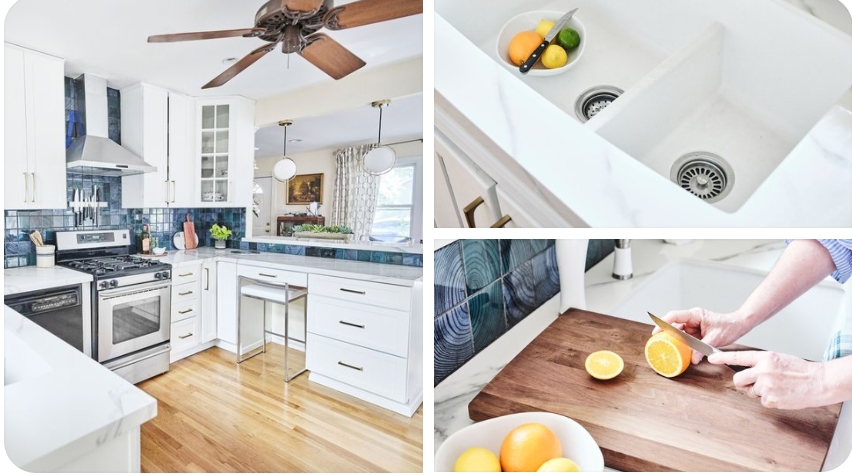
Photography by Cody Kinsfather.
I’ll be taking most of the month of August off to recharge. Normally this summer we would have been in Italy and then Maine for a family wedding. Instead, while I’m taking a break, I may re-share some of my Italy and Maine vacation photos. I need to take some time to really unplug and regroup before the fall. I think it’s called a “vacation”, but since we can’t really travel, we’ll hang out in our new kitchen and stay in our Airbnb, The Collier St. Guest Room, and have a “Staycation.” I can’t wait! I hope you too find a little time for yourself this summer and wish you and your family a fun one. Thanks so much for your support. Till next time, stay safe and well my friends. XO PG
P.S. Oh, I almost forgot! I’ll finally be sending out our summer quarterly newsletter “Pillow Talk” this week. Please subscribe HERE to keep up with our design studio and projects like the One Room Challenge. New pillows are also up on our website, and as you know our studio is always open for custom orders. It will feel good to get back in the studio and play with fabrics and trims, my first love!
Note: The One Room Challenge ended on July 5th. However, I wanted to share more about how the brands made our Kitchen Makeover possible. Please follow them, look at their websites, and feel free to ask me any questions about the products they sponsored for our kitchen. All Before photography is by myself. After photography is by myself and Cody Kinsfather. Opinions are my own.
THANK YOU TO ALL PARTNERS SPONSORING THE COLLIER ST. KITCHEN MAKEOVER:


doreen amico-sorell
Posted at 20:46h, 25 JulyLove this transformation. So dramatic and well done.
Deborah Main
Posted at 12:07h, 27 JulyThank you Doreen!! Appreciate you stopping by the blog. 🙂
Mary Ann Benoit
Posted at 21:06h, 25 JulySuch a beautiful transformation! Love all the colors and elements you selected.
Deborah Main
Posted at 12:08h, 27 JulyThank you Mary Ann. Really appreciate your feedback. We’re enjoying it for sure!
Leslie Carothers
Posted at 07:25h, 26 JulyDeb: This is the most complete ORC post I’ve ever read or seen. What a great job you did on this. I can only imagine how much of a difference it must be making in your lives to be able to cook in an organized, clean, brand new kitchen, especially now when it’s not easy to get out.
You did such a great job, with the help of your interior designer and great friend, Patrick Landrum. Every element is just lovely! And kudos to all the brands that helped you make your dream come true.
Deborah Main
Posted at 12:17h, 27 JulyHi Leslie. Thank you, that’s very sweet of you to say. Yes, it’s made a big difference in our daily lives preparing meals in a sparkling new kitchen, especially in an older home and since we can’t go out.
My dream came true definitely because of the relationship I have with so many fantastic brands. And Patrick is always a big help cause he’s SO good!
I am forever grateful for the brands’ generosity and opportunity to write about their high-quality products.
It was a lot of work, but so worth it. As always, thanks so much for your support! 💛
Ann Porter
Posted at 12:11h, 26 JulyWhat a great reveal! I love the tile mix – when I redo my own I want something in the blue family.
Deborah Main
Posted at 12:20h, 27 JulyThank you Ann! Glad you like the tile. Crossville, Inc tiles is an excellent brand to look at. I saw many other gorgeous blue tiles. Good luck on your own kitchen.
Thanks for stopping by the blog! 🙂
Janet R Lorusso
Posted at 12:19h, 28 JulyYou know I ADORE this makeover, Deb, every choice was just perfect! What a fun post to see the side by side before and after pictures and what a dramatic difference your selections made! I am so inspired to do MY kitchen for an ORC sometime in the future!
Deborah Main
Posted at 23:40h, 28 JulyThank you so much Janet!! I really appreciate your feedback on my design selections and blog posts.
It makes me really happy to know that my Kitchen Makeover has inspired you to do yours someday. I cant wait as I know you’ll do a phenomenal job!
I’m so glad you participated in ORC this spring. Can’t wait to see what you do in the fall. ❤
Christie
Posted at 07:52h, 30 JulyThis is beautiful! I love the color palette especially the backsplash tile! Where did you get the clear stools?
Deborah Main
Posted at 01:28h, 31 JulyThank you Christie! So glad you like the colors. You can order the acrylic bar stools at Eurway. Here’s the link: https://www.eurway.com/squire-bar-height-stool.html
Thanks for stopping by the blog!
Joanne Simmons
Posted at 15:05h, 04 OctoberSooooo–you no longer have a microwave? Or, where is it hidden? We couldn’t live without ours, but if it’s not above the stove, where would it be? I certainly don’t have counterspace for it to roost on a counter.
Deborah Main
Posted at 16:42h, 05 OctoberHi Joanne. Right, we no longer have a microwave. We never cooked in it; only heated up coffee and leftovers. My husband misses it more than I do.
But, if I were to put a microwave back in our kitchen, I’d try one of the new microwave drawers. Ive heard excellent reviews of them. Also you can create a shelf out of a lower cabinet space for a microwave. Last resort would be a smaller one in deep corner of counter.
Look at some kitchen designs on Insta or Pinterest and you’ll see plenty of other spots for microwaves. Hope this helps!
Thank you for stopping by the blog! 🙂