

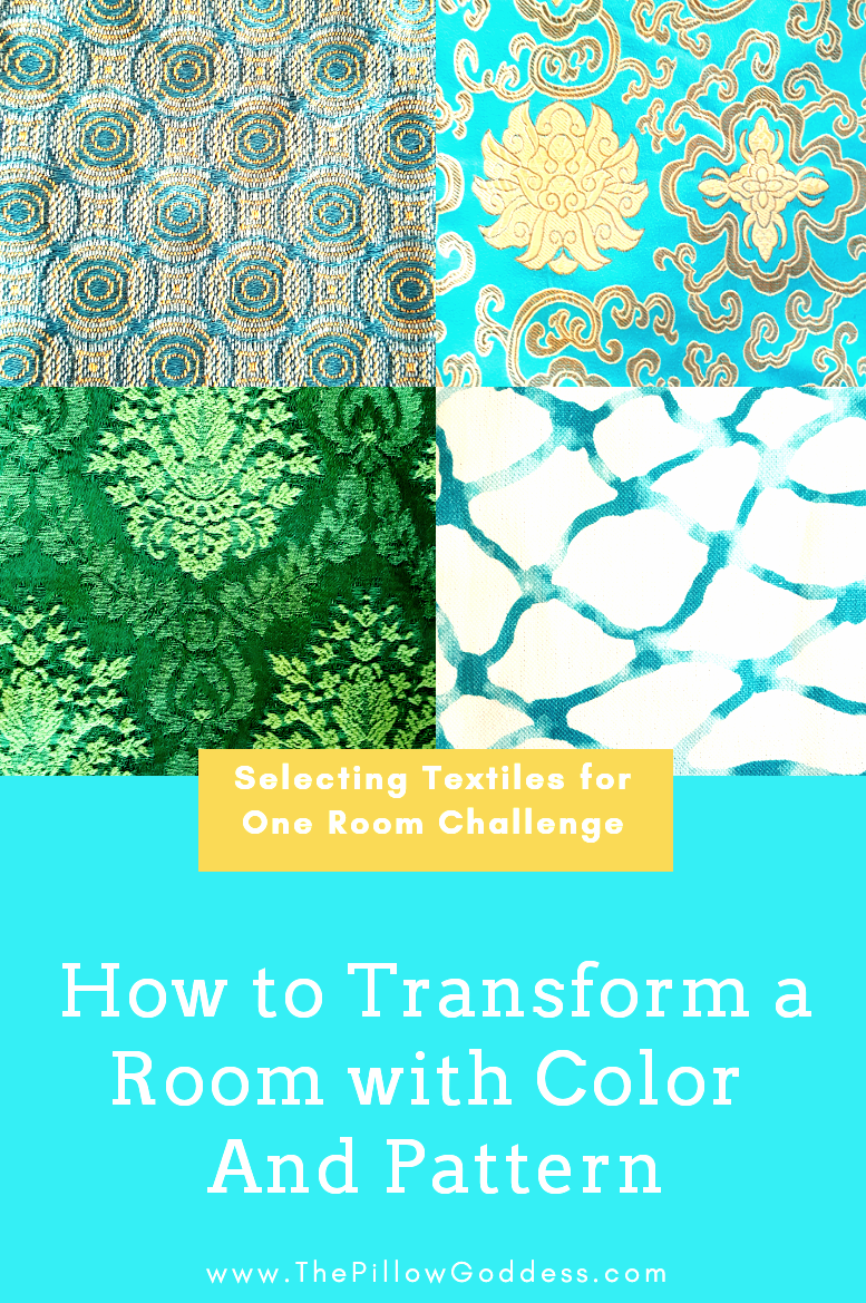
10 Oct How to Select Textiles-One Room Challenge | Fall 2019 | Week 2
Before we get down to the details of how to select textiles, I can’t believe it’s already Week 2 of the One Room Challenge (ORC)! If you’re on the blog for the very first time, let me catch you up.
Why is the One Room Challenge so popular?
The ORC, sponsored by Better Homes & Gardens is a hugely popular biannual design challenge that happens every fall and spring since founded in 2011.
Well, who doesn’t want to finish designing and decorating a room? Perhaps, it’s your dream office or guest bedroom. You know, like one of those spare bedrooms we all stack with stuff and plan to get to…someday, right?
I took care of that in last spring’s One Room Challenge when I transformed our girls’ old bedroom into my husband’s and my new Bold Blue + White Bedroom. See how that challenge went with some great Before & After HERE.

Now you’re almost caught up and can perhaps understand why I jumped on board again this fall. It is a crazy ride for 6 short weeks, but very exciting. My room this time is the Breakfast Nook. Read why in Week 1 HERE.
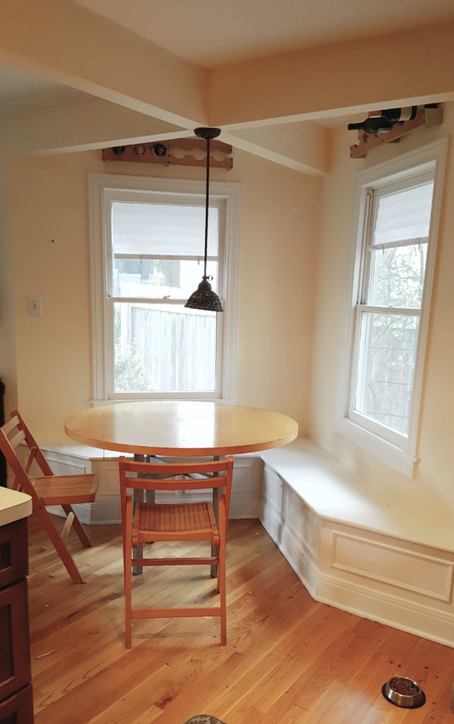
The Breakfast Nook is proving to be more of a challenge than I first thought.
For starters, I’ve waffled back and forth on what to call it because we eat breakfast, lunch, and dinner here and it’s really going to look completely different after the challenge. I’m actually a tad nervous about all this…..but I also can’t wait for you to see the complete room makeover!
NOW LET’S GET DOWN TO BUSINESS
Here’s what I’ve accomplished, and agonized over, in the first 2 weeks:
- Plan, plan, and plan more – Thought through all aspects of Breakfast Nook and checked list twice. In reality, I’ve done this every day since the challenge started on Oct 3rd.
- Secured sponsors for room – Kravet is our wonderful fabric sponsor. If you’re not sure what a sponsor is, it’s a home brand that sponsors part, or all, of your room with their product(s) and in turn, they receive exposure through your blog and social media.
- Struggled over colorway – Oh boy, did I go crazy over this one. Not an easy decision for me, but thankfully y’all helped narrow it down on Instagram.
- Selected in-house studio fabric and trim – This is the fun part for my decorative pillows, and actually where I started the color process to help guide my final textile selections.
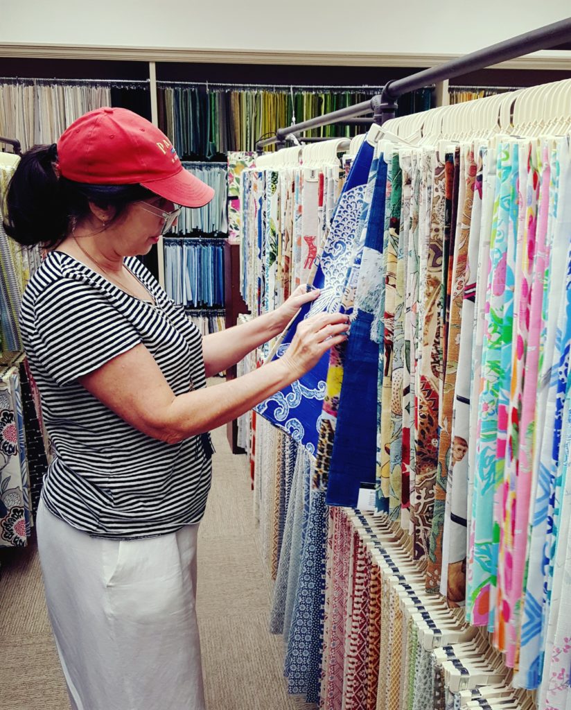
- Shopped for Kravet fabric – Grabbed my interior designer Patrick Landrum (yes, a pillow designer needs an interior designer!) and looked at fabric options at Stockton Hicks Laffey Trade showroom.
- Ordered cushion and shade fabric – Once decisions were made (went back to the showroom with my seamstress to switch out a textile), I ordered the fabric through my Kravet rep, Oscar Lupibo.
- Scheduled time-frame to make shades and valances – Our studio has a highly skilled seamstress on our team, so we discussed the project at length and put it on the schedule.
- Tackled studio mess – Started cleaning out studio so I can work in it. A novel idea I know! See Insta story ORC Highlights for some fun action photos.
- Scheduled upholsterer – Upholstery shops are extremely busy during the holiday season so I wanted to be sure Accent Upholstery workroom could do my cushion makeover in time.
- Contacted photographer – Yay, he’s available! Photoshoot date on the calendar.
- Created a back-up plan – Always have a back-up plan for every aspect of your room in case something falls through. I have a plan in place should I not be able to find the table I want.
- Decided a name for the room – Okay, this seems simple, right? Well, it is a breakfast nook, but it’s going to look so different I stressed over whether I should call it a small dining room. Crazy, I know….but even the littlest things can wreak havoc. Done! It’s still the Breakfast Nook!

IMPORTANCE OF COLOR, PATTERN, AND TEXTURE
Selecting fabric for any project can be easy for some and daunting for others. For pillows, my specialty, it’s a breeze. I’m very decisive. For a complete design project, I usually need the guidance of my interior designer, Patrick Landrum of PL&D Patrick Landrum Design.
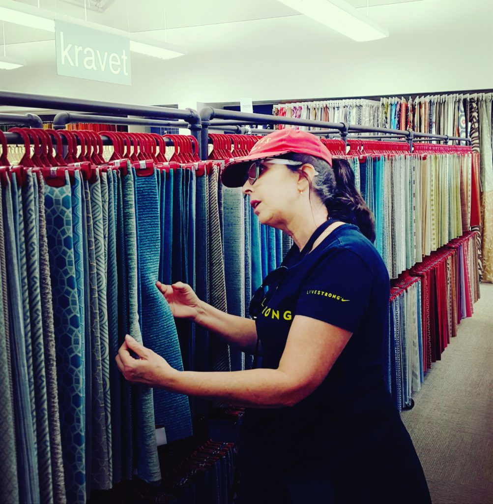
Here we are below at the Stockton Hicks & Laffey showroom looking through all the incredible Kravet fabrics.

Color and texture are my two guiding principles when selecting the perfect fabric for a project. Textiles speak an entire language all their own when designing a room. I may be biased because I’m a pillow designer, but to me, your choice of fabrics can make or break a room. They are important choices because textiles are the foundation of the furnishings and home accessories in any room makeover.
THE PILLOW GODDESS 8 TIPS FOR SELECTING FABRIC
- Assess the function of the fabric. How will the textiles be used in your room? Do you need high-performance fabric for an eating area? Or, if you’re transforming a bedroom, perhaps silk or cotton is best. That’s a decision you need to make upfront.
- Determine the mood you want to set. What feelings do you want to have in the room? This will help you decide the base colors and patterns of your fabrics and if you want to go neutral with light colors or more saturated tones with colorful fabrics. Also, simple or complex patterns; large or small scale. All of these are factors to consider the mood for your room.
- Select your colors. As I mentioned above, some people are very decisive on this while others have a hard time. In design lingo it’s called “colorway” and it’s like telling a story with the colors you choose. For me, they come together once I have the inspiration. But sometimes, when you love color as much as I do, it can be hard to make up my mind. So often I wait for inspiration to strike. Use a color wheel if you have to determine which colors work best together. What helped me most was getting out of my pillow fabrics and playing with those late one evening to help me select color options.
- Take into account the surrounding areas. Since this dining nook is in the middle of the living room and kitchen I had to consider, both physically and visually, the future design of both of these rooms. If you’re a designer who loves neutral this should be easy. But if you’re a designer like me who loves all color combos, this can be a tough choice. Thankfully y’all helped me.
- Mix it up. No matter what colors you choose, mix up the patterns and textures of the fabrics as this will add more visual interest. Creating a mood board helps see visually how all the fabrics work together.
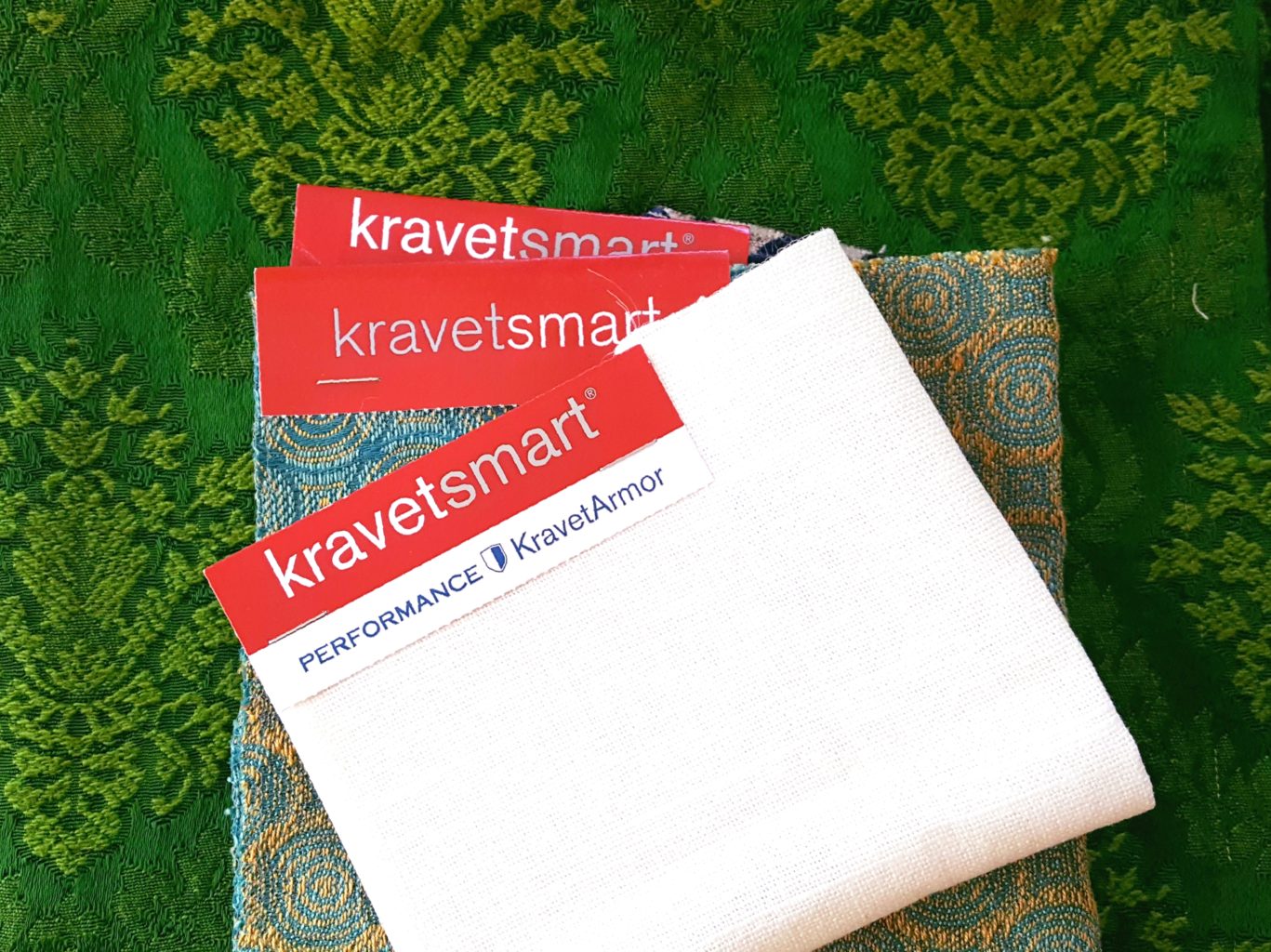
- Be sure fabric is in stock. This is something you want to double-check, especially if you’re ordering from a showroom.
- Measure the quantity of fabric needed. This is important to measure precisely how much fabric you’ll need for your project. Often, availability can determine which fabrics you select. Be sure to triple check your measurements with your seamstress and/or workroom.
- Do a mock-up. Layout all your fabrics to see how the colors and textures work together. You can always change up pillow fabric at the last minute – especially if you have a lot in your home studio or sewing room – but ordered fabric must be correct from the get-go.
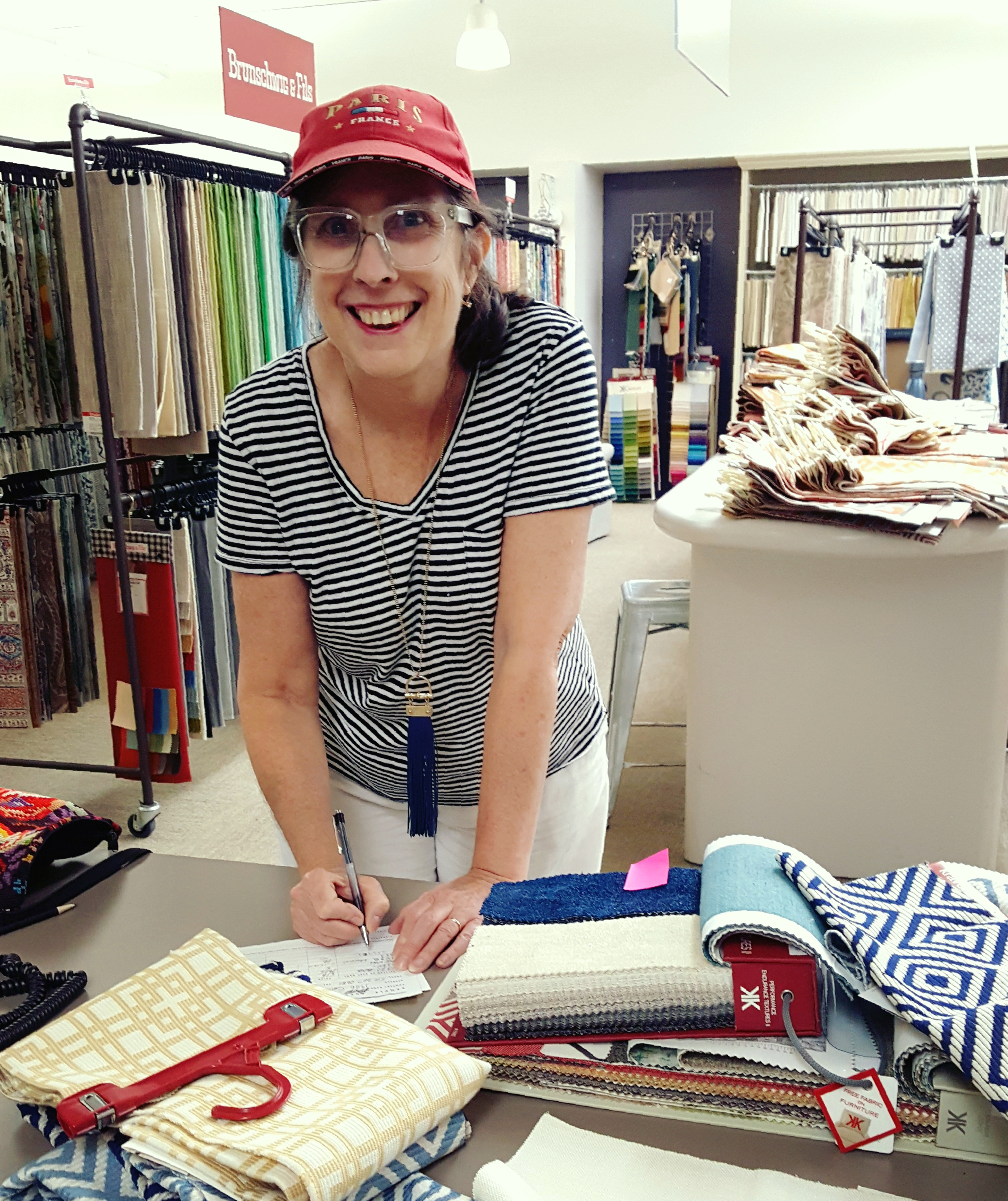
Now you should be ready with your fabric. Below I’m checking out Kravet fabric samples from Stockton Hicks & Laffey showroom.
BREAKFAST NOOK INSPIRATION
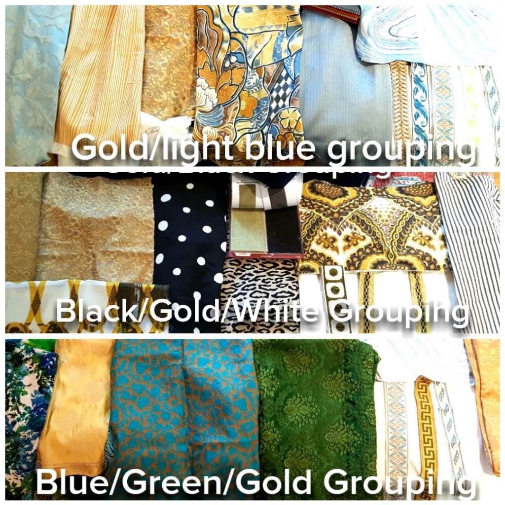
For me, the best way to decide which colors to go with was to first get inspired by my studio fabrics. I’m a luxury pillow designer, so those fabric choices come easily for me.
What helped me most in the decision process, was getting out a few pillow fabrics and playing with them late one evening. I did this before I even thought about the cushion or shades. I needed to get inspired. By pulling out some of my favorite fabrics and putting them together in color groupings really helped jump-start this important textile decision.
I had put 4 color groupings together and they each set a different mood. Thankfully, on Instagram, you helped narrow it down to these three:
DISCOVERING THE SECRET SAUCE
There were still challenges I faced in making a final selection of the colorway for the Breakfast Nook.
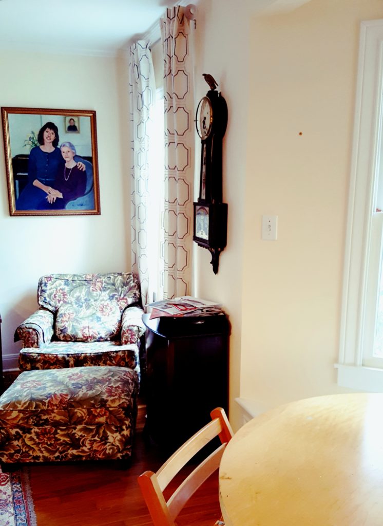
- How will the colors look in the middle of the two rooms – living and kitchen – that I had not yet designed? I have a vintage, blue velvet sofa in the living room, so maybe that was a place to start.
- I was definitely gravitating toward blues, but I knew I couldn’t do blue and white like my bedroom. That would be horrible….then my entire home would look blue and white!!
- The freshly painted walls were a strong cream with a hint of yellow. So selecting yellow fabric just might make them even more yellow.
- I casually asked my husband which color grouping he liked. Well, of course, he said he had no opinion, which was not true. In the end, he preferred a darker cushion and reminded me to factor in the red sauce from his great Italian cooking. (We’re kind of messy eaters.)

Now I was really in a pickle!
A dark cushion? Believe me when I say that I longed for a beautiful soft light blue and white color scheme. A prior sponsor had offered a pair of gorgeous light blue chairs that would be perfect. The above fabric was the first blue and white (but slightly gray) valance we selected for a light blue color scheme. It was all coming together so well.
But now, based on my husband’s input and the fact that he was right (oh, I hate that when it happens!), as much as I wanted that beautiful light blue colorway, it was not who we are. It looks beautiful on Pinterest in all the white kitchens, but it wasn’t practical and functional for our family. I couldn’t do it.
OFF AND RUNNING
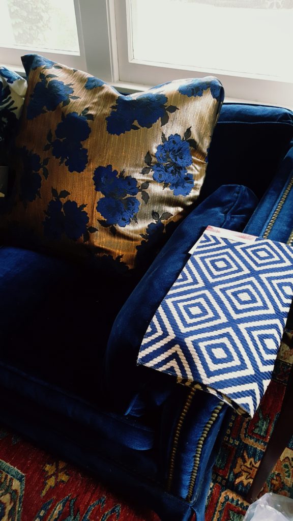
The first important decision I had to make (which you will not get to see until the 2020 spring One Room Challenge) is what fabric to put on the chair and ottoman in the living room. Very important in directing which way to go for the Breakfast Nook because the chair is to the immediate left of the nook. I had a light blue geometric I was considering for the breakfast nook cushion (with the light blue colorway I mention above.)
But, soon realized the blue and off-white geometric fabric (below swatch), by sponsor Kravet, would be perfect for the chair and ottoman. And the pillow fabric is Valentino that I purchased in Florence, Italy. So these two at least guided the living room and I knew eventually we’d be painting the kitchen white. I think.
Be sure to subscribe to The Pillow Goddess blog HERE so you can follow in 2020 too.
GO WITH YOUR GUT
As you can see from everything I mention above, how the colors flow from room to room and the function of the rooms are extremely important. It is paramount to success in the Breakfast Nook. But I must admit, I was stuck. I could not decide which direction to go in.
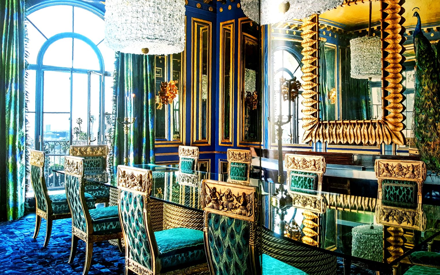
I recently had purchased a copy of acclaimed international interior designer, Timothy Corrigan’s book, The New Elegance. Late one night, frustrated with not knowing which color grouping to select, I sat down and studied it hoping to learn something (Timothy has excellent design tips in the book) and boom!
The inspiration I was looking for all along.
I was transfixed by his blue-green dining room with gold accents. (Note: this is a photo I took of the pages in the book. Design by Timothy Corrigan. Want a chance to win a signed copy of his inspiring book? Please follow me on Instagram and watch this fall for the #bookgiveaway contest.)
ANOTHER LIGHT BULB MOMENT
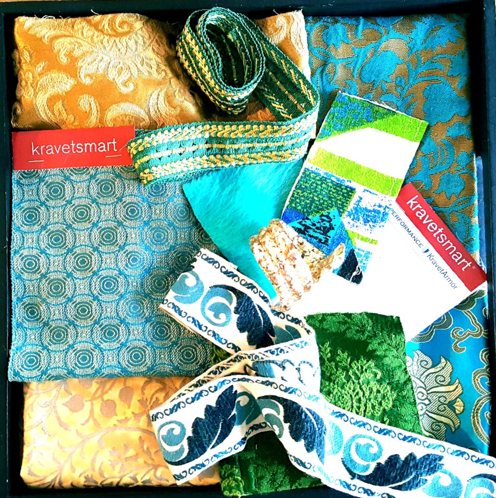
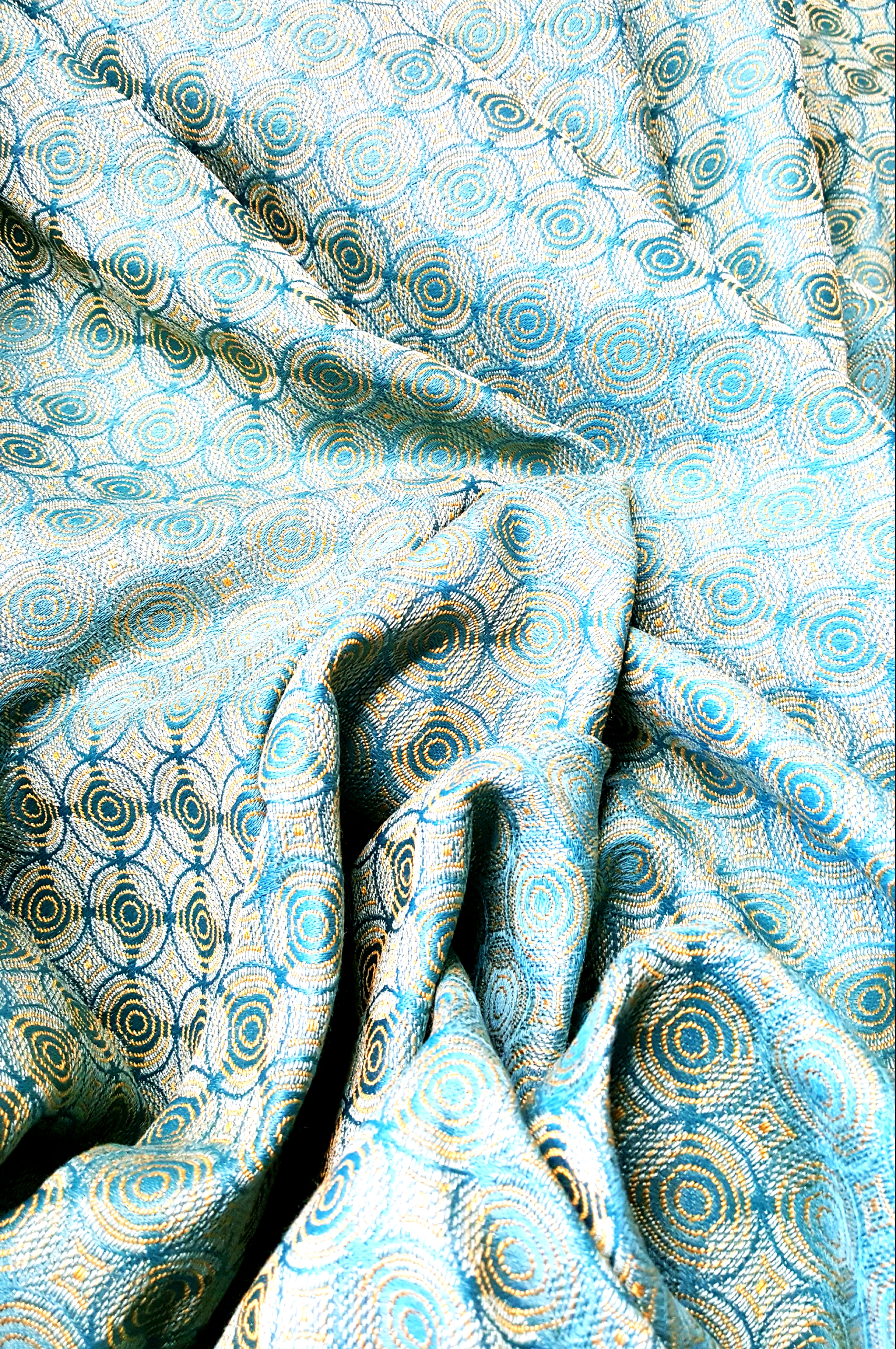
Brilliant! I was so excited because I already had the blue-green/gold color grouping as one of my fabric options. Thankfully, I also remembered a beautiful blue-green fabric back at the Stockton Hicks Laffey showroom that I absolutely loved. So I took the light blue geometric back and completely switched colorways. I knew at this point I could confidently go with the 3rd color grouping, the blue/green/gold color grouping. YAY!!
Below is the wonderful Kravet fabric that I was happy and greatly relieved to find that my memory served me right and it was at the showroom. I went with my friend and studio seamstress, Kim Schlinke. Kim, like Patrick, is very decisive and she helped me select the final valance for the nook.
This beautiful high-performance fabric lays the perfect foundation for my Breakfast Nook design. I love it! The blue-green and gold circles change color in a different light.
LESSONS LEARNED SO FAR
First, is that what I thought the nook was going to be a small project. Instead, the Breakfast Nook, has turned into a far more complex project than I ever imagined. Yes, it is a small area, but it is at the heart of our home, and the heart of our kitchen and living room. And really, when you walk in the front door, your eyes immediately go to the Breakfast Nook, as from that vantage point it looks part of the living room and you don’t even really see the kitchen.
Second, was that it is okay to go one direction and then be pulled in a completely different direction. That is how the design process works and how selecting textiles can often work. Trust your instincts and trust the process. And a little help from your friends, like all of you and my interior designer and seamstress – and I must say it, my husband – goes a long way.
![]()
SPONSOR ANNOUNCEMENT
To wrap up Week 2, I am thrilled to announce our 2nd sponsor – CWI LIGHTING – for another very important feature of our Breakfast Nook, and in for our kitchen and living room too. I’ll explain more of how that all connects with the lighting in the next post, Week 3. Boy, I can’t wait to start looking at all their incredible new lighting options! And I thought the fabric was hard to select, ha!! I hope you’ll help me with this one too.
PLEASE PIN:
Till next time, please PIN the above image, see all the inspiration from the Featured Designers and the 300+ Guest Participants all working hard on their rooms for the One Room Challenge, follow along, and please follow me on Instagram, @thepillowgoddess, where I share some of the messier moments during this challenge. Thank you for all your support! XO PG
Note: This post is sponsored by Kravet fabric and CWI Lighting. All images and opinions are my own, except for logos.
Angela Nickerson
Posted at 00:01h, 11 OctoberI love the combination you landed on! And red sauce is very important!!
Deborah Main
Posted at 00:35h, 17 OctoberLOL!! I’m so glad you caught the “red sauce” line, as my husband’s input proved invaluable. Thanks for stopping by the blog Angela!
Michelle
Posted at 09:35h, 11 OctoberGreat post! Well thought out and I totally agree about the light bulb moments! Sometimes you see it and you just know – THIS IS IT. I love the dining room inspiration photo and think the fabric you chose is perfect. Good luck this week!
Deborah Main
Posted at 00:38h, 17 OctoberThanks so much Michelle!! I think we both have had several light bulb moments in our ORC’s.
Glad you like dining room inspo because those are the colors I chose. I can’t wait for you to see the finished result.
Thanks for all your support. Good luck with your room Too! ❤
Sandra Alvarez
Posted at 11:38h, 11 OctoberI was most drawn to the blue/green/gold color grouping when I saw it. It’s going to be gorgeous!
Deborah Main
Posted at 00:40h, 17 OctoberThank you Sandy! And thanks for your help in making further final selections this week. Even though I’m a fabric junkie, it still is hard to choose. Appreciate your support my friend. Xo
Linda Holt
Posted at 10:26h, 12 OctoberLooking good my friend! Lucky you for finding such great sponsors! Can’t wait to see the end results!
Deborah Main
Posted at 00:41h, 17 OctoberThank you Linda! Yes, very blessed to have such a wonderful sponsors. Look forward to seeing your finished ORC Too!
Julie S Lampe
Posted at 14:29h, 12 OctoberI absolutely love the color palette!! It’s going to be stunning!
Deborah Main
Posted at 00:42h, 17 OctoberThank you so much Julie. As the color palette is coming together, I’m loving it even more!
Thanks for stopping by the blog. 🙂
Janet R Lorusso
Posted at 16:11h, 12 OctoberI love your selections, Deborah! That circle pattern is a spectacular starting point- and some of my favorite colors! Can’t wait to see when this all comes together!
Deborah Main
Posted at 00:44h, 17 OctoberThank you Janet. I was really happy to find that blue-green circle pattern too. You’re so right, it’s been a fantastic starting point. I can’t wait for you to see all the final fabrics together!
Leslie Carothers
Posted at 17:11h, 12 OctoberDeb: I really enjoyed reading about the thought process you went through while selecting these textiles. There’s so much more to consider than people ever realize…. and I’m looking forward to seeing how your breakfast nook comes together over these next few weeks.
Deborah Main
Posted at 00:46h, 17 OctoberThank you so much Leslie. It’s helpful to know you liked reading about my “thought process “, because, as you say, there’s so much more that goes into design decisions that than homeowners realize.
Looking forward to sharing the result in 3 more weeks!
Mary Ann Benoit
Posted at 19:08h, 13 OctoberYour colors look beautiful!
Deborah Main
Posted at 00:46h, 17 OctoberThank you Mary Ann. Appreciate you stopping by the blog. 🙂
S ggem
Posted at 21:28h, 13 OctoberSuch great advice- going with your gut is JUsT the thing- it’ll be gorgeous!
Deborah Main
Posted at 00:56h, 17 OctoberThank you Shannon! Yup, the gut instinct, as you know, usually wins!
Thank you for stopping by the blog and good luck on your ORC.
KaSonndra Leigh
Posted at 05:08h, 14 OctoberI always look forward to your posts because they’re both beautifully photographed and highly informative. I’m happy to see that you decided on a plan and it seems to be coming together well. I learned so much about custom fabric choices when decorating from this post. I’m confident that you’ll pull through this challenge like the pro that you are.
Deborah Main
Posted at 00:55h, 17 OctoberKaSonndra, that is so incredibly sweet of you to say, thank you! It makes me very happy to know you enjoy my rather lengthy posts and that sharing my process helped you learn some new decoraring tips.
Truly appreciate your feedback and confidence in me. That will help me push through week 3 and the challenges yet to face.
Thank you for stopping by the blog and for your very helpfu feedback. 💕
Sheri Bruneau
Posted at 11:01h, 14 OctoberDeborah, your breakfast nook is going to be amazing. I love the blue, green, and gold combination!
Deborah Main
Posted at 00:50h, 17 OctoberThank you Sheri. I hope it turns out amazing. The color combo is really fun. Thanks for the feedback. 🙂
Leslie Price
Posted at 20:29h, 17 OctoberLove all of those colorful fabrics! Kravet fabrics are amazing! I am now wishing that I had a nook in my kitchen!
Deborah Main
Posted at 01:43h, 19 OctoberThank you Leslie. Kravet fabrics are amazing and I feel so fortunate to have them as a sponsor. Breakfast nooks are a lot of fun.
Thanks so much for stopping by the blog!