28 Mar Modern Home Tour Inspiration – 6 Features to Add to Your Home!
Happy Spring! It’s gorgeous here in central Texas and we are sending all of you snowbound some warm sunshine your way. Hang in there, spring will arrive for you soon….I promise!
Let’s get right to the heart of this week’s blog post because we have many beautiful images to share with you from the 10th Anniversary Austin Modern Home Tour last month. But first, let me kick off spring with a photo by Gregg Cestaro of our mid-century modern pillows at the very first Modern Home Tour in which we participated.
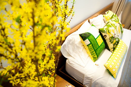
Deborah Main luxury pillows with vintage textiles, Modern Home Tour 2010. Photography by Gregg Cestaro.
Modern homes are being built in Austin and all around the country at a rapid pace. Three in our neighborhood are being built in a single block….ours! Growth is exploding, so if you’re planning to move to Austin, you better get here fast before we run out of homes.
There are a lot of decisions in purchasing a new home. What better way to be inspired by Modern design and architecture then to see them up close and personal. Austin’s home tour was last month, but you can see more in cities all across the USA with the Modern Home Tour. Click HERE for the entire 2018 Modern Home Tour schedule for upcoming tours.
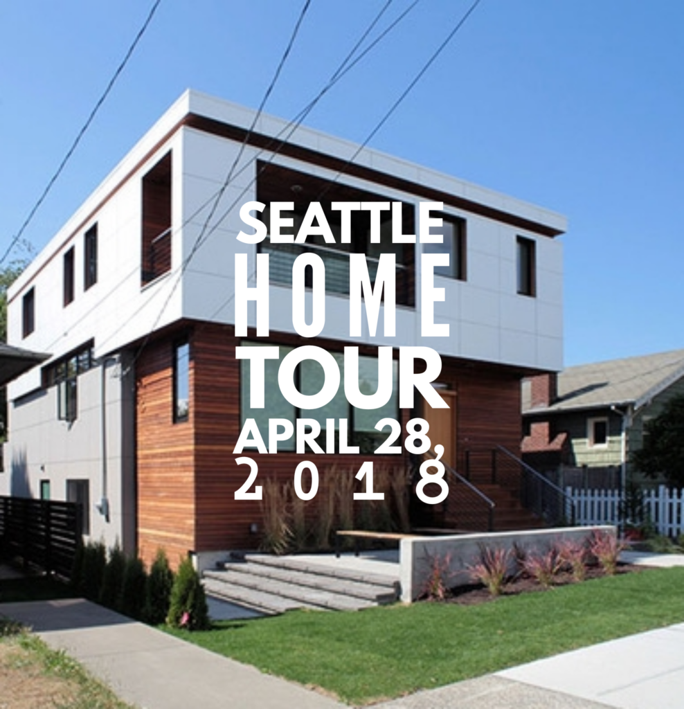
I even met a Dallas builder at Austin’s tour who flies around to all the different tours….now THAT would be a blast, right? Next up – Seattle!
I really enjoyed celebrating Austin’s 10th anniversary Tour because it was 10 years ago, the first one in Austin, so it was really cool to learn about the growth and expansion into other cities. Check out my interview HERE with James Leasure, who, with his partners, produces all the tours. This year we were thrilled to be a sponsor, help promote the Austin tour through our blog, and have Deborah Main Designs’ Mid-century modern pillows in the Newcastle Home below.
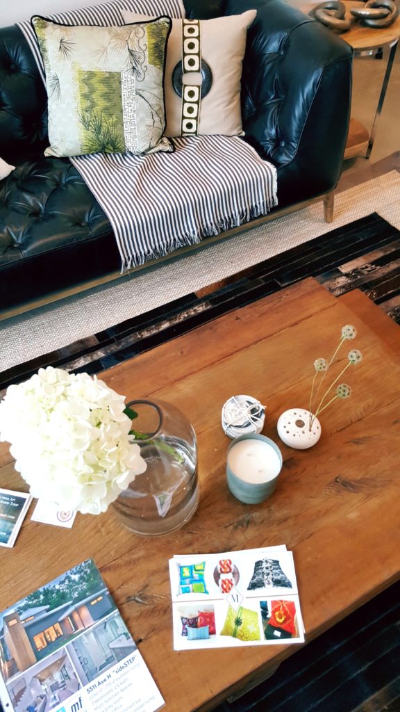
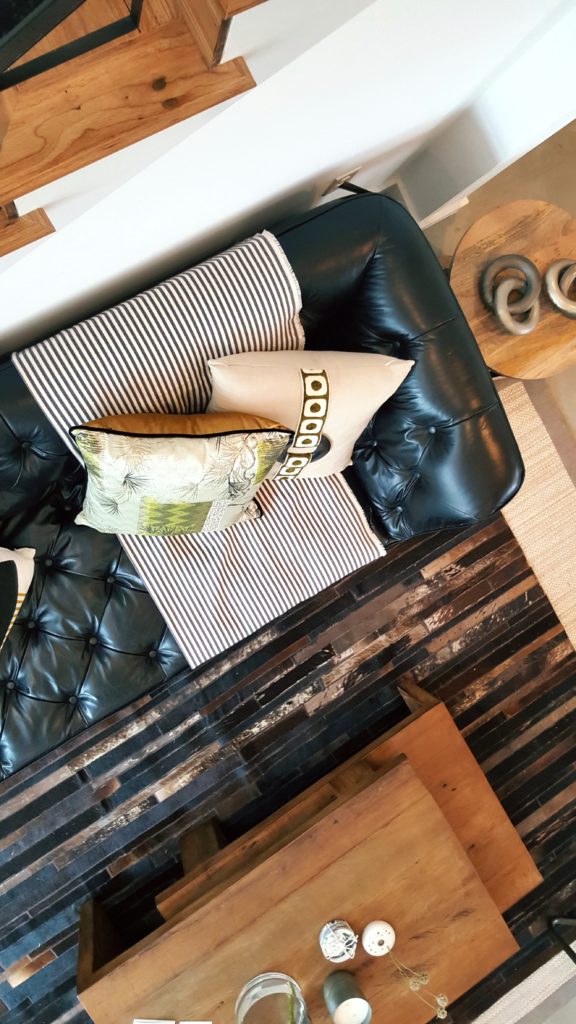
Home staging by Ruby Coultier of Vazzo Spaces. Deborah Main Limited Edition pillows, including “Linen & Wood” on the sofa.
Sometimes it’s the little things, like the magic an interior designer, stager or stylist does to a home, that can add modern to any room. Please see more Austin pics and our interview with the owner of Vazzo Spaces HERE.
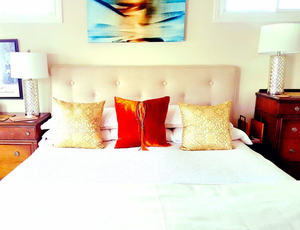
Although my husband and I live in a 1950’s cottage bungalow, we like to mix it up to incorporate modern details whenever we can. Like in our Airbnb below, The Collier Guest Room, which we rent out year round.
With the help of a professional interior designer (always a good idea to hire a professional!) Patrick Landrum, of PL& D/Patrick Landrum Design, selected a pair of modern lamps to go on our antique bureaus (my grandmothers) which I would have never thought of. And since we collect friend Roi James’ oil paintings, we agreed this modern piece with all its strokes of color and texture (almost like folds of fabric) would be perfect above the custom modern linen headboard and luxury Peacock Alley linen bedding. (We also have a few modern structural details our architect updated our bungalow with, but that’s a whole ‘nother blog post.)
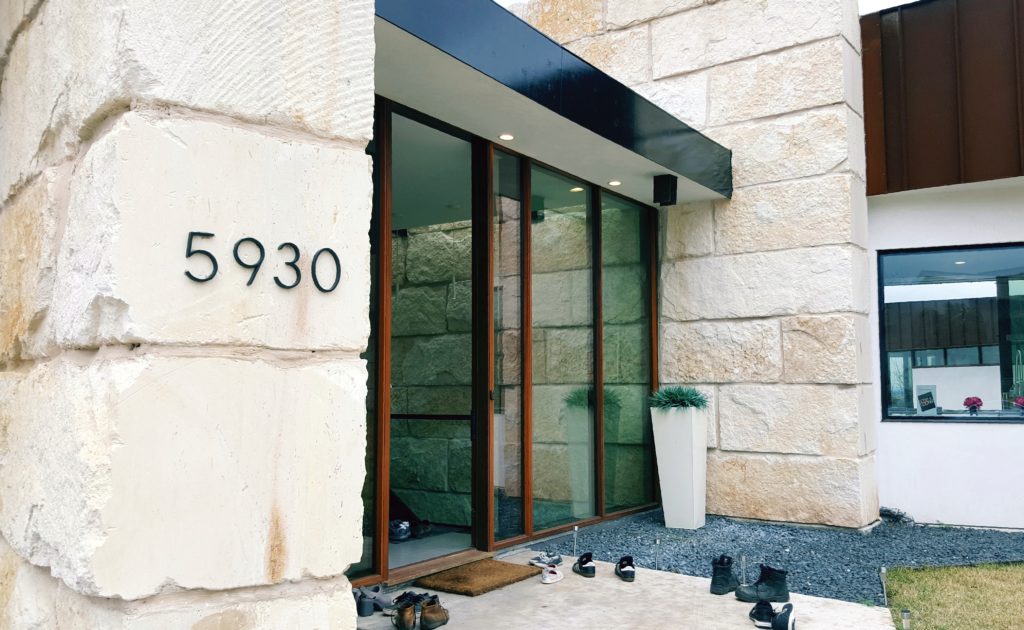
If you’re looking to remodel your home or build a brand new one, I highly recommend attending the Modern Home Tours in any, or all, of the cities. From Austin, Denver, Portland, San Diego and more, the tours are an excellent resource to you as a homeowner or interior designer to get inspiration. You can always tell the start of a Home Tour with the shoes outside the front as in the Bercy Chen home below.
Here are 6 modern features to consider, that really caught my attention at 5 (out of 15) homes I toured in Austin. These details really inspired me, and hopefully will you too. Each is indicative of great architectural and interior design:
- Open concept kitchen, living room, bedrooms.
- Unique building materials and pool design.
- Open stairways that add light (or water).
- Unique Lighting and lots of natural light.
- Home Decor that adds warmth.
- Color and texture with unexpected materials.
#1 Open concept – kitchens, living, dining and bedroom areas.
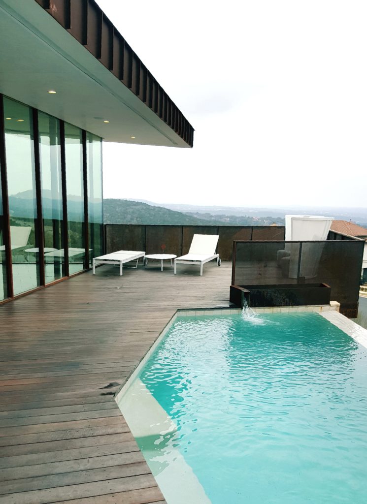
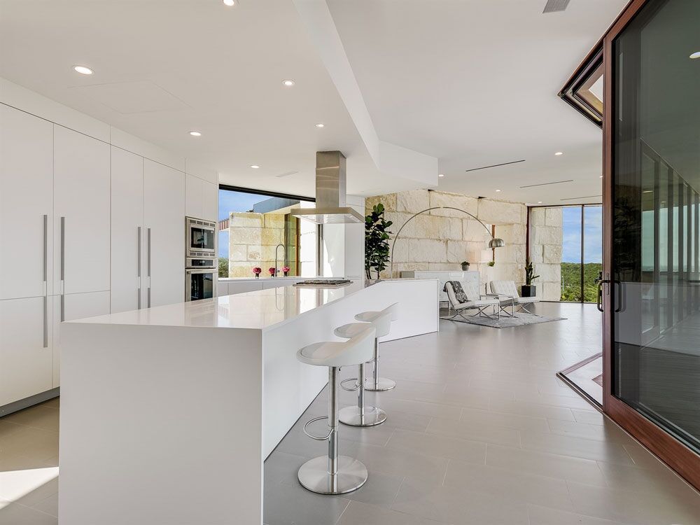
This all white kitchen above in the modern home by Bercy Chen Studio not only opens to the deck and pool in below image, but overlooks the Texas Hill country too.
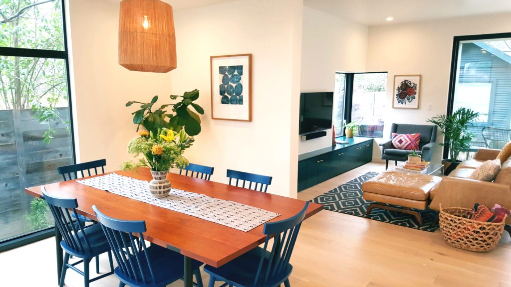
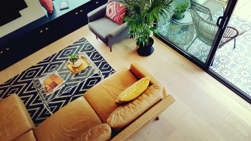
This dining area below, in the vintage bungalow by Architect firm Design Hounds, was also remodeled with an open concept – the kitchen opening into the dining room and living room which steps right outside into the backyard deck. And all rooms having many windows with natural light.
The kitchen, living room and bedroom in the Zagorski home (below) by Steve Zagorski Architects and interior designer Denise Foester all follow the open concept. The Zagorski home is an excellent example of how bringing the interior designer in on the project from the very beginning and working as a team – architect, engineer and the home owners – can produce an incredible result. This by far was one of my favorite homes on the Austin Modern Home Tour!
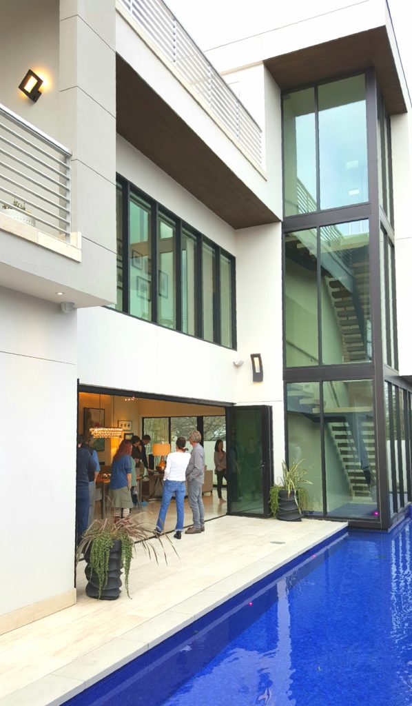
Below are a few images I took on the tour of the open living room kitchen onto a patio and the most captivating pool concept I’ve ever seen. What was very distinct in many of the modern homes, particularly this one, was the use of Nana Walls, which are glass walls that open up an entire wall to the outdoors. I had never seen these floor to ceiling walls designed to this extent, where the wall literally opens up into the wall or, like below, in an accordion fashion. This type of modern design is very exciting to see how much of the outdoors is actually part of the indoor living space and vice a versa. And how much natural light fills the home!
This image below shows you the extent that the floor to ceiling Nana Walls open up completely, wall to wall, from the kitchen/living room to the deck and spectacular pool. More on this unique pool feature later.
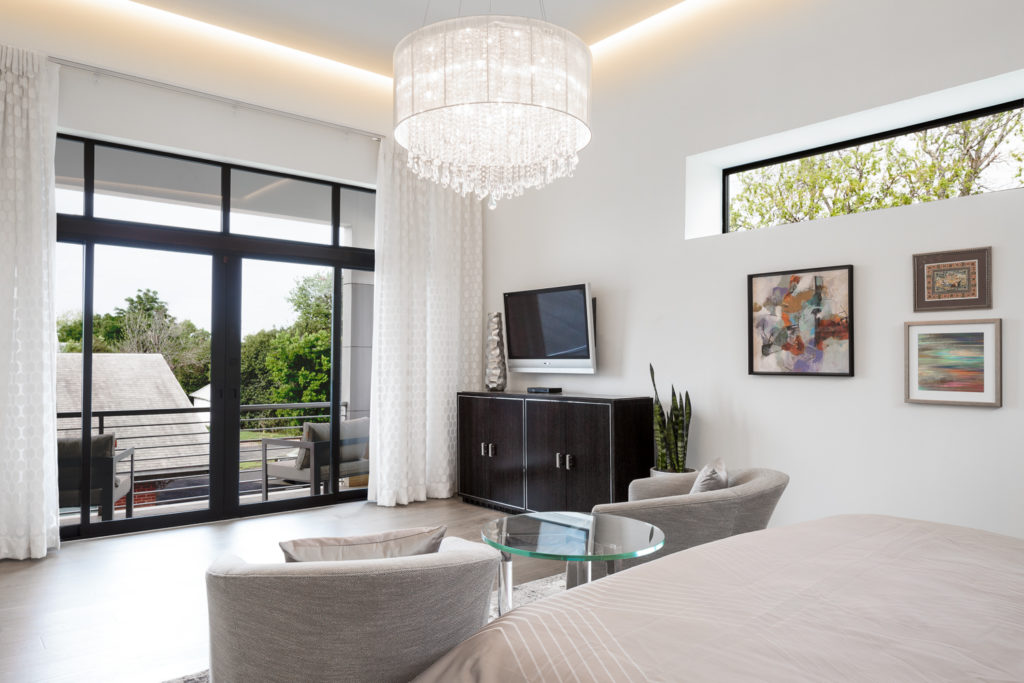
Lastly, in the Zagorski modern master suite upstairs, designed by interior designer Denise Foester, you can see how the view is also wide open to the outdoors And the high windows not only letting natural light in, but the trees and views of the outdoors.
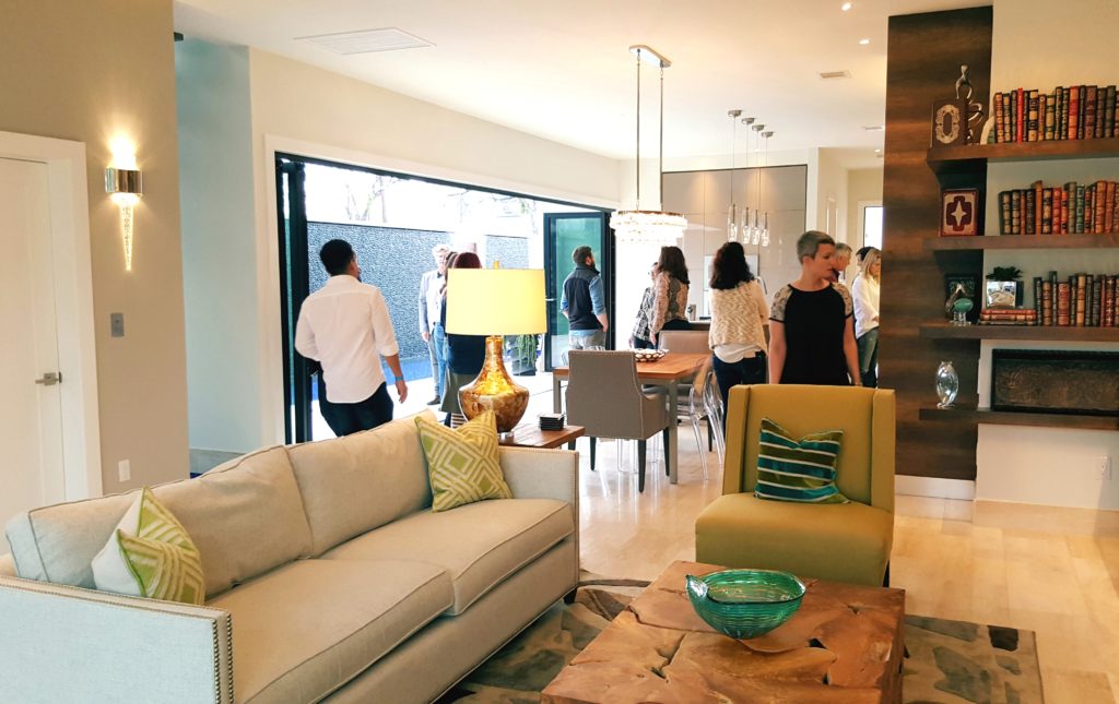
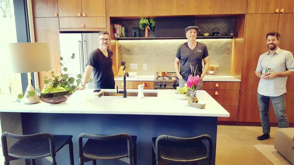
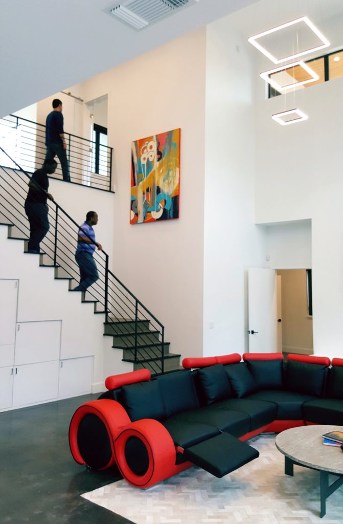
Below is a the smallest of 2-story units right in our neighborhood that features an open patio right off the kitchen an living room. The Abode Modern Home builders are standing in the kitchen with a grassy terrace to their right. The wall to the left of the lamp runs the entire width of the unit, and opens up like a Nana Wall, but is designed like a pocket door in that it slides into the walls.
#2 – Building materials and pool features.
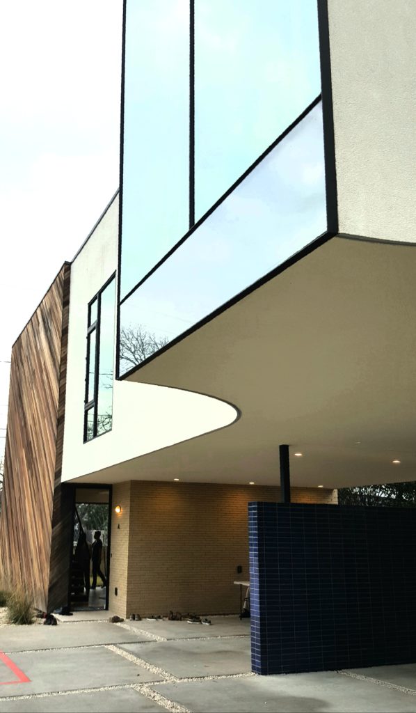
Modern homes are full of angles and unique building materials from mirrored glass to concrete, gorgeous wood exteriors (which are hot right now!) and even limestone.
This architectural beauty, built by Abode Modern Homes, has five units on the lot designed by architect Michael Hsu.
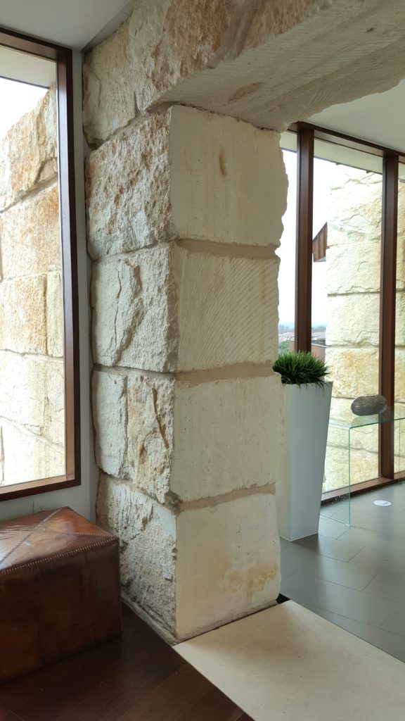
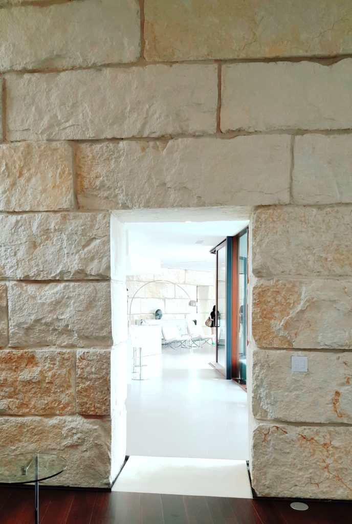
Below, the Bercy Chen home in my book is an architectural feat! GIGANTIC blocks of Texas limestone are incorporated into its metal and glass construction. And as you can see from this image below, they seamlessly run from the inside walls and entryways to the outside. A remarkable modern feature, reminiscent and inspired by ancient ruins, that I’ve never seen before.
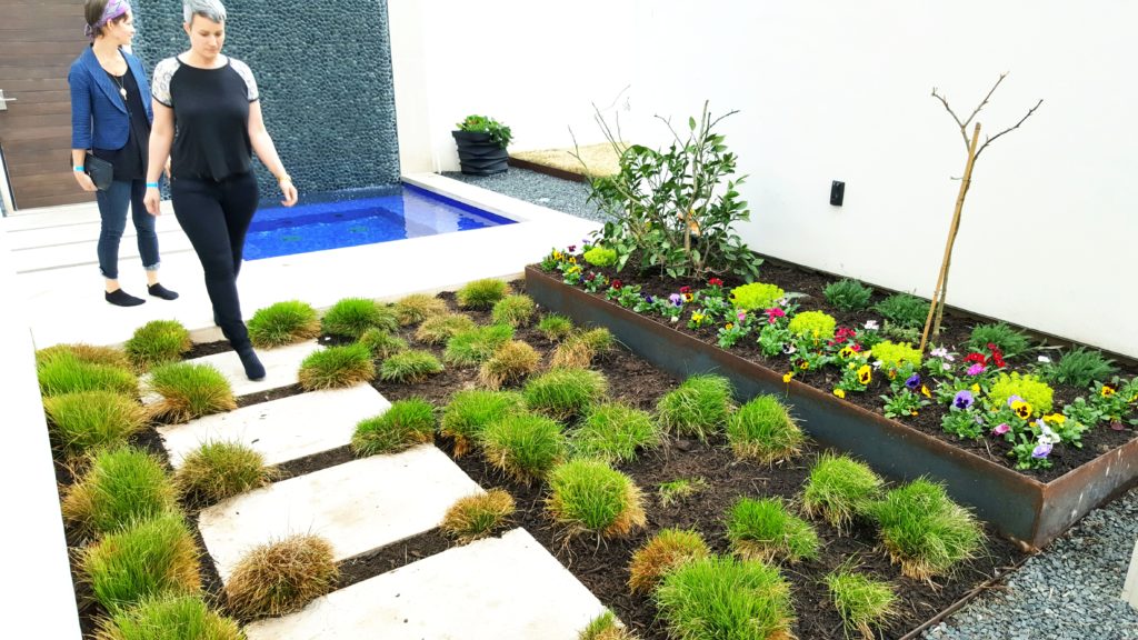
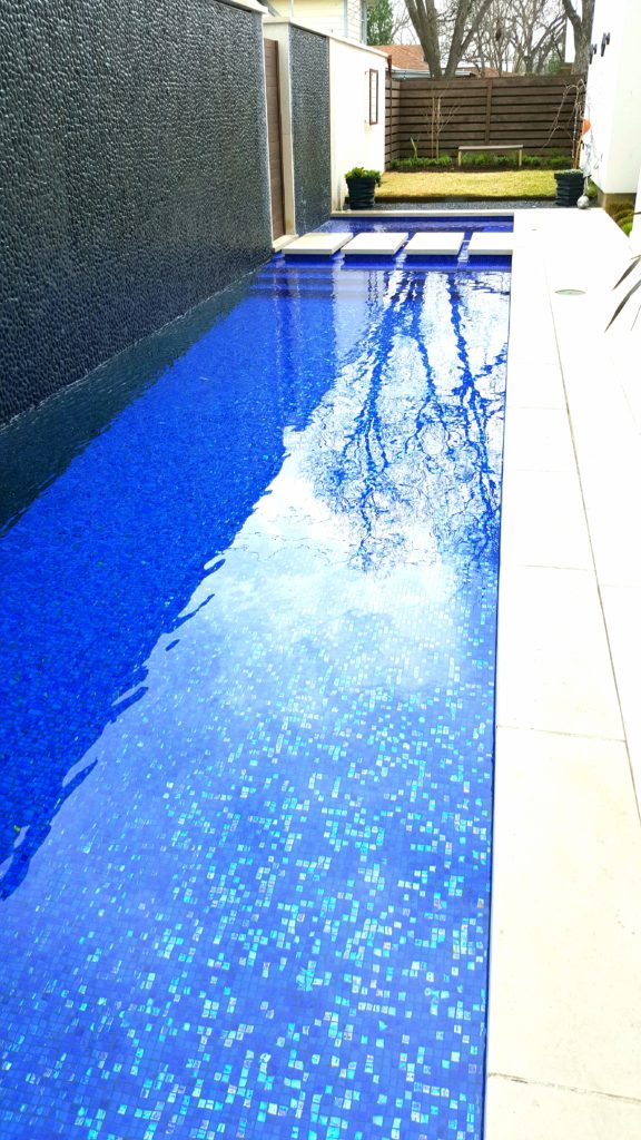
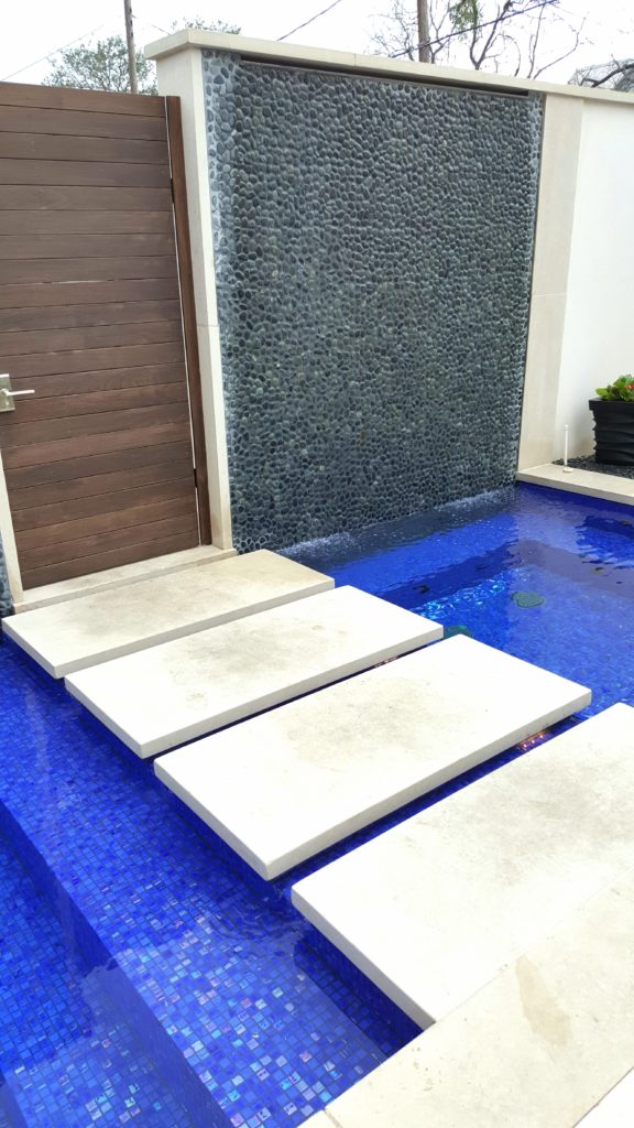
And to die for pools! Not your suburbia pools of the 80’s and 90’s, but modern achitectural beauties to behold, like this one below at the Zagorski home where the water also cascades down the wall. We’re seeing more and more features, once used only in commercial buildings, now becoming a mainstay in modern homes.
This pool design (above) by Steve Zagorski Architects was one I couldn’t take my eyes off of. In fact, with its unique design and iridescent tile bottom, I would have to say it was in my top two modern features (the Bercy Chen limestone blocks being the other). I also loved the story Steve told me how the homeowner wished to “walk on water” right across the stepping stones below through that door to his office. His wish came true.
This seques nicely into the open staircase concept.
#3 Open stairways
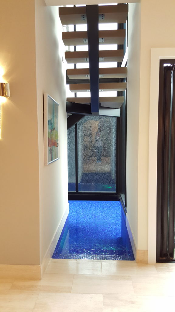
As you can see from this image below, the pool feature at the Zagorski modern home also can be accessed from inside the home right underneath the open staircase. It is visible from the living room and kitchen. This was by far THE coolest modern feature on the tour!
I learned from Denise, the interior designer, that they had to hire a commercial contractor to engineer it because although the Zagorski/Foester team knew it had been done before, it could not be achieved under residential coding. Brilliant architectural concept, not just in having the pool come indoors, but to also have it underneath the open staircase!
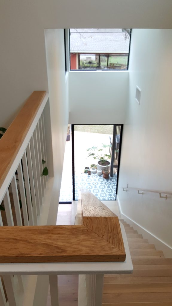
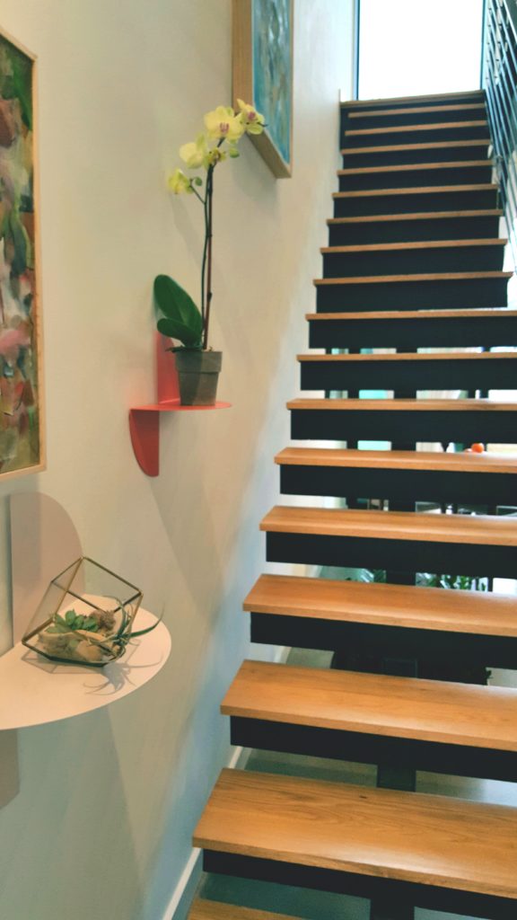
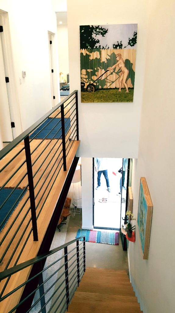
So, even though we’re not suggesting you have to add water underneath your staircase (although, imagine for a moment leaving a hectic day at the office, entering your home, dropping your clothes in a heap on the floor, and stepping into the cool water – all before you even reach the kitchen!) please consider the open staircase design. It was a very popular architectural feature in these other modern homes below.
These two images below were the staircase of the Abode Homes by architect Michael Hsu. The third image is the staircase in the home designed by Winn Wittman Architecture.
#4 Unique Lighting and lots of natural light.
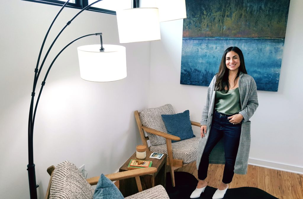
Below is the friendly face of home stager and stylist Ruby Coultier of Vazzo Spaces. Ruby and I partnered up with incorporating Deborah Main Designs luxury pillows into her designs (where you’ll see at the end of this post), but here she’s standing in the foyer of the upstairs with this very cool lamp fixture and beautiful art behind her.
In the Zagorski home (Yup, I use a lot of examples from that home, because to me it had EVERYTHING I would want in a modern home and details that really inspired me) it was the wall sconces and natural light that caught my eye.
While there were plenty of unique modern wall sconces throughout the Zagorski modern home, there was one outstanding chandelier in the master bedroom where the homeowner wanted a little bling (Yay, someone else who loves bling!) and the architectural shape to the table lamps on the nightstands is also amazing. Notice too the natural light coming in from the high windows.
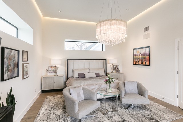
Zagorski master bedroom that opens to a deck. Interior design by Denise . Photography by James Leasure
#5 Home Decor that adds warmth
I saw the most warmth I’ve ever seen in a modern home in the Zagorski home. Most of the homes on the tour are not lived in yet, so that could have something to do with it, but also many modern homes have stark and cold interiors.
This was definitely not the case at all in the interiors of the Zagorski home. Designed by interior designer Denise Foester, the architect and homeowners really let her work her magic and it definitely shows. It shows in the materials choices – textiles, furniture, bookcases and more – that Denise used throughout the home. She definitely did an excellent job listening to her client bringing warmth into the home, as the modern home from the outside is pure concrete.
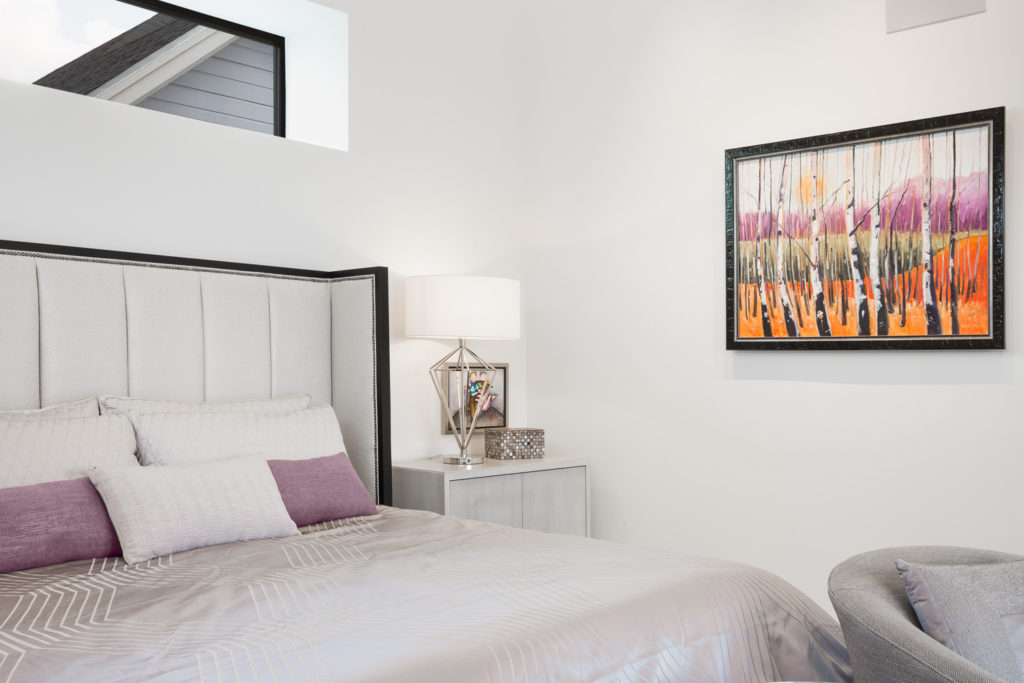
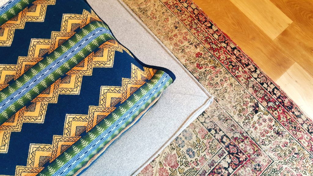
The master bedroom was calm and serene with a lavender and gray color palette. Below is a detail of the lavender bed cover, gray chair, and a mixed tone, but soothing carpet.
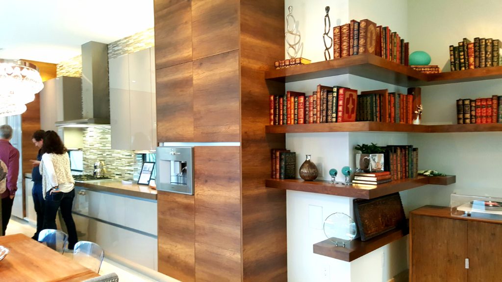
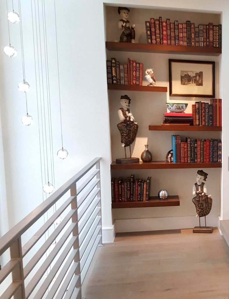
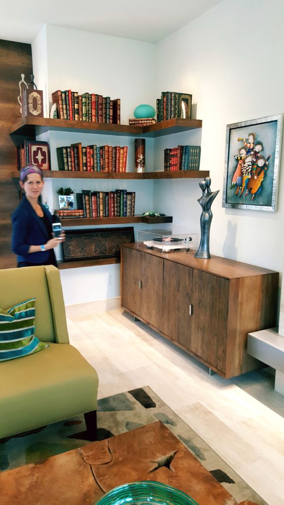
Warm wooden built-in bookcases were designed throughout the home to house the homeowners antique book collection. I love how it can work so nicely wrapped around the kitchen and against the coolness of the metal railing and modern pendant lighting.
#6 Color and Texture with unexpected mix of materials.
On the Austin Modern Home Tour I found the most color, texture and unexpected materials in the Michael Hsu home, the Bercy Chen home, the Zagorski home, and the Newcastle home.
Above and below are the wonderful bohemian-feel textiles full of color and texture incorporated into the interiors of the Abode modern home. How fitting since this home is in South Austin, right around the corner from our vintage bungalow home.
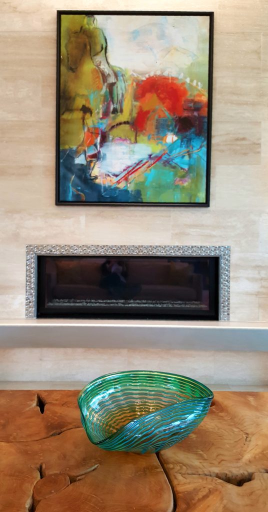
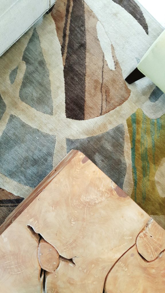
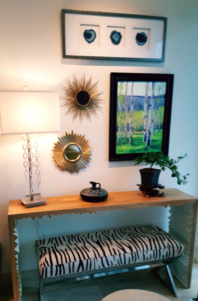
In the Zagorski home, interior designer Denise Foester introduced colorful paintings, textured wooden tables and consoles, and other colorful home decor accents like glass, decorative pillows, rugs, and art.
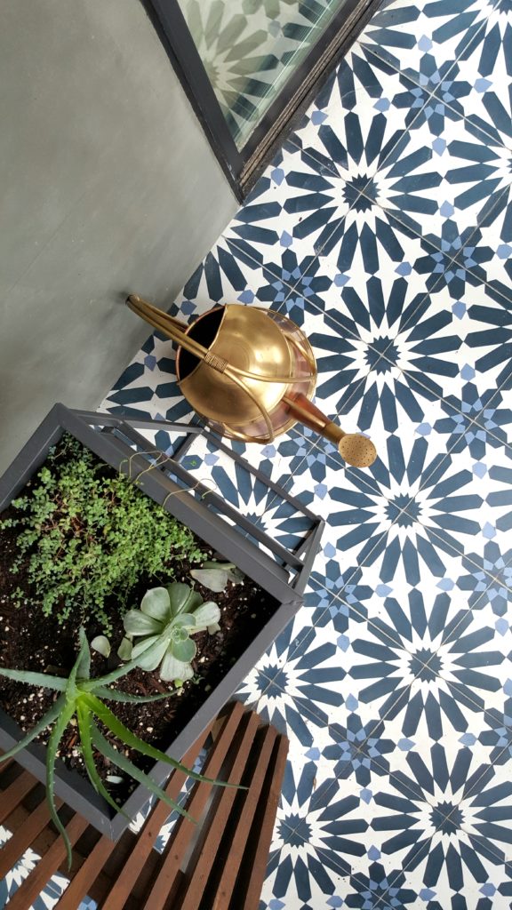
At the vintage bungalow by Design Hounds Architects, their team does both the architecture and interior design. I loved the color and texture with the mix of materials in the tile on the back porch along with wooden slatted planter and copper watering can. It’s a small detail, but one that makes an aesthetically pleasing influence, at least to my eye.
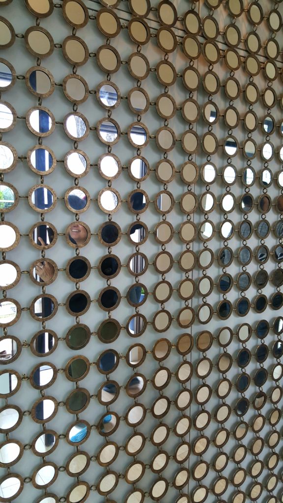
The Zagorski home had a wall panel, reminiscent of the ’60’s and 70’s of textured wooden circular mirrors, as the first thing you see walking into this modern home.
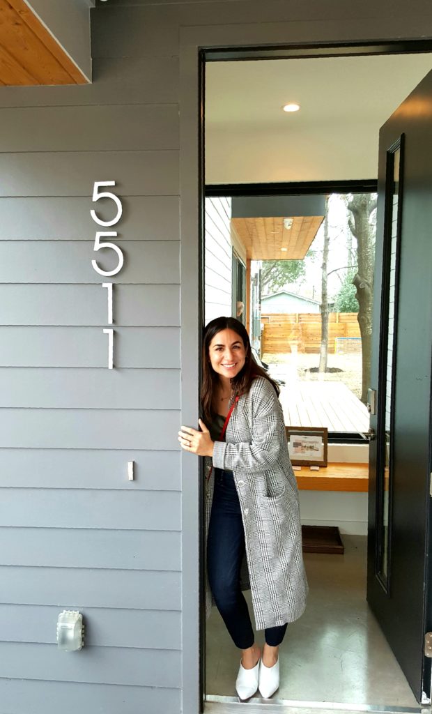
And last, but not least, all the amazing texture and soothing colors that home stager/stylist Ruby Coultier of Vazzo Spaces brought into the living room of the Newcastle home. Here’s the beautiful smile of home stager Ruby at the entrance of the Newcastle home.
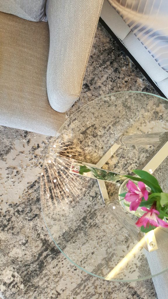
Love all the different materials – neutral colors, leather, fur and wood – Ruby incorpotated into styling this living room. And I just noticed how the metal looped rings on the coffee table play off Deborah Main Designs’ “Linen & Wood” pillow next to a 1950’s Asian textile pillow.
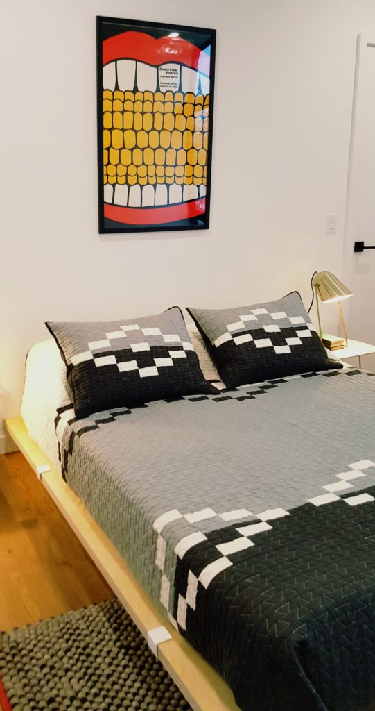
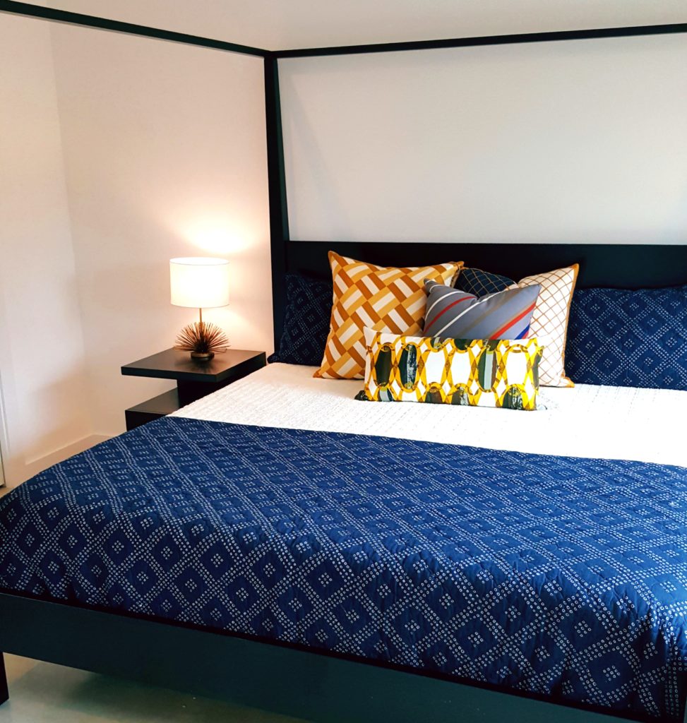
Below is a great example of how Ruby instinctively can group together an entire mix of colors, patterns, and textures of Deborah Main Luxury Pillows on a modern canopy bed. Three of these geometric pillows are handcrafted from vintage Vera Neumann silk scarves and the front pillow is a limited edition of an original Mid-century chain link pattern. The texture on the back is chocolate faux ostrich. I love how well these work with the navy, almost bandana-like pattern of the bed coverlet.
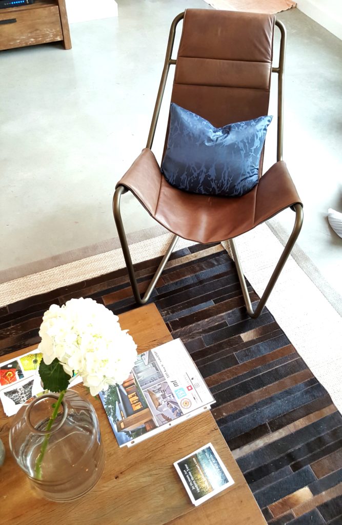
Below ruby accents a modern leather chair from the home owner with a Deborah Main limited edition blue pillow along with wooden tables and consoles from Four Hands furniture. I personally love blue and brown together and the mix of wood and leather textures.
Thank you for reading our blog and I hope you enjoyed the recap of the wonderful modern details on the Austin tour. Please be sure to check out all the other tours coming up; purchase tickets HERE.
Now which of these 6 modern features we highlighted are you going to work into your home this year? Tell us, as we love featuring projects from our readers.
Till next week, when we flash you back to the era of Downton Abbey for a luxurious evening, enjoy the budding of spring wherever you are, even with a little snow on the ground. Happy Spring, XO PG
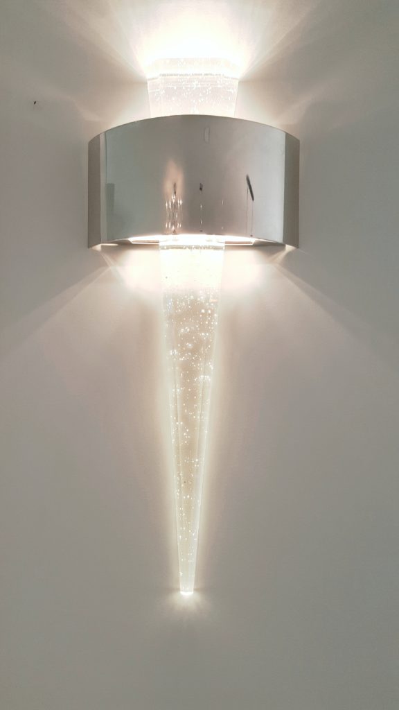
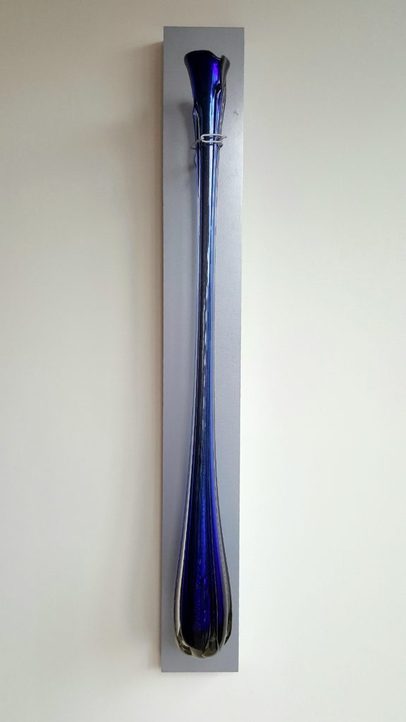
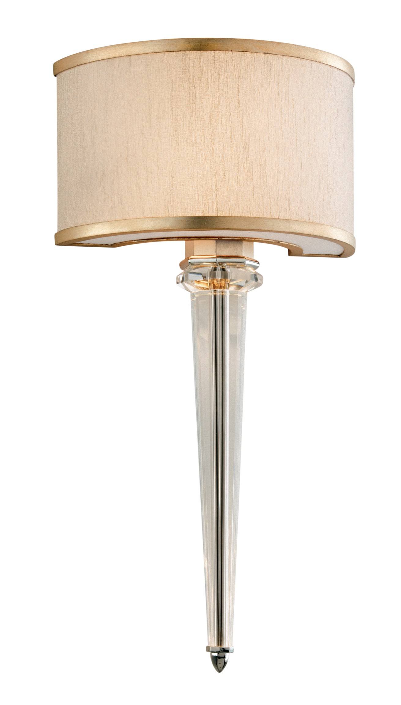
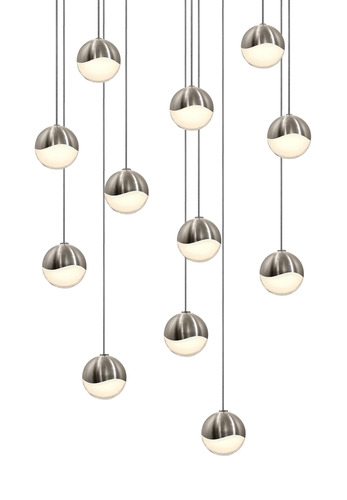
Note: This post is sponsored by the Modern Home Tour. All opinions and mages are my own, except where noted. Below are two affiliate links of modern lighting similar, but not exact, to that in the Zagorski/Foester home. Affiliate links in a blog are ways you can purchase products on the blog while the blogger receives a very small compensation. Thank you for reading our blog.


Sarah
Posted at 04:34h, 29 MarchThere is so much gorgeousness in this home!!
Deborah Main
Posted at 21:25h, 29 MarchThank you Sarah! I’m so glad you enjoyed our post on the Modern Home Tour. I wish I could have seen more homes, but the 5 I did really inspired me. LOTS of gorgeousness!! Thanks for reading our blog and commenting. 🙂