19 May Texture Tuesday – Japanese Architecture & Audrey Hepburn
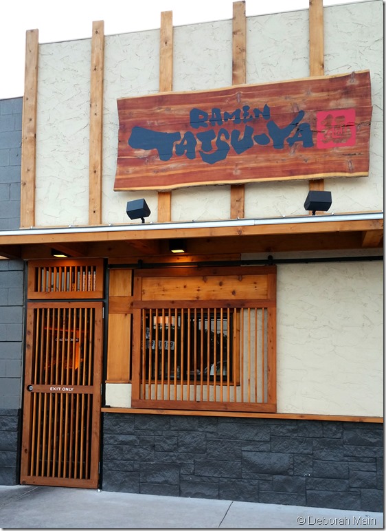
Last night we tried a new restaurant in our hood for our Chinese exchange student’s 18th birthday. One thing I promised my girls, was that I wouldn’t take a whole lot of photos during dinner. So, in keeping with that promise, at the end of our meal I snuck off to the rest room (It was occupied, so actually didn’t make it pass the hall way) and snapped away as we exited this new “south” location of a very popular Austin restaurant, “Raman Tatsu-ja”.
The food and service were wonderful, but for this week’s #TextureTuesday, it’s all about the texture and homage to Japanese design that truly captured my attention.
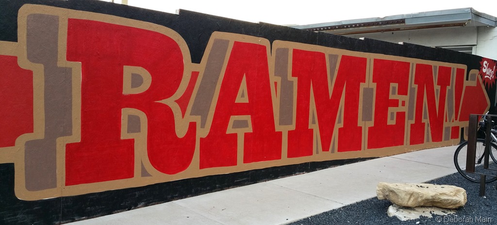
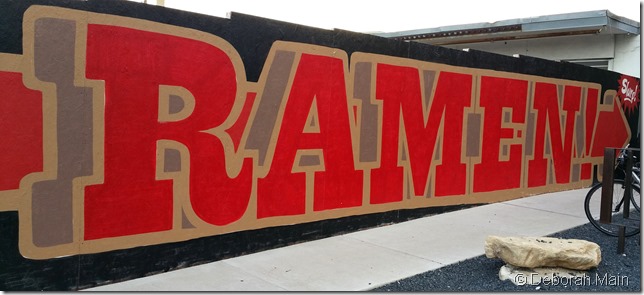
You can’t miss this big sign on South Lamar in Austin! Ramen noodles is their specialty, and after eating there I understand why.
You see, “Balance and Soul” is what evidently makes a great Ramen noodle bowl, THE key comfort food in Japan. And Tatsu-Ja did not disappoint.
You can read about when they first debuted in Austin HERE, and what a hot spot in the dining scene this casual restaurant is.
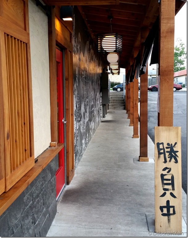
In terms of the architecture and design of this little South Austin gem, I think Chris McCray & Company got that balance and soul just right. Known for creating “responsible design”, Chris did a superb job, in my opinion, of incorporating several key elements of Japanese design in the wood-centered, black, red and white-themed space of RamenTatsu-Ja.
Here are seven I found (source, Presentation Zen)
- Embrace economy of materials and means.
- Repeat design elements.
- Keep things clean and clutter-free.
- Avoid symmetry.
- Avoid the obvious in favor of the subtle.
- Think not only of yourself, but of the other (e.g., the viewer).
- Remain humble and modest.
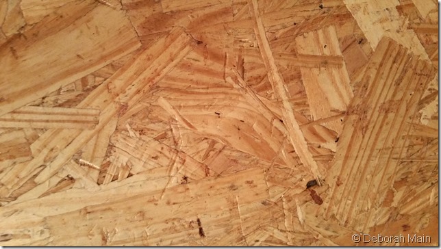
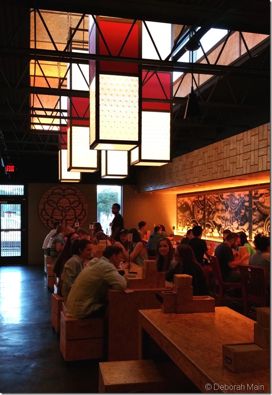
Upon being greeted at the door and ordering, we sat at a communal table made of chipped wood. Now there’s some texture for you! If you know me, you know I love wood and we were surrounded by it, as the tables, cubed seating and walls were made of this textured composite wood. (There was a gorgeous mural and more, but I’ll have to come back another time to see all the other design details).
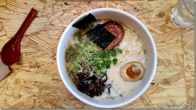
As first timers, we enjoyed their #1, pork broth with chashu (braised pork belly), egg, green onions, and we added seaweed. (I’ve heard that the more toppings you add, the more thrilling the experience becomes!).
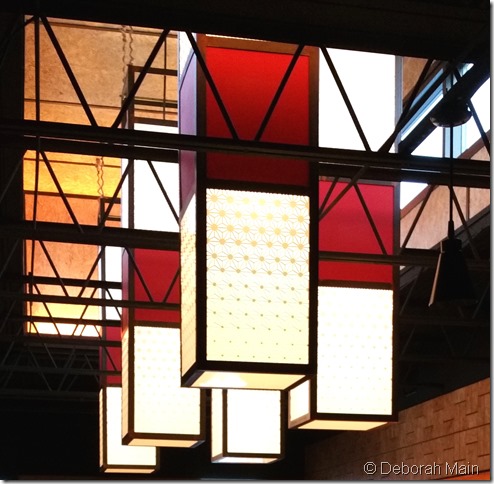
But about half way through our meal, I finally looked up and that’s where I fell in love – the light fixtures!
This central lighting fixture was it for me!! Incorporating the red and white theme, the repetition of shape, the lack of symmetry, these all brought this gorgeous, striking lighting fixture to be the “piece de resistance” of this tiny restaurant’s design. Just look at the detail….if you look close enough high up you’ll see the lighting hanging by rope that looks like a Ramen noodle. In and of itself, this lighting is a masterful work of art!
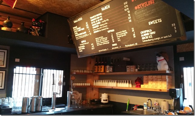
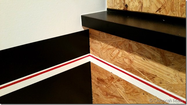
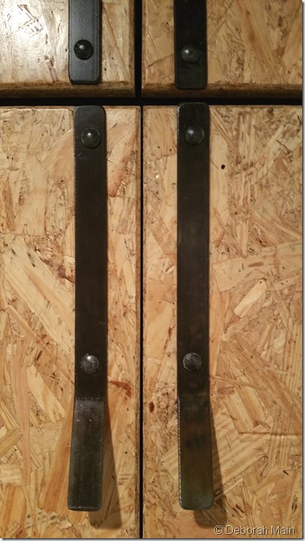
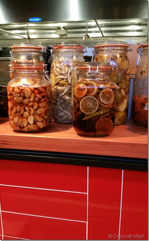
More details below of the repetition of red and white stripe against black, chipped wood, forged iron handles and bright red tile below the pickled jars of everything under the sun.
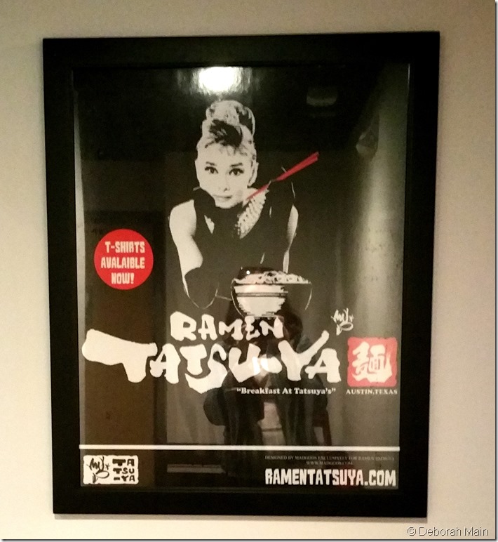
Then along came Audrey!! Now that’s classic! Come to think of it, Audrey herself exemplified elements of Japanese design. She was simple, beautiful, understated, and a timeless icon who captured our attention in film and with the work she did as an ambassador and gentle soul.
She’s remembered and revered for simply being Audrey!
And that is what Japanese design seems to be all about, the “balance and soul” of life, which is a concept I associate Audrey Hepburn with and all she stood for.
Till next time, I hope the details of the design of Ramen Tatsu-Ja inspire you to create simplicity in your life! XOPG
In one door and out the other, Ramen Tatsu-Ya was a wonderful experience and inspiring experience. Check out their website HERE to learn more about what quickly has become an Austin icon. I love the slatted wood at the entrance, and here at the exit and throughout the design of this cute little restaurant. What a treat to have it right in my neighborhood!


No Comments