13 May Texture Tuesday – Inspiration Abound in Historic Boutique Hotel

Photography by and with permission from, www.OxfordHotel.com
Spring has sprung! Many consumers, average homeowners like myself, choose to freshen up their home in the spring via decorating with a new rug, colorful pillows, or a fresh coat of paint. Some even embark on a partial or full remodel.
I’m happy to say, that after 16 years, my time has come and we’re about to start a partial remodel. But who knows, it may turn into a full kitchen and bath remodel by the time we’re done with it!
I’m VERY excited!! For many reasons, but the primary one being that everyone loves a fresh face, and besides needing a brand new roof, and some other non-exciting necessities, I can’t wait to make a splash of color and lighten up my home! And I really want to share with you all that I learn and discover along the way. Also of note, the last time I did my home I was NOT a pillow designer, so it’s a whole new ball game now.
I’m also very excited to be enlisting the help of two of my dear friends, who just also happen to be very talented interior designers, Patrick Landrum of PL&D Design and Hjardeir Dunn of Hjardeir Dunn Design. As I am not an interior designer myself, it will not only be fun to work with them, but a great learning experience for me. I do not think like an interior designer, nor do I possess any of the amazing expertise of interior designers, so it’s a real treat to learn all that goes into great design. Plus I have the incredible Interior Design Community, the brain child of Laurie Laizure of Customized Walls, to also lean on, as their support and advice has been invaluable!
Just by following my blog HERE, you will learn so much about design – from bathroom tile, to kitchen sinks, to lighting and more. I’ll write about design ideas, do’s and dont’s from industry leaders, my preferences, brands I love and recommend….well, the entire process really. So hang onto your hat, cause it’s going to be a fun ride through the summer! Who doesn’t learn from seeing what others do? I know I do!! That’s why I plan to rely on many of the experts in the kitchen and bath industry and I look forward to sharing their expertise with you here.
But for this week’s #TextureTuesday I bring you a little inspiration from the historic Oxford Hotel in Denver, Colorado.
While on trips, my whole family always wonders WHY in the world I would want to take photos of the hotel bathroom!?!? Well, you just never know where inspiration strikes!
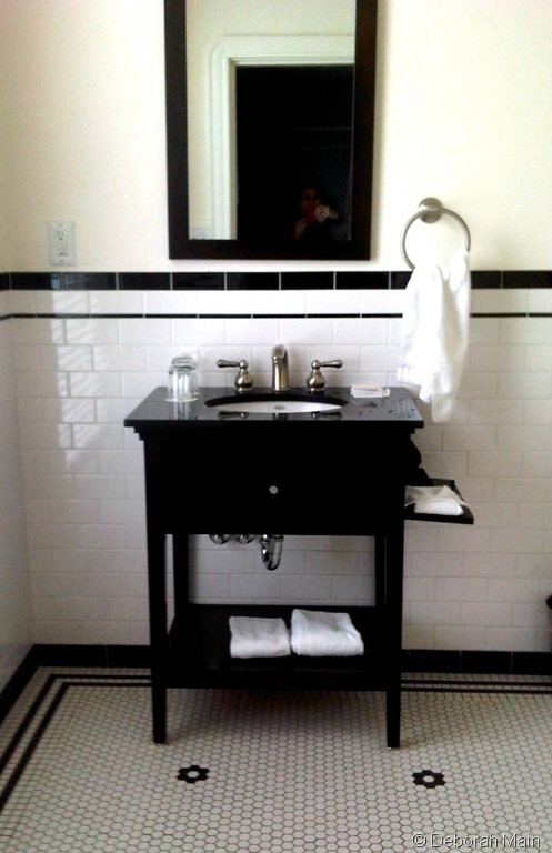
So check out my pics of what inspired me then and now. We already have a black and white bathroom, but like some homeowners, repairs are in order due to a leaky shower, so I’m dreaming about this bathroom right now. And, while our master bedroom is a lovely shade of off-white, I DO love a gorgeous Wedgewood blue….or maybe even a sunny yellow.
I’m such a traditionalist at heart, I guess because of my Yankee roots, but it’s really the classic elegance mixed with a touch of modern luxury that I am most drawn to. And who doesn’t love a little luxury here and there!
Think about what areas in your home you’d like to add a touch of glamour and luxury to this spring. Till next week, XO PG
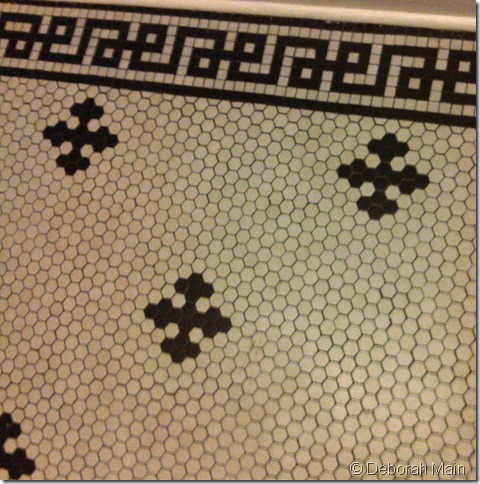
I just LOVE this black and white bathroom. The classic vintage look that is for real!
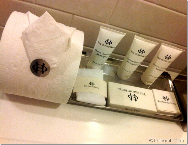
Yes, I even take pics of the toilet paper, shampoo and soap! To me, presentation is everything! Truly, I really care about it A LOT!! And this logo and bathroom essentials has great classic packaging.
I’m sure there’s an official name for this classic antique black and white tile bathroom pattern above, and I’ll find out soon enough, but all I know is that I have always loved it!
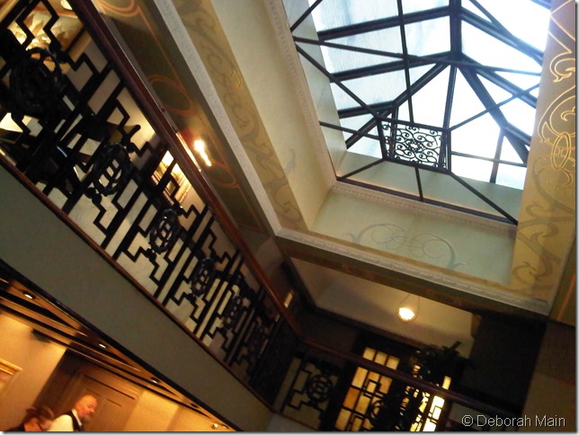
I also love architecture! And while my home and studio is a classic 1950’s small bungalow, and I won’t be able to do grandiose architecture like this, you’d be surprised the little things you can do to achieve similar results. Like when we remodeled in 1999, our architect drew up all my design ideas and then threw in some of his own, and one is a very distinct “T” in the ceiling that links the kitchen with the living room with a fun breakfast nook. (I’ll show details of that in future posts when we’re working on the kitchen design). But I love the architectural details in the above image. The grill work in the skylight and railing are amazing. Just look at how much is going on in that one pic!!
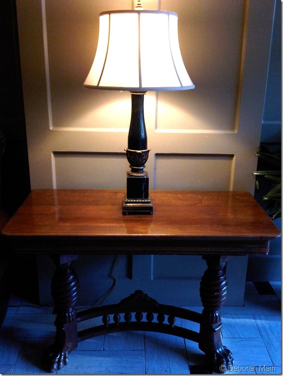
A simple lamp on a gorgeous antique table can magically turn into a statement piece. The architectural design of the table legs and claw feet are beautiful.
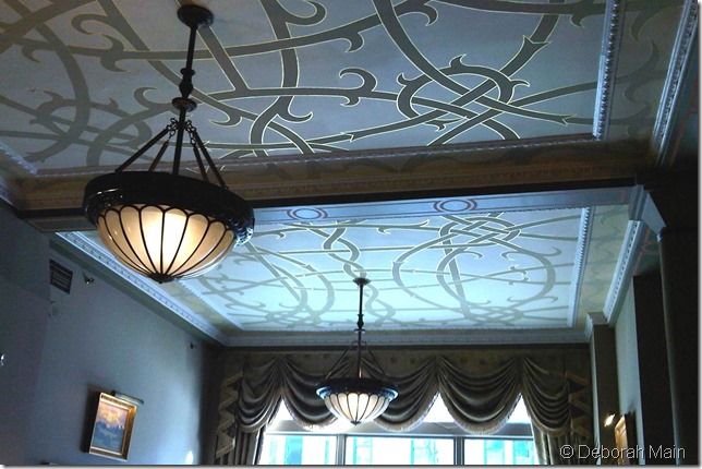
There’s nothing like a gorgeous pendant for dramatic lighting! It’s like jewelry for the home, a familiar tag line I used when we first launched our Les Bijoux pillow Collection featuring wearable vintage brooches. And look at the detail of the ceilings edged in gold. I absolutely LOVE detail!!
In fact, when I first designed my home in 1999, not having any background in design or interiors, the one thing that struck me (after friends and family saw the finished house) was their comments “I love the details!”. They kept pointing out to me details and texture of a kitchen door knob, or the fireplace mantel or the texture and alternating colors of the rattan shades in the breakfast nook.
And not then, but later on, much much later on, when I became a pillow designer, that “detail” phrase is what really stuck with me and helped me learn about my inner talents as a pillow artist.
I LOVE detail, especially textured detail in fabrics, design, art and architecture and I think it now shows up in my pillows at Deborah Main Designs.
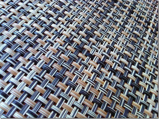
Can you guess what this texture is above? I saw a lot of blues, golds, creams and browns throughout this fabulous boutique hotel. I’m not going to tell you yet. But if you guess what this texture is and share this blog post daily on Twitter, Facebook, Instagram and any other social media with the hashtag #TextureTuesday, I will take everyone’s name with the correct answer and do a drawing on NEXT #TextureTuesday, May 19th, where I will announce the winner of this wonderful coffee table design book, AERO, by Thomas O’ Brien.(read more about Thomas O’Brien and his studio in our blog post from last year HERE).
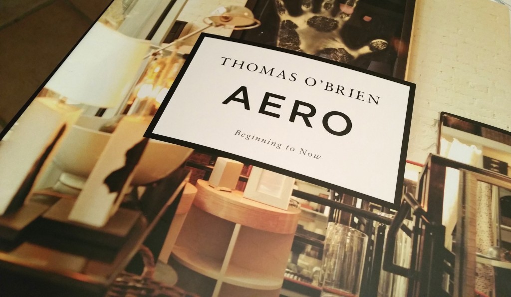
Read on our blog HERE about Thomas O’ Brien and receiving a copy of his book at my first Dallas #SneakPeek2014. It’s a fabulous inspiring book!
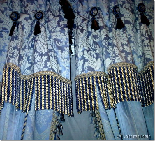
More #TextureTuesday detail of the dramatic drapery below in the hotel’s guest rooms. Love the fringe (and I can’t help but think of the fabulous #TrimQueen when I look at ANY fringe now!) The pattern looks much like the vintage and antique French textiles and Passementarie we’ve collected over the years in our studio, Deborah Main Designs.
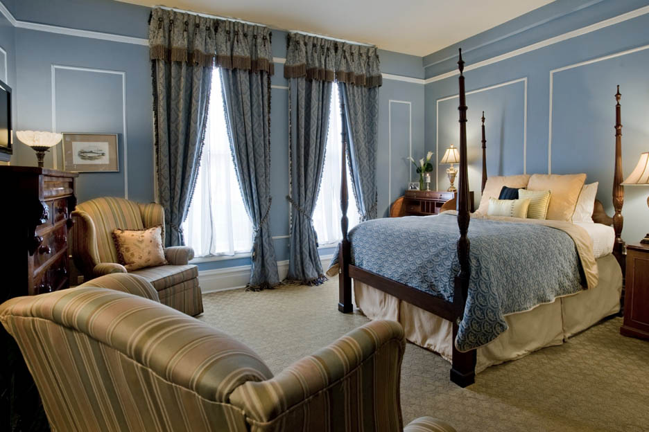
I love the classic elegance of this Wedgewood blue room and dramatic drapery in The Oxford Hotel. Photography by, and with permission from, The Oxford Hotel.
NOTE: I was not compensated in any way for this blog post. All images, except where noted, and words are my own.


No Comments